// Shopping app UI
Outdoor Gear Shopping App UI Design in Expo
This outdoor gear shop app UI gives a store the mood of a mountain weekend. A collage onboarding screen sets the tone, then a clean home leads with new arrivals and best picks.
- Screens
- 3
- Built with
- Expo SDK 58
- Fonts
- Plus Jakarta Sans, Caveat
- License
- Free (MIT)
Ridgeline Outdoor Gear app screens
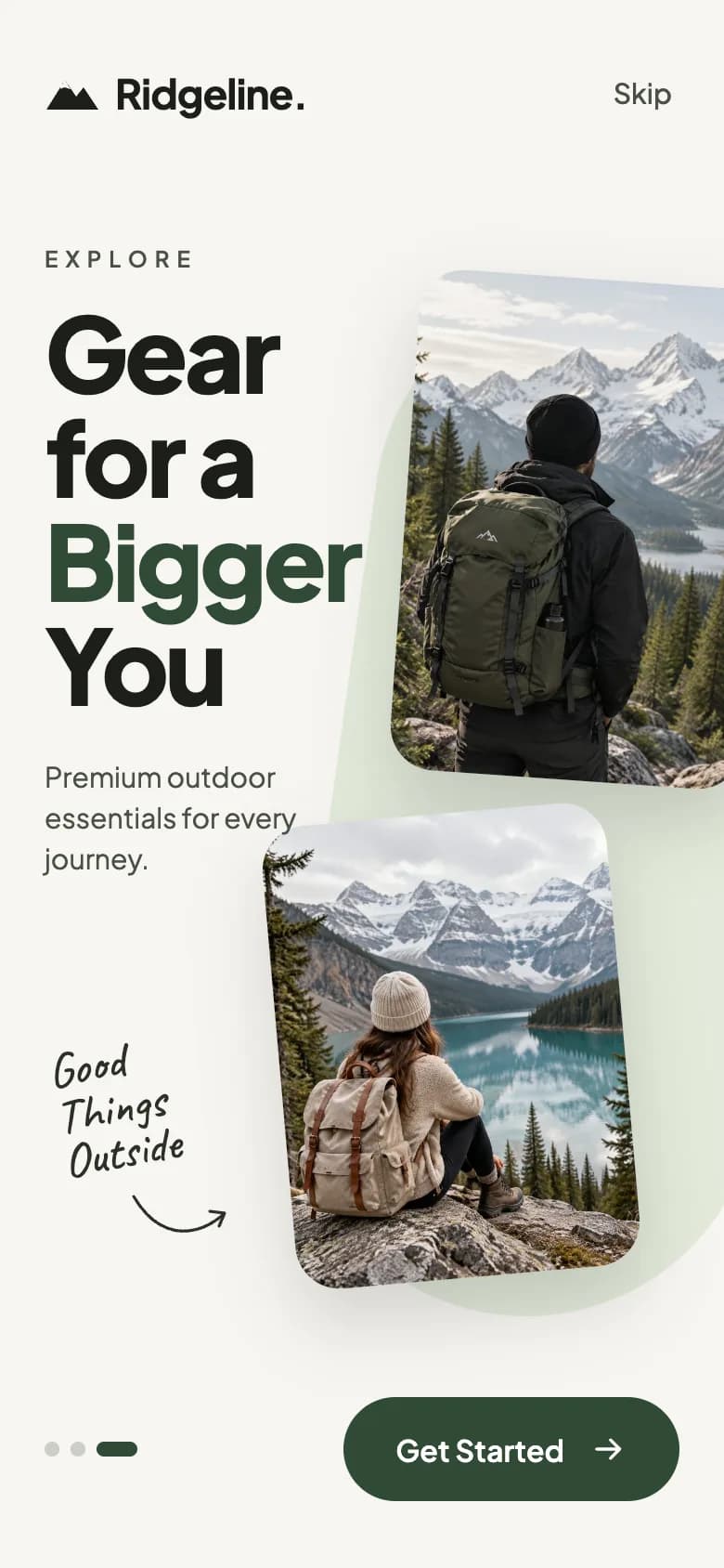
Onboarding
A stacked headline, overlapping adventure photos, a handwritten note and a Get Started button.
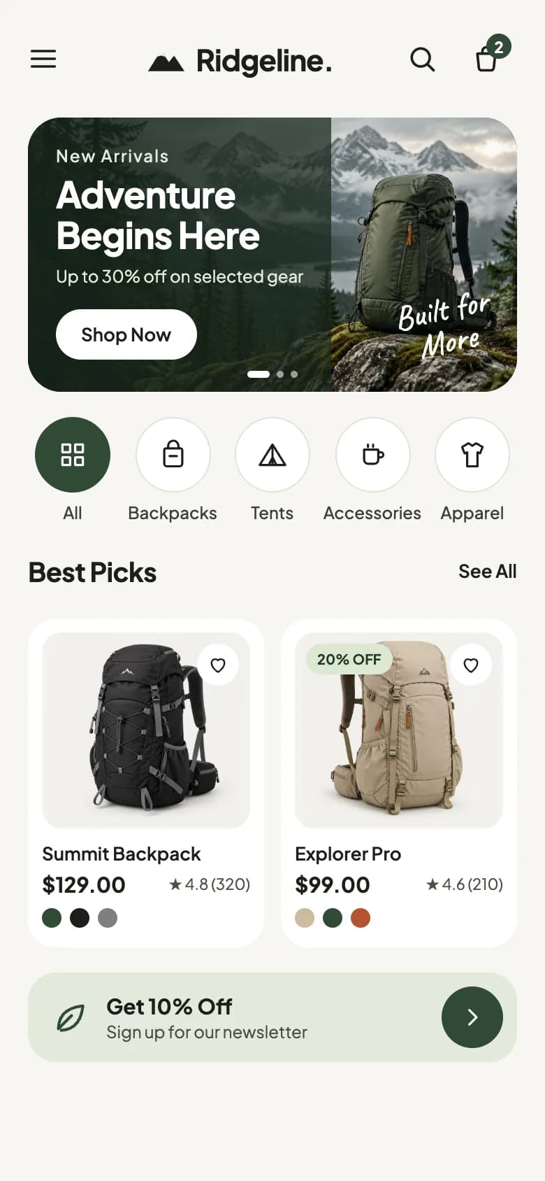
Shop home
A new arrivals banner, round category filters, best picks and a newsletter offer.
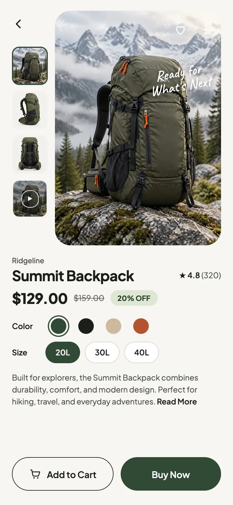
Product detail
A hero photo with thumbnails, rating, sale price, colour and size options and cart actions.
Copy the Ridgeline Outdoor Gear kit
Use the artifact as a design brief, the skill to generate the UI with an AI agent, or the code to run it right away.
Design artifact
The full design: tokens, screens and source
# Ridgeline Outdoor Gear: design artifact
This outdoor gear shop app UI gives a store the mood of a mountain weekend. A collage onboarding screen sets the tone, then a clean home leads with new arrivals and best picks.
- Type: Shopping mobile app UI
- Screens: 3
- Artboard: 390 × 844
- Target: Expo SDK 58, Expo Router, TypeScript, expo-image, react-native-svg
- Live page: https://developermill.com/app-designs/outdoor-gear-shop-app-ui-design
## Design direction
Warm off-white with forest green, adventure photography and handwritten notes that give the store a field-journal feel.
- Collage onboarding with handwritten notes
- Round category filters with selected icons
- Thumbnail gallery that swaps the main photo
- Colour rings, sizes and add to cart actions
## Foundations
### Colour
| Token | Hex |
| --- | --- |
| Forest | `#2F4A35` |
| Deep pine | `#1F3324` |
| Bone | `#F7F6F1` |
| Moss wash | `#E3EADB` |
| Slate blue | `#3B5B6E` |
| Bark | `#1C1F1A` |
### Typography
- Typefaces: Plus Jakarta Sans, Caveat
- Common sizes (px): 10, 11, 12, 13, 15, 16, 24, 26
### Shape and depth
- Common corner radii (px): 3, 4, 7, 13, 20, 24
- Shadows: `0 18px 40px rgba(28,31,26,0.18)`, `0 0 0 3px #F7F6F1, 0 0 0 5px ' + c.hex : '',
pick: () => this.setState({ color: i })
}))`
## Screens
### 1. Onboarding
A stacked headline, overlapping adventure photos, a handwritten note and a Get Started button.
Preview: https://developermill.com/app-designs/outdoor-gear-shop-app-ui-design/welcome.webp
Copy on this screen:
- Ridgeline.
- Skip
- EXPLORE
- Gear
- for a
- Bigger
- You
- Premium outdoor essentials for every journey.
- Good
- Things
- Outside
- Get Started
### 2. Shop home
A new arrivals banner, round category filters, best picks and a newsletter offer.
Preview: https://developermill.com/app-designs/outdoor-gear-shop-app-ui-design/home.webp
Copy on this screen:
- Ridgeline.
- 2
- New Arrivals
- Adventure Begins Here
- Up to 30% off on selected gear
- Shop Now
- Built for
- More
- Best Picks
- See All
- Summit Backpack
- $129.00
- ★ 4.8 (320)
- 20% OFF
- Explorer Pro
- $99.00
- ★ 4.6 (210)
- Get 10% Off
- Sign up for our newsletter
### 3. Product detail
A hero photo with thumbnails, rating, sale price, colour and size options and cart actions.
Preview: https://developermill.com/app-designs/outdoor-gear-shop-app-ui-design/product.webp
Copy on this screen:
- Ready for
- What's Next
- Ridgeline
- Summit Backpack
- ★ 4.8
- (320)
- $129.00
- $159.00
- 20% OFF
- Color
- Size
- Built for explorers, the Summit Backpack combines durability, comfort, and modern design. Perfect for hiking, travel, and everyday adventures.
- Read More
- Add to Cart
- Buy Now
## Full source
The original artboards as HTML. Image URLs point at the hosted demo assets.
### Onboarding (Main)
```html
<!doctype html>
<html lang="en">
<head>
<meta charset="utf-8">
<title>Ridgeline onboarding</title>
<script src="./support.js"></script>
</head>
<body>
<x-dc>
<helmet>
<link rel="stylesheet" href="https://fonts.googleapis.com/css2?family=Plus+Jakarta+Sans:wght@400;500;600;700;800&family=Caveat:wght@500;600&display=swap">
<style>
body{margin:0}
a{color:#2F4A35}a:hover{color:#1F3324}
</style>
</helmet>
<div style="width: 390px; height: 844px; position: relative; overflow: hidden; background: #F7F6F1; font-family: 'Plus Jakarta Sans', system-ui, sans-serif; color: #1C1F1A; box-sizing: border-box">
<div style="position: absolute; left: 24px; right: 24px; top: 28px; display: flex; align-items: center; justify-content: space-between; z-index: 3">
<div style="display: flex; align-items: center; gap: 8px">
<svg width="30" height="20" viewBox="0 0 30 20" aria-hidden="true"><path d="M1 19 L11 3 L17 12 L21 7 L29 19 Z" fill="#1C1F1A"></path><path d="M11 3 L14 8 L11 7 L8 8 Z" fill="#F7F6F1"></path></svg>
<span style="font-size: 22px; font-weight: 700; letter-spacing: -0.5px">Ridgeline.</span>
</div>
<a href="Home.dc.html" style="font-size: 15px; font-weight: 500; color: #4A5046; text-decoration: none; padding: 12px 4px">Skip</a>
</div>
<div style="position: absolute; right: -40px; top: 150px; width: 250px; height: 560px; border-radius: 140px; background: #E3EADB; transform: rotate(8deg); z-index: 0"></div>
<img src="https://developermill.com/app-designs/outdoor-gear-shop-app-ui-design/assets/aaaa5ef6d7.jpg" alt="Hiker with an olive backpack facing snowy mountains" style="position: absolute; right: -18px; top: 150px; width: 190px; height: 270px; object-fit: cover; border-radius: 24px; transform: rotate(4deg); box-shadow: 0 18px 40px rgba(28,31,26,0.18); z-index: 1">
<img src="https://developermill.com/app-designs/outdoor-gear-shop-app-ui-design/assets/e57e33827d.jpg" alt="Hiker with a beige backpack sitting by a mountain lake" style="position: absolute; left: 150px; top: 438px; width: 186px; height: 250px; object-fit: cover; border-radius: 24px; transform: rotate(-5deg); box-shadow: 0 18px 40px rgba(28,31,26,0.18); z-index: 1">
<div style="position: absolute; left: 24px; top: 132px; width: 230px; z-index: 2">
<p style="margin: 0 0 14px 0; font-size: 12px; font-weight: 600; letter-spacing: 4px; color: #4A5046">EXPLORE</p>
<h1 style="margin: 0; font-size: 56px; line-height: 1.0; font-weight: 800; letter-spacing: -2px">Gear<br>for a<br><span style="color: {{accent}}">Bigger</span><br>You</h1>
<p style="margin: 22px 0 0 0; width: 150px; font-size: 15px; line-height: 1.45; color: #4A5046">Premium outdoor essentials for every journey.</p>
</div>
<div style="position: absolute; left: 30px; top: 560px; z-index: 2; display: flex; flex-direction: column; align-items: flex-start">
<p style="margin: 0; font-family: 'Caveat', cursive; font-size: 26px; line-height: 0.95; color: #2B2F28; transform: rotate(-10deg)">Good<br>Things<br>Outside</p>
<svg width="54" height="30" viewBox="0 0 54 30" aria-hidden="true" style="margin: 6px 0 0 40px"><path d="M2 4 C 16 28, 36 26, 50 14" fill="none" stroke="#2B2F28" stroke-width="1.6" stroke-linecap="round"></path><path d="M43 12 L51 13 L48 20" fill="none" stroke="#2B2F28" stroke-width="1.6" stroke-linecap="round" stroke-linejoin="round"></path></svg>
</div>
<div style="position: absolute; left: 24px; right: 24px; bottom: 36px; display: flex; align-items: center; justify-content: space-between; z-index: 3">
<div style="display: flex; gap: 6px; align-items: center" aria-label="Step 3 of 3">
<span style="width: 8px; height: 8px; border-radius: 4px; background: #C9CEC4"></span>
<span style="width: 8px; height: 8px; border-radius: 4px; background: #C9CEC4"></span>
<span style="width: 22px; height: 8px; border-radius: 4px; background: {{accent}}"></span>
</div>
<a href="Home.dc.html" style="display: flex; align-items: center; gap: 14px; height: 56px; padding: 0 28px; border-radius: 28px; background: {{accent}}; color: #FFFFFF; font-size: 16px; font-weight: 600; text-decoration: none">Get Started
<svg width="20" height="20" viewBox="0 0 24 24" aria-hidden="true"><path d="M4 12h15M13 6l6 6-6 6" fill="none" stroke="#FFFFFF" stroke-width="2" stroke-linecap="round" stroke-linejoin="round"></path></svg>
</a>
</div>
</div>
</x-dc>
<script type="text/x-dc" data-dc-script data-props='{"accent":{"editor":"color","default":"#2F4A35","options":["#2F4A35","#3B5B6E","#7A4A2E"]},"$preview":{"width":390,"height":844}}'>
class Component extends DCLogic {
renderVals() {
return { accent: this.props.accent ?? '#2F4A35' };
}
}
</script>
</body>
</html>
```
### Shop home (Home)
```html
<!doctype html>
<html lang="en">
<head>
<meta charset="utf-8">
<title>Ridgeline home</title>
<script src="./support.js"></script>
</head>
<body>
<x-dc>
<helmet>
<link rel="stylesheet" href="https://fonts.googleapis.com/css2?family=Plus+Jakarta+Sans:wght@400;500;600;700;800&family=Caveat:wght@500;600&display=swap">
<style>
body{margin:0}
a{color:#2F4A35}a:hover{color:#1F3324}
button{font-family:inherit}
</style>
</helmet>
<div style="width: 390px; height: 844px; overflow: hidden; background: #F7F6F1; font-family: 'Plus Jakarta Sans', system-ui, sans-serif; color: #1C1F1A; box-sizing: border-box; padding: 18px 20px 24px 20px; display: flex; flex-direction: column; gap: 18px">
<div style="display: flex; align-items: center; justify-content: space-between; height: 48px">
<button aria-label="Menu" style="width: 44px; height: 44px; border: none; background: transparent; padding: 0; display: flex; align-items: center; justify-content: flex-start; cursor: pointer">
<svg width="22" height="22" viewBox="0 0 24 24" aria-hidden="true"><path d="M3 6h18M3 12h18M3 18h18" stroke="#1C1F1A" stroke-width="2" stroke-linecap="round"></path></svg>
</button>
<div style="display: flex; align-items: center; gap: 7px">
<svg width="28" height="19" viewBox="0 0 30 20" aria-hidden="true"><path d="M1 19 L11 3 L17 12 L21 7 L29 19 Z" fill="#1C1F1A"></path><path d="M11 3 L14 8 L11 7 L8 8 Z" fill="#F7F6F1"></path></svg>
<span style="font-size: 21px; font-weight: 700; letter-spacing: -0.5px">Ridgeline.</span>
</div>
<div style="display: flex; align-items: center; gap: 2px">
<button aria-label="Search" style="width: 44px; height: 44px; border: none; background: transparent; padding: 0; display: flex; align-items: center; justify-content: center; cursor: pointer">
<svg width="22" height="22" viewBox="0 0 24 24" aria-hidden="true"><circle cx="11" cy="11" r="7" fill="none" stroke="#1C1F1A" stroke-width="2"></circle><path d="M16.5 16.5L21 21" stroke="#1C1F1A" stroke-width="2" stroke-linecap="round"></path></svg>
</button>
<button aria-label="Cart, 2 items" style="position: relative; width: 44px; height: 44px; border: none; background: transparent; padding: 0; display: flex; align-items: center; justify-content: center; cursor: pointer">
<svg width="22" height="22" viewBox="0 0 24 24" aria-hidden="true"><path d="M5 8h14l-1.2 11.2a2 2 0 0 1-2 1.8H8.2a2 2 0 0 1-2-1.8L5 8z" fill="none" stroke="#1C1F1A" stroke-width="2" stroke-linejoin="round"></path><path d="M9 8V6a3 3 0 0 1 6 0v2" fill="none" stroke="#1C1F1A" stroke-width="2"></path></svg>
<span style="position: absolute; top: 4px; right: 4px; min-width: 18px; height: 18px; border-radius: 9px; background: {{accent}}; color: #FFFFFF; font-size: 11px; font-weight: 700; display: flex; align-items: center; justify-content: center">2</span>
</button>
</div>
</div>
<div style="position: relative; height: 196px; border-radius: 24px; overflow: hidden; background: {{accent}}; flex-shrink: 0">
<img src="https://developermill.com/app-designs/outdoor-gear-shop-app-ui-design/assets/ea54353a2a.jpg" alt="Olive backpack on a mossy rock in the mountains" style="position: absolute; left: 0; top: 0; width: 100%; height: 100%; object-fit: cover; object-position: 70% 50%">
<div style="position: absolute; left: 0; top: 0; width: 62%; height: 100%; background: rgba(26,40,29,0.72)"></div>
<div style="position: absolute; left: 20px; top: 20px; width: 200px; display: flex; flex-direction: column; align-items: flex-start">
<p style="margin: 0; font-size: 12px; font-weight: 500; letter-spacing: 1px; color: #E3EADB">New Arrivals</p>
<h2 style="margin: 6px 0 0 0; font-size: 26px; line-height: 1.1; font-weight: 700; color: #FFFFFF; letter-spacing: -0.5px">Adventure Begins Here</h2>
<p style="margin: 8px 0 0 0; font-size: 12px; line-height: 1.4; color: #E3EADB">Up to 30% off on selected gear</p>
<a href="Product.dc.html" style="margin-top: 14px; height: 36px; padding: 0 18px; border-radius: 18px; background: #FFFFFF; color: #1C1F1A; font-size: 13px; font-weight: 600; text-decoration: none; display: flex; align-items: center">Shop Now</a>
</div>
<p style="position: absolute; right: 18px; bottom: 24px; margin: 0; font-family: 'Caveat', cursive; font-size: 24px; line-height: 0.95; color: #FFFFFF; transform: rotate(-12deg); text-align: center">Built for<br>More</p>
<div style="position: absolute; left: 50%; bottom: 10px; transform: translateX(-50%); display: flex; gap: 5px" aria-hidden="true">
<span style="width: 16px; height: 5px; border-radius: 3px; background: #FFFFFF"></span>
<span style="width: 5px; height: 5px; border-radius: 3px; background: rgba(255,255,255,0.55)"></span>
<span style="width: 5px; height: 5px; border-radius: 3px; background: rgba(255,255,255,0.55)"></span>
</div>
</div>
<div style="display: flex; justify-content: space-between">
<sc-for list="{{cats}}" as="cat" hint-placeholder-count="5">
<button onClick="{{cat.pick}}" aria-pressed="{{cat.pressed}}" style="border: none; background: transparent; padding: 0; display: flex; flex-direction: column; align-items: center; gap: 7px; width: 64px; cursor: pointer">
<span style="width: 54px; height: 54px; border-radius: 27px; display: flex; align-items: center; justify-content: center; {{cat.circleStyle}}">
<svg width="22" height="22" viewBox="0 0 24 24" aria-hidden="true" style="{{cat.iconStyle}}"><path d="{{cat.icon}}" fill="none" stroke="currentColor" stroke-width="1.7" stroke-linecap="round" stroke-linejoin="round"></path></svg>
</span>
<span style="font-size: 12px; font-weight: 500; color: #3A3F37">{{cat.label}}</span>
</button>
</sc-for>
</div>
<div style="display: flex; align-items: center; justify-content: space-between">
<h3 style="margin: 0; font-size: 19px; font-weight: 700; letter-spacing: -0.3px">Best Picks</h3>
<a href="Product.dc.html" style="font-size: 13px; font-weight: 600; color: #1C1F1A; text-decoration: none; padding: 8px 0">See All</a>
</div>
<div style="display: grid; grid-template-columns: repeat(2, minmax(0, 1fr)); gap: 12px">
<a href="Product.dc.html" style="display: flex; flex-direction: column; background: #FFFFFF; border-radius: 20px; padding: 10px 10px 14px 10px; text-decoration: none; color: #1C1F1A">
<div style="position: relative; height: 140px; border-radius: 14px; background: #F3F2EE; overflow: hidden">
<img src="https://developermill.com/app-designs/outdoor-gear-shop-app-ui-design/assets/cf322b9d9b.jpg" alt="Black Summit Backpack" style="width: 100%; height: 100%; object-fit: contain">
<span style="position: absolute; top: 8px; right: 8px; width: 30px; height: 30px; border-radius: 15px; background: #FFFFFF; display: flex; align-items: center; justify-content: center">
<svg width="16" height="16" viewBox="0 0 24 24" aria-hidden="true"><path d="M12 20s-7-4.4-7-10a4 4 0 0 1 7-2.6A4 4 0 0 1 19 10c0 5.6-7 10-7 10z" fill="none" stroke="#1C1F1A" stroke-width="1.8" stroke-linejoin="round"></path></svg>
</span>
</div>
<p style="margin: 10px 0 0 0; font-size: 13px; font-weight: 600">Summit Backpack</p>
<div style="margin-top: 4px; display: flex; align-items: center; justify-content: space-between">
<span style="font-size: 15px; font-weight: 700">$129.00</span>
<span style="font-size: 11px; color: #4A5046">★ 4.8 (320)</span>
</div>
<div style="margin-top: 8px; display: flex; gap: 6px" aria-label="3 colors">
<span style="width: 14px; height: 14px; border-radius: 7px; background: #2F4A35"></span>
<span style="width: 14px; height: 14px; border-radius: 7px; background: #1C1F1A"></span>
<span style="width: 14px; height: 14px; border-radius: 7px; background: #7C7F7A"></span>
</div>
</a>
<a href="Product.dc.html" style="display: flex; flex-direction: column; background: #FFFFFF; border-radius: 20px; padding: 10px 10px 14px 10px; text-decoration: none; color: #1C1F1A">
<div style="position: relative; height: 140px; border-radius: 14px; background: #F3F2EE; overflow: hidden">
<img src="https://developermill.com/app-designs/outdoor-gear-shop-app-ui-design/assets/9f7a9e7918.jpg" alt="Sand Explorer Pro backpack" style="width: 100%; height: 100%; object-fit: contain">
<span style="position: absolute; top: 8px; left: 8px; height: 22px; padding: 0 8px; border-radius: 11px; background: #DCE7D2; color: #24392A; font-size: 10px; font-weight: 700; display: flex; align-items: center">20% OFF</span>
<span style="position: absolute; top: 8px; right: 8px; width: 30px; height: 30px; border-radius: 15px; background: #FFFFFF; display: flex; align-items: center; justify-content: center">
<svg width="16" height="16" viewBox="0 0 24 24" aria-hidden="true"><path d="M12 20s-7-4.4-7-10a4 4 0 0 1 7-2.6A4 4 0 0 1 19 10c0 5.6-7 10-7 10z" fill="none" stroke="#1C1F1A" stroke-width="1.8" stroke-linejoin="round"></path></svg>
</span>
</div>
<p style="margin: 10px 0 0 0; font-size: 13px; font-weight: 600">Explorer Pro</p>
<div style="margin-top: 4px; display: flex; align-items: center; justify-content: space-between">
<span style="font-size: 15px; font-weight: 700">$99.00</span>
<span style="font-size: 11px; color: #4A5046">★ 4.6 (210)</span>
</div>
<div style="margin-top: 8px; display: flex; gap: 6px" aria-label="3 colors">
<span style="width: 14px; height: 14px; border-radius: 7px; background: #CDBB9E"></span>
<span style="width: 14px; height: 14px; border-radius: 7px; background: #2F4A35"></span>
<span style="width: 14px; height: 14px; border-radius: 7px; background: #B4532F"></span>
</div>
</a>
</div>
<div style="display: flex; align-items: center; gap: 12px; background: #E3EADB; border-radius: 20px; padding: 10px 10px 10px 16px">
<svg width="28" height="28" viewBox="0 0 24 24" aria-hidden="true"><path d="M5 19c0-8 5-13 15-14-1 10-6 15-14 15" fill="none" stroke="#2F4A35" stroke-width="1.8" stroke-linejoin="round"></path><path d="M5 19l8-8" stroke="#2F4A35" stroke-width="1.8" stroke-linecap="round"></path></svg>
<div style="flex: 1; min-width: 0">
<p style="margin: 0; font-size: 15px; font-weight: 700">Get 10% Off</p>
<p style="margin: 2px 0 0 0; font-size: 12px; color: #4A5046">Sign up for our newsletter</p>
</div>
<button aria-label="Sign up for the newsletter" style="width: 44px; height: 44px; border-radius: 22px; border: none; background: {{accent}}; display: flex; align-items: center; justify-content: center; cursor: pointer">
<svg width="18" height="18" viewBox="0 0 24 24" aria-hidden="true"><path d="M9 5l7 7-7 7" fill="none" stroke="#FFFFFF" stroke-width="2.2" stroke-linecap="round" stroke-linejoin="round"></path></svg>
</button>
</div>
</div>
</x-dc>
<script type="text/x-dc" data-dc-script data-props='{"accent":{"editor":"color","default":"#2F4A35","options":["#2F4A35","#3B5B6E","#7A4A2E"]},"$preview":{"width":390,"height":844}}'>
class Component extends DCLogic {
constructor(props) {
super(props);
this.state = { cat: 'all' };
}
renderVals() {
const accent = this.props.accent ?? '#2F4A35';
const list = [
{ id: 'all', label: 'All', icon: 'M4 4h6v6H4zM14 4h6v6h-6zM4 14h6v6H4zM14 14h6v6h-6z' },
{ id: 'backpacks', label: 'Backpacks', icon: 'M8 7V5a4 4 0 0 1 8 0v2M6 7h12a1 1 0 0 1 1 1v11a2 2 0 0 1-2 2H7a2 2 0 0 1-2-2V8a1 1 0 0 1 1-1zM9 13h6' },
{ id: 'tents', label: 'Tents', icon: 'M12 4L2 20h20L12 4zM12 4v16M9 20l3-6 3 6' },
{ id: 'accessories', label: 'Accessories', icon: 'M5 8h11v8a3 3 0 0 1-3 3H8a3 3 0 0 1-3-3V8zM16 10h2a2 2 0 0 1 0 4h-2M8 4v2M12 4v2' },
{ id: 'apparel', label: 'Apparel', icon: 'M9 3l3 2 3-2 5 3-2 5-2-1v11H8V10l-2 1-2-5 5-3z' }
];
const cats = list.map((c) => {
const on = this.state.cat === c.id;
return {
...c,
pressed: on ? 'true' : 'false',
circleStyle: on ? 'background: ' + accent + '; border: 1px solid ' + accent : 'background: #FFFFFF; border: 1px solid #E2E3DC',
iconStyle: on ? 'color: #FFFFFF' : 'color: #1C1F1A',
pick: () => this.setState({ cat: c.id })
};
});
return { accent, cats };
}
}
</script>
</body>
</html>
```
### Product detail (Product)
```html
<!doctype html>
<html lang="en">
<head>
<meta charset="utf-8">
<title>Summit Backpack detail</title>
<script src="./support.js"></script>
</head>
<body>
<x-dc>
<helmet>
<link rel="stylesheet" href="https://fonts.googleapis.com/css2?family=Plus+Jakarta+Sans:wght@400;500;600;700;800&family=Caveat:wght@500;600&display=swap">
<style>
body{margin:0}
a{color:#2F4A35}a:hover{color:#1F3324}
button{font-family:inherit}
</style>
</helmet>
<div style="width: 390px; height: 844px; overflow: hidden; background: #F7F6F1; font-family: 'Plus Jakarta Sans', system-ui, sans-serif; color: #1C1F1A; box-sizing: border-box; padding: 18px 20px 24px 20px; display: flex; flex-direction: column">
<div style="display: flex; gap: 12px; height: 392px; flex-shrink: 0">
<div style="width: 60px; display: flex; flex-direction: column; gap: 10px">
<a href="Home.dc.html" aria-label="Back to home" style="width: 44px; height: 44px; display: flex; align-items: center; justify-content: flex-start; margin-bottom: 6px">
<svg width="22" height="22" viewBox="0 0 24 24" aria-hidden="true"><path d="M15 5l-7 7 7 7" fill="none" stroke="#1C1F1A" stroke-width="2.2" stroke-linecap="round" stroke-linejoin="round"></path></svg>
</a>
<sc-for list="{{thumbs}}" as="t" hint-placeholder-count="4">
<button onClick="{{t.pick}}" aria-label="{{t.label}}" aria-pressed="{{t.pressed}}" style="position: relative; width: 60px; height: 64px; padding: 0; border-radius: 12px; overflow: hidden; background: #F3F2EE; cursor: pointer; {{t.ring}}">
<img src="{{t.src}}" alt="" style="width: 100%; height: 100%; object-fit: cover; display: block">
<sc-if value="{{t.video}}" hint-placeholder-val="{{ false }}">
<span style="position: absolute; left: 0; top: 0; width: 100%; height: 100%; display: flex; align-items: center; justify-content: center; background: rgba(20,24,20,0.35)">
<span style="width: 26px; height: 26px; border-radius: 13px; border: 1.5px solid #FFFFFF; display: flex; align-items: center; justify-content: center">
<svg width="10" height="10" viewBox="0 0 10 10" aria-hidden="true"><path d="M2 1l7 4-7 4z" fill="#FFFFFF"></path></svg>
</span>
</span>
</sc-if>
</button>
</sc-for>
</div>
<div style="position: relative; flex: 1; min-width: 0; border-radius: 26px; overflow: hidden; background: #E9EBE4">
<img src="{{mainSrc}}" alt="{{mainAlt}}" style="width: 100%; height: 100%; object-fit: cover; display: block">
<div style="position: absolute; top: 10px; right: 8px; display: flex; gap: 2px">
<button onClick="{{toggleFav}}" aria-label="Save to wishlist" aria-pressed="{{favPressed}}" style="width: 44px; height: 44px; border: none; background: transparent; padding: 0; display: flex; align-items: center; justify-content: center; cursor: pointer">
<svg width="22" height="22" viewBox="0 0 24 24" aria-hidden="true"><path d="M12 20s-7-4.4-7-10a4 4 0 0 1 7-2.6A4 4 0 0 1 19 10c0 5.6-7 10-7 10z" fill="{{favFill}}" stroke="#FFFFFF" stroke-width="1.9" stroke-linejoin="round"></path></svg>
</button>
<button aria-label="More options" style="width: 36px; height: 44px; border: none; background: transparent; padding: 0; display: flex; align-items: center; justify-content: center; cursor: pointer">
<svg width="20" height="20" viewBox="0 0 24 24" aria-hidden="true"><circle cx="12" cy="5" r="1.8" fill="#FFFFFF"></circle><circle cx="12" cy="12" r="1.8" fill="#FFFFFF"></circle><circle cx="12" cy="19" r="1.8" fill="#FFFFFF"></circle></svg>
</button>
</div>
<p style="position: absolute; right: 18px; top: 92px; margin: 0; font-family: 'Caveat', cursive; font-size: 24px; line-height: 0.95; color: #FFFFFF; transform: rotate(-10deg); text-align: center; text-shadow: 0 1px 6px rgba(0,0,0,0.35)">Ready for<br>What's Next</p>
</div>
</div>
<p style="margin: 18px 0 0 0; font-size: 12px; font-weight: 500; color: #4A5046">Ridgeline</p>
<div style="margin-top: 2px; display: flex; align-items: center; justify-content: space-between">
<h1 style="margin: 0; font-size: 24px; font-weight: 700; letter-spacing: -0.5px">Summit Backpack</h1>
<span style="font-size: 13px; font-weight: 600">★ 4.8 <span style="font-weight: 400; color: #4A5046">(320)</span></span>
</div>
<div style="margin-top: 8px; display: flex; align-items: center; gap: 10px">
<span style="font-size: 24px; font-weight: 800; letter-spacing: -0.5px">$129.00</span>
<span style="font-size: 13px; color: #5E6459; text-decoration: line-through">$159.00</span>
<span style="height: 26px; padding: 0 12px; border-radius: 13px; background: #DCE7D2; color: #24392A; font-size: 12px; font-weight: 700; display: flex; align-items: center">20% OFF</span>
</div>
<div style="margin-top: 10px; display: flex; align-items: center; gap: 12px">
<span style="width: 44px; font-size: 13px; font-weight: 600">Color</span>
<div style="display: flex; gap: 2px" role="radiogroup" aria-label="Color">
<sc-for list="{{colors}}" as="c" hint-placeholder-count="4">
<button onClick="{{c.pick}}" role="radio" aria-checked="{{c.checked}}" aria-label="{{c.label}}" style="width: 44px; height: 44px; border: none; background: transparent; padding: 0; display: flex; align-items: center; justify-content: center; cursor: pointer">
<span style="width: 26px; height: 26px; border-radius: 13px; background: {{c.hex}}; {{c.ring}}"></span>
</button>
</sc-for>
</div>
</div>
<div style="margin-top: 4px; display: flex; align-items: center; gap: 12px">
<span style="width: 44px; font-size: 13px; font-weight: 600">Size</span>
<div style="display: flex; gap: 8px" role="radiogroup" aria-label="Size">
<sc-for list="{{sizes}}" as="s" hint-placeholder-count="3">
<button onClick="{{s.pick}}" role="radio" aria-checked="{{s.checked}}" style="min-width: 58px; height: 36px; padding: 0 14px; border-radius: 18px; font-size: 13px; font-weight: 600; cursor: pointer; {{s.style}}">{{s.label}}</button>
</sc-for>
</div>
</div>
<p style="margin: 14px 0 0 0; font-size: 13px; line-height: 1.55; color: #4A5046">Built for explorers, the Summit Backpack combines durability, comfort, and modern design. Perfect for hiking, travel, and everyday adventures. <a href="#" style="color: #1C1F1A; font-weight: 600">Read More</a></p>
<div style="margin-top: auto; display: flex; gap: 12px">
<button style="flex: 1; height: 56px; border-radius: 28px; border: 1.5px solid #1C1F1A; background: transparent; color: #1C1F1A; font-size: 15px; font-weight: 600; display: flex; align-items: center; justify-content: center; gap: 10px; cursor: pointer">
<svg width="20" height="20" viewBox="0 0 24 24" aria-hidden="true"><path d="M3 4h2l2.2 11.2a1.5 1.5 0 0 0 1.5 1.2h8.6a1.5 1.5 0 0 0 1.5-1.1L21 8H6.2" fill="none" stroke="#1C1F1A" stroke-width="1.8" stroke-linecap="round" stroke-linejoin="round"></path><circle cx="9.5" cy="20" r="1.4" fill="#1C1F1A"></circle><circle cx="17" cy="20" r="1.4" fill="#1C1F1A"></circle></svg>
Add to Cart
</button>
<button style="flex: 1; height: 56px; border-radius: 28px; border: none; background: {{accent}}; color: #FFFFFF; font-size: 15px; font-weight: 600; cursor: pointer">Buy Now</button>
</div>
</div>
</x-dc>
<script type="text/x-dc" data-dc-script data-props='{"accent":{"editor":"color","default":"#2F4A35","options":["#2F4A35","#3B5B6E","#7A4A2E"]},"$preview":{"width":390,"height":844}}'>
class Component extends DCLogic {
constructor(props) {
super(props);
this.state = { thumb: 0, color: 0, size: 0, fav: false };
}
renderVals() {
const accent = this.props.accent ?? '#2F4A35';
const hero = 'https://developermill.com/app-designs/outdoor-gear-shop-app-ui-design/assets/e704b1df40.jpg';
const imgs = [
{ src: hero, label: 'Front view', alt: 'Olive Summit Backpack on a mossy rock with mountains behind' },
{ src: 'https://developermill.com/app-designs/outdoor-gear-shop-app-ui-design/assets/07a4ddcd95.jpg', label: 'Side view', alt: 'Side view of the Summit Backpack showing the mesh pocket' },
{ src: 'https://developermill.com/app-designs/outdoor-gear-shop-app-ui-design/assets/8b6c712321.jpg', label: 'Back view', alt: 'Back view of the Summit Backpack showing straps and hip belt' },
{ src: hero, label: 'Play product video', alt: 'Olive Summit Backpack on a mossy rock with mountains behind', video: true }
];
const thumbs = imgs.map((t, i) => ({
...t,
video: !!t.video,
pressed: this.state.thumb === i ? 'true' : 'false',
ring: this.state.thumb === i ? 'border: 2px solid ' + accent : 'border: 2px solid transparent',
pick: () => this.setState({ thumb: i })
}));
const main = imgs[this.state.thumb];
const colorList = [
{ label: 'Forest green', hex: '#2F4A35' },
{ label: 'Black', hex: '#1C1F1A' },
{ label: 'Sand', hex: '#CDBB9E' },
{ label: 'Rust', hex: '#B4532F' }
];
const colors = colorList.map((c, i) => ({
...c,
checked: this.state.color === i ? 'true' : 'false',
ring: this.state.color === i ? 'box-shadow: 0 0 0 3px #F7F6F1, 0 0 0 5px ' + c.hex : '',
pick: () => this.setState({ color: i })
}));
const sizes = ['20L', '30L', '40L'].map((label, i) => ({
label,
checked: this.state.size === i ? 'true' : 'false',
style: this.state.size === i
? 'background: ' + accent + '; color: #FFFFFF; border: 1px solid ' + accent
: 'background: #FFFFFF; color: #1C1F1A; border: 1px solid #D6D8D0',
pick: () => this.setState({ size: i })
}));
return {
accent,
thumbs,
mainSrc: main.src,
mainAlt: main.alt,
colors,
sizes,
favPressed: this.state.fav ? 'true' : 'false',
favFill: this.state.fav ? '#FFFFFF' : 'none',
toggleFav: () => this.setState({ fav: !this.state.fav })
};
}
}
</script>
</body>
</html>
```SKILL.md
Save as .claude/skills/outdoor-gear-shop-app-ui/SKILL.md
---
name: outdoor-gear-shop-app-ui
description: Build the Ridgeline Outdoor Gear mobile app UI in Expo React Native. Use when asked to create a ecommerce app UI or a new screen in this visual style.
---

# Ridgeline Outdoor Gear app UI

Build this shopping app UI in an Expo Router project with TypeScript.

Reference: https://developermill.com/app-designs/outdoor-gear-shop-app-ui-design

## Visual direction

Warm off-white with forest green, adventure photography and handwritten notes that give the store a field-journal feel.

Keep these signature details:

- Collage onboarding with handwritten notes
- Round category filters with selected icons
- Thumbnail gallery that swaps the main photo
- Colour rings, sizes and add to cart actions

## Set up

```bash
npx expo install expo-image react-native-svg @expo-google-fonts/caveat @expo-google-fonts/plus-jakarta-sans expo-font
```

## Tokens

| Name | Hex |
| --- | --- |
| Forest | `#2F4A35` |
| Deep pine | `#1F3324` |
| Bone | `#F7F6F1` |
| Moss wash | `#E3EADB` |
| Slate blue | `#3B5B6E` |
| Bark | `#1C1F1A` |

- Typefaces: Plus Jakarta Sans, Caveat
- Text sizes (px): 10, 11, 12, 13, 15, 16, 24, 26
- Corner radii (px): 3, 4, 7, 13, 20, 24

Define these once and reuse them. Do not add new colours.

## Screens

1. **Onboarding.** A stacked headline, overlapping adventure photos, a handwritten note and a Get Started button.
2. **Shop home.** A new arrivals banner, round category filters, best picks and a newsletter offer.
3. **Product detail.** A hero photo with thumbnails, rating, sale price, colour and size options and cart actions.

## Build rules

- Draw each screen on a 390 × 844 artboard and scale it to the device width.
- Load each custom font weight by family name with expo-font. Do not set fontWeight with custom fonts.
- Draw icons, charts and illustrations with react-native-svg.
- Use Pressable with an accessibilityLabel for controls, with at least a 44px target.
- Navigate with router.navigate and keep sample data as constants at the top of the file.
- Use expo-image with contentFit for photos.

## Done when

- All routes are linked and reachable.
- Colours, type and radii match the tokens above.
- `npx tsc --noEmit` and `npx expo lint` pass.
- The layout holds up on small and large phones.
Set up the project
npx create-expo-app@latest outdoor-gear-shop-app --template default
cd outdoor-gear-shop-app
rm -rf src
npx expo install expo-image react-native-svg @expo-google-fonts/caveat @expo-google-fonts/plus-jakarta-sans expo-font
src/app/_layout.tsx
import { Caveat_400Regular } from '@expo-google-fonts/caveat';
import {
  PlusJakartaSans_400Regular,
  PlusJakartaSans_500Medium,
  PlusJakartaSans_600SemiBold,
  PlusJakartaSans_700Bold,
  PlusJakartaSans_800ExtraBold,
} from '@expo-google-fonts/plus-jakarta-sans';
import { useFonts } from 'expo-font';
import { Stack } from 'expo-router';

export default function RootLayout() {
  const [fontsLoaded] = useFonts({
    Caveat_400Regular,
    PlusJakartaSans_400Regular,
    PlusJakartaSans_500Medium,
    PlusJakartaSans_600SemiBold,
    PlusJakartaSans_700Bold,
    PlusJakartaSans_800ExtraBold,
  });

  if (!fontsLoaded) return null;

  return <Stack screenOptions={{ headerShown: false }} />;
}
src/app/index.tsx
import { Image } from 'expo-image';
import { router } from 'expo-router';
import { Pressable, Text, View } from 'react-native';
import Svg, { Path } from 'react-native-svg';

import { Screen } from '@/components/screen';
import { asset } from '@/lib/assets';

const accent = '#2F4A35';

export default function MainScreen() {
  return (
    <Screen background="#F7F6F1" statusBar="dark">
      <View style={{ flex: 1 }}>
        <View
          style={{
            position: 'absolute',
            left: 24,
            right: 24,
            top: 28,
            alignItems: 'center',
            justifyContent: 'space-between',
            zIndex: 3,
            flexDirection: 'row',
          }}>
          <View style={{ alignItems: 'center', gap: 8, flexShrink: 1, flexDirection: 'row' }}>
            <Svg width="30" height="20" viewBox="0 0 30 20">
              <Path d="M1 19 L11 3 L17 12 L21 7 L29 19 Z" fill="#1C1F1A" />
              <Path d="M11 3 L14 8 L11 7 L8 8 Z" fill="#F7F6F1" />
            </Svg>
            <Text
              style={{
                flexShrink: 1,
                fontFamily: 'PlusJakartaSans_700Bold',
                fontSize: 22,
                color: '#1C1F1A',
                letterSpacing: -0.5,
              }}>
              Ridgeline.
            </Text>
          </View>
          <Pressable
            accessibilityRole="link"
            onPress={() => router.navigate('/home')}
            style={{ paddingVertical: 12, paddingHorizontal: 4, flexShrink: 1 }}>
            <Text
              style={{ fontFamily: 'PlusJakartaSans_500Medium', fontSize: 15, color: '#4A5046' }}>
              Skip
            </Text>
          </Pressable>
        </View>
        <View
          style={{
            position: 'absolute',
            right: -40,
            top: 150,
            width: 250,
            height: 560,
            borderRadius: 140,
            backgroundColor: '#E3EADB',
            transform: [{ rotate: '8deg' }],
            zIndex: 0,
          }}
        />
        <Image
          source={{ uri: asset('aaaa5ef6d7.jpg') }}
          contentFit="cover"
          accessibilityLabel="Hiker with an olive backpack facing snowy mountains"
          style={{
            position: 'absolute',
            right: -18,
            top: 150,
            width: 190,
            height: 270,
            borderRadius: 24,
            transform: [{ rotate: '4deg' }],
            boxShadow: '0 18px 40px rgba(28,31,26,0.18)',
            zIndex: 1,
          }}
        />
        <Image
          source={{ uri: asset('e57e33827d.jpg') }}
          contentFit="cover"
          accessibilityLabel="Hiker with a beige backpack sitting by a mountain lake"
          style={{
            position: 'absolute',
            left: 150,
            top: 438,
            width: 186,
            height: 250,
            borderRadius: 24,
            transform: [{ rotate: '-5deg' }],
            boxShadow: '0 18px 40px rgba(28,31,26,0.18)',
            zIndex: 1,
          }}
        />
        <View style={{ position: 'absolute', left: 24, top: 132, width: 230, zIndex: 2 }}>
          <Text
            style={{
              marginTop: 0,
              marginBottom: 14,
              marginHorizontal: 0,
              fontFamily: 'PlusJakartaSans_600SemiBold',
              fontSize: 12,
              color: '#4A5046',
              letterSpacing: 4,
            }}>
            EXPLORE
          </Text>
          <Text
            style={{
              margin: 0,
              fontFamily: 'PlusJakartaSans_800ExtraBold',
              fontSize: 56,
              color: '#1C1F1A',
              letterSpacing: -2,
              lineHeight: 56,
            }}>
            Gear{'\n'}for a{'\n'}
            <Text style={{ color: accent }}>Bigger</Text>
            {'\n'}You
          </Text>
          <Text
            style={{
              marginTop: 22,
              marginBottom: 0,
              marginHorizontal: 0,
              width: 150,
              fontFamily: 'PlusJakartaSans_400Regular',
              fontSize: 15,
              color: '#4A5046',
              lineHeight: 21.75,
            }}>
            Premium outdoor essentials for every journey.
          </Text>
        </View>
        <View
          style={{ position: 'absolute', left: 30, top: 560, zIndex: 2, alignItems: 'flex-start' }}>
          <Text
            style={{
              margin: 0,
              transform: [{ rotate: '-10deg' }],
              fontFamily: 'Caveat_400Regular',
              fontSize: 26,
              color: '#2B2F28',
              lineHeight: 24.7,
            }}>
            Good{'\n'}Things{'\n'}Outside
          </Text>
          <Svg
            width="54"
            height="30"
            viewBox="0 0 54 30"
            style={{ marginTop: 6, marginBottom: 0, marginLeft: 40, marginRight: 0 }}>
            <Path
              d="M2 4 C 16 28, 36 26, 50 14"
              fill="none"
              stroke="#2B2F28"
              strokeWidth="1.6"
              strokeLinecap="round"
            />
            <Path
              d="M43 12 L51 13 L48 20"
              fill="none"
              stroke="#2B2F28"
              strokeWidth="1.6"
              strokeLinecap="round"
              strokeLinejoin="round"
            />
          </Svg>
        </View>
        <View
          style={{
            position: 'absolute',
            left: 24,
            right: 24,
            bottom: 36,
            alignItems: 'center',
            justifyContent: 'space-between',
            zIndex: 3,
            flexDirection: 'row',
          }}>
          <View style={{ gap: 6, alignItems: 'center', flexShrink: 1, flexDirection: 'row' }}>
            <View style={{ width: 8, height: 8, borderRadius: 4, backgroundColor: '#C9CEC4' }} />
            <View style={{ width: 8, height: 8, borderRadius: 4, backgroundColor: '#C9CEC4' }} />
            <View style={{ width: 22, height: 8, borderRadius: 4, backgroundColor: accent }} />
          </View>
          <Pressable
            accessibilityRole="link"
            onPress={() => router.navigate('/home')}
            style={{
              alignItems: 'center',
              gap: 14,
              height: 56,
              paddingVertical: 0,
              paddingHorizontal: 28,
              borderRadius: 28,
              backgroundColor: accent,
              flexShrink: 1,
              flexDirection: 'row',
            }}>
            <Text
              style={{
                fontFamily: 'PlusJakartaSans_600SemiBold',
                fontSize: 16,
                color: '#FFFFFF',
                flexShrink: 1,
              }}>
              Get Started
            </Text>
            <Svg width="20" height="20" viewBox="0 0 24 24">
              <Path
                d="M4 12h15M13 6l6 6-6 6"
                fill="none"
                stroke="#FFFFFF"
                strokeWidth="2"
                strokeLinecap="round"
                strokeLinejoin="round"
              />
            </Svg>
          </Pressable>
        </View>
      </View>
    </Screen>
  );
}
src/app/home.tsx
import { Image } from 'expo-image';
import { router } from 'expo-router';
import { useState } from 'react';
import { Pressable, Text, View } from 'react-native';
import Svg, { Circle, Path } from 'react-native-svg';
import { Screen } from '@/components/screen';
import { asset } from '@/lib/assets';
import { css } from '@/lib/css';
// Screen state, and the values the layout below reads from it.
function useScreen() {
const [state, setScreenState] = useState<Record<string, any>>({ cat: 'all' });
const setState = (patch: Record<string, any>) =>
setScreenState((current) => ({ ...current, ...patch }));
const accent = '#2F4A35';
const list = [
{ id: 'all', label: 'All', icon: 'M4 4h6v6H4zM14 4h6v6h-6zM4 14h6v6H4zM14 14h6v6h-6z' },
{
id: 'backpacks',
label: 'Backpacks',
icon: 'M8 7V5a4 4 0 0 1 8 0v2M6 7h12a1 1 0 0 1 1 1v11a2 2 0 0 1-2 2H7a2 2 0 0 1-2-2V8a1 1 0 0 1 1-1zM9 13h6',
},
{ id: 'tents', label: 'Tents', icon: 'M12 4L2 20h20L12 4zM12 4v16M9 20l3-6 3 6' },
{
id: 'accessories',
label: 'Accessories',
icon: 'M5 8h11v8a3 3 0 0 1-3 3H8a3 3 0 0 1-3-3V8zM16 10h2a2 2 0 0 1 0 4h-2M8 4v2M12 4v2',
},
{ id: 'apparel', label: 'Apparel', icon: 'M9 3l3 2 3-2 5 3-2 5-2-1v11H8V10l-2 1-2-5 5-3z' },
];
const cats = list.map((c) => {
const on = state.cat === c.id;
return {
...c,
pressed: on ? 'true' : 'false',
circleStyle: on
? 'background: ' + accent + '; border: 1px solid ' + accent
: 'background: #FFFFFF; border: 1px solid #E2E3DC',
iconColor: on ? '#FFFFFF' : '#1C1F1A',
pick: () => setState({ cat: c.id }),
};
});
return { accent, cats };
}
export default function HomeScreen() {
const { accent, cats } = useScreen();
return (
<Screen background="#F7F6F1" statusBar="dark">
<View style={{ paddingTop: 18, paddingBottom: 24, paddingHorizontal: 20, gap: 18, flex: 1 }}>
<View
style={{
alignItems: 'center',
justifyContent: 'space-between',
height: 48,
flexDirection: 'row',
}}>
<Pressable
accessibilityRole="button"
accessibilityLabel="Menu"
style={{
width: 44,
height: 44,
borderWidth: 0,
padding: 0,
alignItems: 'center',
justifyContent: 'flex-start',
flexDirection: 'row',
}}>
<Svg width="22" height="22" viewBox="0 0 24 24">
<Path
d="M3 6h18M3 12h18M3 18h18"
stroke="#1C1F1A"
strokeWidth="2"
strokeLinecap="round"
/>
</Svg>
</Pressable>
<View style={{ alignItems: 'center', gap: 7, flexShrink: 1, flexDirection: 'row' }}>
<Svg width="28" height="19" viewBox="0 0 30 20">
<Path d="M1 19 L11 3 L17 12 L21 7 L29 19 Z" fill="#1C1F1A" />
<Path d="M11 3 L14 8 L11 7 L8 8 Z" fill="#F7F6F1" />
</Svg>
<Text
style={{
flexShrink: 1,
fontFamily: 'PlusJakartaSans_700Bold',
fontSize: 21,
color: '#1C1F1A',
letterSpacing: -0.5,
}}>
Ridgeline.
</Text>
</View>
<View style={{ alignItems: 'center', gap: 2, flexShrink: 1, flexDirection: 'row' }}>
<Pressable
accessibilityRole="button"
accessibilityLabel="Search"
style={{
width: 44,
height: 44,
borderWidth: 0,
padding: 0,
alignItems: 'center',
justifyContent: 'center',
flexDirection: 'row',
}}>
<Svg width="22" height="22" viewBox="0 0 24 24">
<Circle cx="11" cy="11" r="7" fill="none" stroke="#1C1F1A" strokeWidth="2" />
<Path d="M16.5 16.5L21 21" stroke="#1C1F1A" strokeWidth="2" strokeLinecap="round" />
</Svg>
</Pressable>
<Pressable
accessibilityRole="button"
accessibilityLabel="Cart, 2 items"
style={{
width: 44,
height: 44,
borderWidth: 0,
padding: 0,
alignItems: 'center',
justifyContent: 'center',
flexDirection: 'row',
}}>
<Svg width="22" height="22" viewBox="0 0 24 24">
<Path
d="M5 8h14l-1.2 11.2a2 2 0 0 1-2 1.8H8.2a2 2 0 0 1-2-1.8L5 8z"
fill="none"
stroke="#1C1F1A"
strokeWidth="2"
strokeLinejoin="round"
/>
<Path d="M9 8V6a3 3 0 0 1 6 0v2" fill="none" stroke="#1C1F1A" strokeWidth="2" />
</Svg>
<View
style={{
position: 'absolute',
top: 4,
right: 4,
minWidth: 18,
height: 18,
borderRadius: 9,
backgroundColor: accent,
alignItems: 'center',
justifyContent: 'center',
flexDirection: 'row',
}}>
<Text
style={{
fontFamily: 'PlusJakartaSans_700Bold',
fontSize: 11,
color: '#FFFFFF',
flexShrink: 1,
}}>
2
</Text>
</View>
</Pressable>
</View>
</View>
<View
style={{
height: 196,
borderRadius: 24,
overflow: 'hidden',
backgroundColor: accent,
flexShrink: 0,
}}>
<Image
source={{ uri: asset('ea54353a2a.jpg') }}
contentFit="cover"
contentPosition={{ left: '70%', top: '50%' }}
accessibilityLabel="Olive backpack on a mossy rock in the mountains"
style={{ position: 'absolute', left: 0, top: 0, width: '100%', height: '100%' }}
/>
<View
style={{
position: 'absolute',
left: 0,
top: 0,
width: '62%',
height: '100%',
backgroundColor: 'rgba(26,40,29,0.72)',
}}
/>
<View
style={{
position: 'absolute',
left: 20,
top: 20,
width: 200,
alignItems: 'flex-start',
}}>
<Text
style={{
margin: 0,
fontFamily: 'PlusJakartaSans_500Medium',
fontSize: 12,
color: '#E3EADB',
letterSpacing: 1,
}}>
New Arrivals
</Text>
<Text
style={{
marginTop: 6,
marginBottom: 0,
marginHorizontal: 0,
fontFamily: 'PlusJakartaSans_700Bold',
fontSize: 26,
color: '#FFFFFF',
letterSpacing: -0.5,
lineHeight: 28.6,
}}>
Adventure Begins Here
</Text>
<Text
style={{
marginTop: 8,
marginBottom: 0,
marginHorizontal: 0,
fontFamily: 'PlusJakartaSans_400Regular',
fontSize: 12,
color: '#E3EADB',
lineHeight: 16.8,
}}>
Up to 30% off on selected gear
</Text>
<Pressable
accessibilityRole="link"
onPress={() => router.navigate('/product')}
style={{
marginTop: 14,
height: 36,
paddingVertical: 0,
paddingHorizontal: 18,
borderRadius: 18,
backgroundColor: '#FFFFFF',
alignItems: 'center',
flexDirection: 'row',
}}>
<Text
style={{
fontFamily: 'PlusJakartaSans_600SemiBold',
fontSize: 13,
color: '#1C1F1A',
flexShrink: 1,
}}>
Shop Now
</Text>
</Pressable>
</View>
<Text
style={{
position: 'absolute',
right: 18,
bottom: 24,
margin: 0,
transform: [{ rotate: '-12deg' }],
fontFamily: 'Caveat_400Regular',
fontSize: 24,
color: '#FFFFFF',
lineHeight: 22.8,
textAlign: 'center',
}}>
Built for{'\n'}More
</Text>
<View
style={{
position: 'absolute',
left: '50%',
bottom: 10,
transform: [{ translateX: '-50%' }],
gap: 5,
flexDirection: 'row',
}}>
<View style={{ width: 16, height: 5, borderRadius: 3, backgroundColor: '#FFFFFF' }} />
<View
style={{
width: 5,
height: 5,
borderRadius: 3,
backgroundColor: 'rgba(255,255,255,0.55)',
}}
/>
<View
style={{
width: 5,
height: 5,
borderRadius: 3,
backgroundColor: 'rgba(255,255,255,0.55)',
}}
/>
</View>
</View>
<View style={{ justifyContent: 'space-between', flexDirection: 'row' }}>
{cats.map((cat, index) => (
<Pressable
key={index}
accessibilityRole="button"
onPress={cat.pick}
style={{ borderWidth: 0, padding: 0, alignItems: 'center', gap: 7, width: 64 }}>
<View
style={{
width: 54,
height: 54,
borderRadius: 27,
alignItems: 'center',
justifyContent: 'center',
flexDirection: 'row',
...css(cat.circleStyle),
}}>
<Svg width="22" height="22" viewBox="0 0 24 24">
<Path
d={cat.icon}
fill="none"
stroke={cat.iconColor}
strokeWidth="1.7"
strokeLinecap="round"
strokeLinejoin="round"
/>
</Svg>
</View>
<Text
style={{ fontFamily: 'PlusJakartaSans_500Medium', fontSize: 12, color: '#3A3F37' }}>
{cat.label}
</Text>
</Pressable>
))}
</View>
<View
style={{ alignItems: 'center', justifyContent: 'space-between', flexDirection: 'row' }}>
<Text
style={{
margin: 0,
flexShrink: 1,
fontFamily: 'PlusJakartaSans_700Bold',
fontSize: 19,
color: '#1C1F1A',
letterSpacing: -0.3,
}}>
Best Picks
</Text>
<Pressable
accessibilityRole="link"
onPress={() => router.navigate('/product')}
style={{ paddingVertical: 8, paddingHorizontal: 0, flexShrink: 1 }}>
<Text
style={{ fontFamily: 'PlusJakartaSans_600SemiBold', fontSize: 13, color: '#1C1F1A' }}>
See All
</Text>
</Pressable>
</View>
<View style={{ flexDirection: 'row', gap: 12 }}>
<Pressable
accessibilityRole="link"
onPress={() => router.navigate('/product')}
style={{
backgroundColor: '#FFFFFF',
borderRadius: 20,
paddingTop: 10,
paddingBottom: 14,
paddingHorizontal: 10,
flex: 1,
}}>
<View
style={{
height: 140,
borderRadius: 14,
backgroundColor: '#F3F2EE',
overflow: 'hidden',
}}>
<Image
source={{ uri: asset('cf322b9d9b.jpg') }}
contentFit="contain"
accessibilityLabel="Black Summit Backpack"
style={{ width: '100%', height: '100%' }}
/>
<View
style={{
position: 'absolute',
top: 8,
right: 8,
width: 30,
height: 30,
borderRadius: 15,
backgroundColor: '#FFFFFF',
alignItems: 'center',
justifyContent: 'center',
flexDirection: 'row',
}}>
<Svg width="16" height="16" viewBox="0 0 24 24">
<Path
d="M12 20s-7-4.4-7-10a4 4 0 0 1 7-2.6A4 4 0 0 1 19 10c0 5.6-7 10-7 10z"
fill="none"
stroke="#1C1F1A"
strokeWidth="1.8"
strokeLinejoin="round"
/>
</Svg>
</View>
</View>
<Text
style={{
marginTop: 10,
marginBottom: 0,
marginHorizontal: 0,
fontFamily: 'PlusJakartaSans_600SemiBold',
fontSize: 13,
color: '#1C1F1A',
}}>
Summit Backpack
</Text>
<View
style={{
marginTop: 4,
alignItems: 'center',
justifyContent: 'space-between',
flexDirection: 'row',
}}>
<Text
style={{
flexShrink: 1,
fontFamily: 'PlusJakartaSans_700Bold',
fontSize: 15,
color: '#1C1F1A',
}}>
$129.00
</Text>
<Text
style={{
flexShrink: 1,
fontFamily: 'PlusJakartaSans_400Regular',
fontSize: 11,
color: '#4A5046',
}}>
★ 4.8 (320)
</Text>
</View>
<View style={{ marginTop: 8, gap: 6, flexDirection: 'row' }}>
<View
style={{ width: 14, height: 14, borderRadius: 7, backgroundColor: '#2F4A35' }}
/>
<View
style={{ width: 14, height: 14, borderRadius: 7, backgroundColor: '#1C1F1A' }}
/>
<View
style={{ width: 14, height: 14, borderRadius: 7, backgroundColor: '#7C7F7A' }}
/>
</View>
</Pressable>
<Pressable
accessibilityRole="link"
onPress={() => router.navigate('/product')}
style={{
backgroundColor: '#FFFFFF',
borderRadius: 20,
paddingTop: 10,
paddingBottom: 14,
paddingHorizontal: 10,
flex: 1,
}}>
<View
style={{
height: 140,
borderRadius: 14,
backgroundColor: '#F3F2EE',
overflow: 'hidden',
}}>
<Image
source={{ uri: asset('9f7a9e7918.jpg') }}
contentFit="contain"
accessibilityLabel="Sand Explorer Pro backpack"
style={{ width: '100%', height: '100%' }}
/>
<View
style={{
position: 'absolute',
top: 8,
left: 8,
height: 22,
paddingVertical: 0,
paddingHorizontal: 8,
borderRadius: 11,
backgroundColor: '#DCE7D2',
alignItems: 'center',
flexDirection: 'row',
}}>
<Text
style={{
fontFamily: 'PlusJakartaSans_700Bold',
fontSize: 10,
color: '#24392A',
flexShrink: 1,
}}>
20% OFF
</Text>
</View>
<View
style={{
position: 'absolute',
top: 8,
right: 8,
width: 30,
height: 30,
borderRadius: 15,
backgroundColor: '#FFFFFF',
alignItems: 'center',
justifyContent: 'center',
flexDirection: 'row',
}}>
<Svg width="16" height="16" viewBox="0 0 24 24">
<Path
d="M12 20s-7-4.4-7-10a4 4 0 0 1 7-2.6A4 4 0 0 1 19 10c0 5.6-7 10-7 10z"
fill="none"
stroke="#1C1F1A"
strokeWidth="1.8"
strokeLinejoin="round"
/>
</Svg>
</View>
</View>
<Text
style={{
marginTop: 10,
marginBottom: 0,
marginHorizontal: 0,
fontFamily: 'PlusJakartaSans_600SemiBold',
fontSize: 13,
color: '#1C1F1A',
}}>
Explorer Pro
</Text>
<View
style={{
marginTop: 4,
alignItems: 'center',
justifyContent: 'space-between',
flexDirection: 'row',
}}>
<Text
style={{
flexShrink: 1,
fontFamily: 'PlusJakartaSans_700Bold',
fontSize: 15,
color: '#1C1F1A',
}}>
$99.00
</Text>
<Text
style={{
flexShrink: 1,
fontFamily: 'PlusJakartaSans_400Regular',
fontSize: 11,
color: '#4A5046',
}}>
★ 4.6 (210)
</Text>
</View>
<View style={{ marginTop: 8, gap: 6, flexDirection: 'row' }}>
<View
style={{ width: 14, height: 14, borderRadius: 7, backgroundColor: '#CDBB9E' }}
/>
<View
style={{ width: 14, height: 14, borderRadius: 7, backgroundColor: '#2F4A35' }}
/>
<View
style={{ width: 14, height: 14, borderRadius: 7, backgroundColor: '#B4532F' }}
/>
</View>
</Pressable>
</View>
<View
style={{
alignItems: 'center',
gap: 12,
backgroundColor: '#E3EADB',
borderRadius: 20,
paddingVertical: 10,
paddingLeft: 16,
paddingRight: 10,
flexDirection: 'row',
}}>
<Svg width="28" height="28" viewBox="0 0 24 24">
<Path
d="M5 19c0-8 5-13 15-14-1 10-6 15-14 15"
fill="none"
stroke="#2F4A35"
strokeWidth="1.8"
strokeLinejoin="round"
/>
<Path d="M5 19l8-8" stroke="#2F4A35" strokeWidth="1.8" strokeLinecap="round" />
</Svg>
<View style={{ flex: 1, minWidth: 0 }}>
<Text
style={{
margin: 0,
fontFamily: 'PlusJakartaSans_700Bold',
fontSize: 15,
color: '#1C1F1A',
}}>
Get 10% Off
</Text>
<Text
style={{
marginTop: 2,
marginBottom: 0,
marginHorizontal: 0,
fontFamily: 'PlusJakartaSans_400Regular',
fontSize: 12,
color: '#4A5046',
}}>
Sign up for our newsletter
</Text>
</View>
<Pressable
accessibilityRole="button"
accessibilityLabel="Sign up for the newsletter"
style={{
width: 44,
height: 44,
borderRadius: 22,
borderWidth: 0,
backgroundColor: accent,
alignItems: 'center',
justifyContent: 'center',
flexDirection: 'row',
}}>
<Svg width="18" height="18" viewBox="0 0 24 24">
<Path
d="M9 5l7 7-7 7"
fill="none"
stroke="#FFFFFF"
strokeWidth="2.2"
strokeLinecap="round"
strokeLinejoin="round"
/>
</Svg>
</Pressable>
</View>
</View>
</Screen>
);
}src/app/product.tsx
import { Image } from 'expo-image';
import { router } from 'expo-router';
import { useState } from 'react';
import { Pressable, Text, View } from 'react-native';
import Svg, { Circle, Path } from 'react-native-svg';
import { Screen } from '@/components/screen';
import { asset } from '@/lib/assets';
import { css, cssText } from '@/lib/css';
// Screen state, and the values the layout below reads from it.
function useScreen() {
const [state, setScreenState] = useState<Record<string, any>>({
thumb: 0,
color: 0,
size: 0,
fav: false,
});
const setState = (patch: Record<string, any>) =>
setScreenState((current) => ({ ...current, ...patch }));
const accent = '#2F4A35';
const hero = 'e704b1df40.jpg';
const imgs = [
{
src: hero,
label: 'Front view',
alt: 'Olive Summit Backpack on a mossy rock with mountains behind',
},
{
src: '07a4ddcd95.jpg',
label: 'Side view',
alt: 'Side view of the Summit Backpack showing the mesh pocket',
},
{
src: '8b6c712321.jpg',
label: 'Back view',
alt: 'Back view of the Summit Backpack showing straps and hip belt',
},
{
src: hero,
label: 'Play product video',
alt: 'Olive Summit Backpack on a mossy rock with mountains behind',
video: true,
},
];
const thumbs = imgs.map((t, i) => ({
...t,
video: !!t.video,
pressed: state.thumb === i ? 'true' : 'false',
ring: state.thumb === i ? 'border: 2px solid ' + accent : 'border: 2px solid transparent',
pick: () => setState({ thumb: i }),
}));
const main = imgs[state.thumb];
const colorList = [
{ label: 'Forest green', hex: '#2F4A35' },
{ label: 'Black', hex: '#1C1F1A' },
{ label: 'Sand', hex: '#CDBB9E' },
{ label: 'Rust', hex: '#B4532F' },
];
const colors = colorList.map((c, i) => ({
...c,
checked: state.color === i ? 'true' : 'false',
ring: state.color === i ? 'box-shadow: 0 0 0 3px #F7F6F1, 0 0 0 5px ' + c.hex : '',
pick: () => setState({ color: i }),
}));
const sizes = ['20L', '30L', '40L'].map((label, i) => ({
label,
checked: state.size === i ? 'true' : 'false',
style:
state.size === i
? 'background: ' + accent + '; color: #FFFFFF; border: 1px solid ' + accent
: 'background: #FFFFFF; color: #1C1F1A; border: 1px solid #D6D8D0',
pick: () => setState({ size: i }),
}));
return {
accent,
thumbs,
mainSrc: main.src,
mainAlt: main.alt,
colors,
sizes,
favPressed: state.fav ? 'true' : 'false',
favFill: state.fav ? '#FFFFFF' : 'none',
toggleFav: () => setState({ fav: !state.fav }),
};
}
export default function ProductScreen() {
const { accent, thumbs, mainSrc, colors, sizes, favFill, toggleFav } = useScreen();
return (
<Screen background="#F7F6F1" statusBar="dark">
<View style={{ paddingTop: 18, paddingBottom: 24, paddingHorizontal: 20, flex: 1 }}>
<View style={{ gap: 12, height: 392, flexShrink: 0, flexDirection: 'row' }}>
<View style={{ width: 60, gap: 10 }}>
<Pressable
accessibilityRole="link"
accessibilityLabel="Back to home"
onPress={() => router.navigate('/home')}
style={{
width: 44,
height: 44,
alignItems: 'center',
justifyContent: 'flex-start',
marginBottom: 6,
flexDirection: 'row',
}}>
<Svg width="22" height="22" viewBox="0 0 24 24">
<Path
d="M15 5l-7 7 7 7"
fill="none"
stroke="#1C1F1A"
strokeWidth="2.2"
strokeLinecap="round"
strokeLinejoin="round"
/>
</Svg>
</Pressable>
{thumbs.map((t, index) => (
<Pressable
key={index}
accessibilityRole="button"
accessibilityLabel={t.label}
onPress={t.pick}
style={{
width: 60,
height: 64,
padding: 0,
borderRadius: 12,
overflow: 'hidden',
backgroundColor: '#F3F2EE',
alignItems: 'center',
justifyContent: 'center',
...css(t.ring),
}}>
<Image
source={{ uri: asset(t.src) }}
contentFit="cover"
style={{ width: '100%', height: '100%' }}
/>
{t.video ? (
<View
style={{
position: 'absolute',
left: 0,
top: 0,
width: '100%',
height: '100%',
alignItems: 'center',
justifyContent: 'center',
backgroundColor: 'rgba(20,24,20,0.35)',
flexDirection: 'row',
}}>
<View
style={{
width: 29,
height: 29,
borderRadius: 13,
borderWidth: 1.5,
borderColor: '#FFFFFF',
alignItems: 'center',
justifyContent: 'center',
flexDirection: 'row',
}}>
<Svg width="10" height="10" viewBox="0 0 10 10">
<Path d="M2 1l7 4-7 4z" fill="#FFFFFF" />
</Svg>
</View>
</View>
) : null}
</Pressable>
))}
</View>
<View
style={{
flex: 1,
minWidth: 0,
borderRadius: 26,
overflow: 'hidden',
backgroundColor: '#E9EBE4',
}}>
<Image
source={{ uri: asset(mainSrc) }}
contentFit="cover"
style={{ width: '100%', height: '100%' }}
/>
<View style={{ position: 'absolute', top: 10, right: 8, gap: 2, flexDirection: 'row' }}>
<Pressable
accessibilityRole="button"
accessibilityLabel="Save to wishlist"
onPress={toggleFav}
style={{
width: 44,
height: 44,
borderWidth: 0,
padding: 0,
alignItems: 'center',
justifyContent: 'center',
flexDirection: 'row',
}}>
<Svg width="22" height="22" viewBox="0 0 24 24">
<Path
d="M12 20s-7-4.4-7-10a4 4 0 0 1 7-2.6A4 4 0 0 1 19 10c0 5.6-7 10-7 10z"
fill={favFill}
stroke="#FFFFFF"
strokeWidth="1.9"
strokeLinejoin="round"
/>
</Svg>
</Pressable>
<Pressable
accessibilityRole="button"
accessibilityLabel="More options"
style={{
width: 36,
height: 44,
borderWidth: 0,
padding: 0,
alignItems: 'center',
justifyContent: 'center',
flexDirection: 'row',
}}>
<Svg width="20" height="20" viewBox="0 0 24 24">
<Circle cx="12" cy="5" r="1.8" fill="#FFFFFF" />
<Circle cx="12" cy="12" r="1.8" fill="#FFFFFF" />
<Circle cx="12" cy="19" r="1.8" fill="#FFFFFF" />
</Svg>
</Pressable>
</View>
<Text
style={{
position: 'absolute',
right: 18,
top: 92,
margin: 0,
transform: [{ rotate: '-10deg' }],
fontFamily: 'Caveat_400Regular',
fontSize: 24,
color: '#FFFFFF',
lineHeight: 22.8,
textAlign: 'center',
textShadowOffset: { width: 0, height: 1 },
textShadowRadius: 6,
textShadowColor: 'rgba(0,0,0,0.35)',
}}>
Ready for{'\n'}
{"What's Next"}
</Text>
</View>
</View>
<Text
style={{
marginTop: 18,
marginBottom: 0,
marginHorizontal: 0,
fontFamily: 'PlusJakartaSans_500Medium',
fontSize: 12,
color: '#4A5046',
}}>
Ridgeline
</Text>
<View
style={{
marginTop: 2,
alignItems: 'center',
justifyContent: 'space-between',
flexDirection: 'row',
}}>
<Text
style={{
margin: 0,
flexShrink: 1,
fontFamily: 'PlusJakartaSans_700Bold',
fontSize: 24,
color: '#1C1F1A',
letterSpacing: -0.5,
}}>
Summit Backpack
</Text>
<Text
style={{
flexShrink: 1,
fontFamily: 'PlusJakartaSans_600SemiBold',
fontSize: 13,
color: '#1C1F1A',
}}>
{'★ 4.8 '}
<Text style={{ fontFamily: 'PlusJakartaSans_400Regular', color: '#4A5046' }}>
(320)
</Text>
</Text>
</View>
<View style={{ marginTop: 8, alignItems: 'center', gap: 10, flexDirection: 'row' }}>
<Text
style={{
flexShrink: 1,
fontFamily: 'PlusJakartaSans_800ExtraBold',
fontSize: 24,
color: '#1C1F1A',
letterSpacing: -0.5,
}}>
$129.00
</Text>
<Text
style={{
flexShrink: 1,
fontFamily: 'PlusJakartaSans_400Regular',
fontSize: 13,
color: '#5E6459',
textDecorationLine: 'line-through',
}}>
$159.00
</Text>
<View
style={{
height: 26,
paddingVertical: 0,
paddingHorizontal: 12,
borderRadius: 13,
backgroundColor: '#DCE7D2',
alignItems: 'center',
flexShrink: 1,
flexDirection: 'row',
}}>
<Text
style={{
fontFamily: 'PlusJakartaSans_700Bold',
fontSize: 12,
color: '#24392A',
flexShrink: 1,
}}>
20% OFF
</Text>
</View>
</View>
<View style={{ marginTop: 10, alignItems: 'center', gap: 12, flexDirection: 'row' }}>
<Text
style={{
width: 44,
fontFamily: 'PlusJakartaSans_600SemiBold',
fontSize: 13,
color: '#1C1F1A',
flexShrink: 1,
}}>
Color
</Text>
<View style={{ gap: 2, flexShrink: 1, flexDirection: 'row' }}>
{colors.map((c, index) => (
<Pressable
key={index}
accessibilityRole="button"
accessibilityLabel={c.label}
onPress={c.pick}
style={{
width: 44,
height: 44,
borderWidth: 0,
padding: 0,
alignItems: 'center',
justifyContent: 'center',
flexDirection: 'row',
}}>
<View
style={{
width: 26,
height: 26,
borderRadius: 13,
backgroundColor: c.hex,
...css(c.ring),
}}
/>
</Pressable>
))}
</View>
</View>
<View style={{ marginTop: 4, alignItems: 'center', gap: 12, flexDirection: 'row' }}>
<Text
style={{
width: 44,
fontFamily: 'PlusJakartaSans_600SemiBold',
fontSize: 13,
color: '#1C1F1A',
flexShrink: 1,
}}>
Size
</Text>
<View style={{ gap: 8, flexShrink: 1, flexDirection: 'row' }}>
{sizes.map((s, index) => (
<Pressable
key={index}
accessibilityRole="button"
onPress={s.pick}
style={{
minWidth: 58,
height: 36,
paddingVertical: 0,
paddingHorizontal: 14,
borderRadius: 18,
flexShrink: 1,
alignItems: 'center',
justifyContent: 'center',
...css(s.style),
}}>
<Text
style={[
{
fontFamily: 'PlusJakartaSans_600SemiBold',
fontSize: 13,
color: '#000000',
textAlign: 'center',
},
cssText(s.style),
]}>
{s.label}
</Text>
</Pressable>
))}
</View>
</View>
<Text
style={{
marginTop: 14,
marginBottom: 0,
marginHorizontal: 0,
fontFamily: 'PlusJakartaSans_400Regular',
fontSize: 13,
color: '#4A5046',
lineHeight: 20.15,
}}>
{
'Built for explorers, the Summit Backpack combines durability, comfort, and modern design. Perfect for hiking, travel, and everyday adventures. '
}
<Text style={{ fontFamily: 'PlusJakartaSans_600SemiBold', color: '#1C1F1A' }}>
Read More
</Text>
</Text>
<View style={{ marginTop: 'auto', gap: 12, flexDirection: 'row' }}>
<Pressable
accessibilityRole="button"
style={{
flex: 1,
height: 56,
borderRadius: 28,
borderWidth: 1.5,
borderColor: '#1C1F1A',
alignItems: 'center',
justifyContent: 'center',
gap: 10,
flexDirection: 'row',
}}>
<Svg width="20" height="20" viewBox="0 0 24 24">
<Path
d="M3 4h2l2.2 11.2a1.5 1.5 0 0 0 1.5 1.2h8.6a1.5 1.5 0 0 0 1.5-1.1L21 8H6.2"
fill="none"
stroke="#1C1F1A"
strokeWidth="1.8"
strokeLinecap="round"
strokeLinejoin="round"
/>
<Circle cx="9.5" cy="20" r="1.4" fill="#1C1F1A" />
<Circle cx="17" cy="20" r="1.4" fill="#1C1F1A" />
</Svg>
<Text
style={{
fontFamily: 'PlusJakartaSans_600SemiBold',
fontSize: 15,
color: '#1C1F1A',
flexShrink: 1,
}}>
Add to Cart
</Text>
</Pressable>
<Pressable
accessibilityRole="button"
style={{
flex: 1,
height: 56,
borderRadius: 28,
borderWidth: 0,
backgroundColor: accent,
alignItems: 'center',
justifyContent: 'center',
}}>
<Text
style={{
fontFamily: 'PlusJakartaSans_600SemiBold',
fontSize: 15,
color: '#FFFFFF',
textAlign: 'center',
}}>
Buy Now
</Text>
</Pressable>
</View>
</View>
</Screen>
);
}src/components/screen.tsx
import { StatusBar } from 'expo-status-bar';
import type { ReactNode } from 'react';
import { ScrollView, useWindowDimensions, View } from 'react-native';

// Every screen is drawn on a 390 wide artboard, then scaled to the device width.
const ARTBOARD_WIDTH = 390;

type Props = {
  background: string;
  statusBar: 'light' | 'dark';
  height?: number;
  children: ReactNode;
};

export function Screen({ background, statusBar, height: artboardHeight = 844, children }: Props) {
  const { width, height } = useWindowDimensions();
  const scale = width / ARTBOARD_WIDTH;

  return (
    <ScrollView
      bounces={false}
      showsVerticalScrollIndicator={false}
      style={{ flex: 1, backgroundColor: background }}
      contentContainerStyle={{ height: Math.max(artboardHeight * scale, height) }}>
      <StatusBar style={statusBar} />
      <View
        style={{
          width: ARTBOARD_WIDTH,
          height: artboardHeight,
          overflow: 'hidden',
          transformOrigin: 'left top',
          transform: [{ scale }],
        }}>
        {children}
      </View>
    </ScrollView>
  );
}
src/lib/assets.ts
// Demo images are hosted by DeveloperMill. Point this at your own CDN, or swap to require().
const ASSET_BASE = 'https://developermill.com/app-designs/outdoor-gear-shop-app-ui-design/assets';

export const asset = (name: string) => `${ASSET_BASE}/${name}`;
src/lib/css.ts
import type { TextStyle, ViewStyle } from 'react-native';

// A few styles change with state, so they are kept as short CSS strings from the design.
const FACES: Record<number, string> = {400: 'PlusJakartaSans_400Regular', 500: 'PlusJakartaSans_500Medium', 600: 'PlusJakartaSans_600SemiBold', 700: 'PlusJakartaSans_700Bold', 800: 'PlusJakartaSans_800ExtraBold'};

const px = (value: string) => (value.endsWith('%') ? (value as `${number}%`) : parseFloat(value));

function declarations(source: string) {
  return source
    .split(';')
    .map((rule) => rule.split(':').map((part) => part.trim()))
    .filter(([name, value]) => name && value);
}

export function css(source: string): ViewStyle {
  const style: Record<string, unknown> = {};

  for (const [name, ...rest] of declarations(source)) {
    const value = rest.join(':');

    if (name === 'background' || name === 'background-color') {
      style.backgroundColor = value;
    } else if (name === 'border') {
      const [width, , ...color] = value.split(' ');
      if (value === 'none' || value === '0') style.borderWidth = 0;
      else {
        style.borderWidth = parseFloat(width);
        style.borderColor = color.join(' ');
      }
    } else if (name === 'display' && value === 'flex') {
      style.flexDirection = style.flexDirection ?? 'row';
    } else if (name === 'flex-direction') {
      style.flexDirection = value;
    } else if (name === 'align-items') {
      style.alignItems = value;
    } else if (name === 'justify-content') {
      style.justifyContent = value;
    } else if (name === 'box-shadow') {
      style.boxShadow = value;
    } else if (name === 'position') {
      style.position = value === 'absolute' ? 'absolute' : 'relative';
    } else if (name === 'opacity') {
      style.opacity = parseFloat(value);
    } else if (name === 'gap' || name === 'width' || name === 'height' || name === 'left' || name === 'top') {
      style[name] = px(value);
    } else if (name === 'border-radius') {
      style.borderRadius = px(value);
    } else if (name === 'padding') {
      const [vertical, horizontal = vertical] = value.split(' ');
      style.paddingVertical = px(vertical);
      style.paddingHorizontal = px(horizontal);
    } else if (name === 'white-space' && value === 'nowrap') {
      style.flexShrink = 0;
    } else if (name === 'flex-shrink') {
      style.flexShrink = parseFloat(value);
    } else if (name === 'flex') {
      if (value === 'none') style.flexGrow = 0;
      else style.flex = parseFloat(value);
    }
  }

  return style as ViewStyle;
}

export function cssText(source: string): TextStyle {
  const style: Record<string, unknown> = {};

  for (const [name, value] of declarations(source)) {
    if (name === 'color') style.color = value;
    if (name === 'font-size') style.fontSize = parseFloat(value);
    if (name === 'font-weight' && FACES[Number(value)]) style.fontFamily = FACES[Number(value)];
    if (name === 'text-decoration' && value.startsWith('line-through')) {
      style.textDecorationLine = 'line-through';
    }
  }

  return style as TextStyle;
}
About this design
The product page is fully interactive: thumbnails swap the main photo, colours and sizes select, and the heart toggles. It is a complete pattern for any fashion, sports or home goods store.
Warm off-white with forest green, adventure photography and handwritten notes that give the store a field-journal feel.
- Collage onboarding with handwritten notes
- Round category filters with selected icons
- Thumbnail gallery that swaps the main photo
- Colour rings, sizes and add to cart actions
Colour palette
Forest
#2F4A35
Deep pine
#1F3324
Bone
#F7F6F1
Moss wash
#E3EADB
Slate blue
#3B5B6E
Bark
#1C1F1A
How to use this design
- 01
Pick what to copy
Copy the Ridgeline Outdoor Gear artifact, skill or code from this page.
- 02
Run it or generate it
Paste the code into a new Expo app and start it, or give the skill to your AI coding agent.
- 03
Make it yours
Replace the demo images and sample content, then connect your own data.
Frequently asked questions
What is interactive on the product page?
The thumbnails change the main photo, and colour, size and the favourite heart all hold selected state.
Do the category filters change the products?
The selected category is tracked and highlighted. Use that value to filter your own product list.
Can this become a full store?
Yes. Connect the products to Shopify or your own API, and add the cart and checkout logic your store needs.
Is the Ridgeline Outdoor Gear design free to use?
Yes. The design, skill and Expo code are free and MIT licensed, including for commercial apps. Replace the demo images and sample content with your own before you ship.
What is the difference between the artifact, skill and code?
The artifact is the full design: tokens, screens and source. The skill is a SKILL.md that teaches an AI coding agent to build the UI. The code is the finished Expo app you can paste in and run.
Which Expo version does the code use?
It targets Expo SDK 58 with Expo Router and TypeScript. It uses packages installed through npx expo install, with no custom native code.