// Music app UI
Hardware Sampler App UI Design in Expo
Industrial Sampler is a skeuomorphic music app UI that looks like a piece of studio hardware, split across a player deck and a full controller.
- Screens
- 2
- Built with
- Expo SDK 58
- Fonts
- Barlow Condensed, Helvetica Neue
- License
- Free (MIT)
Industrial Sampler app screens
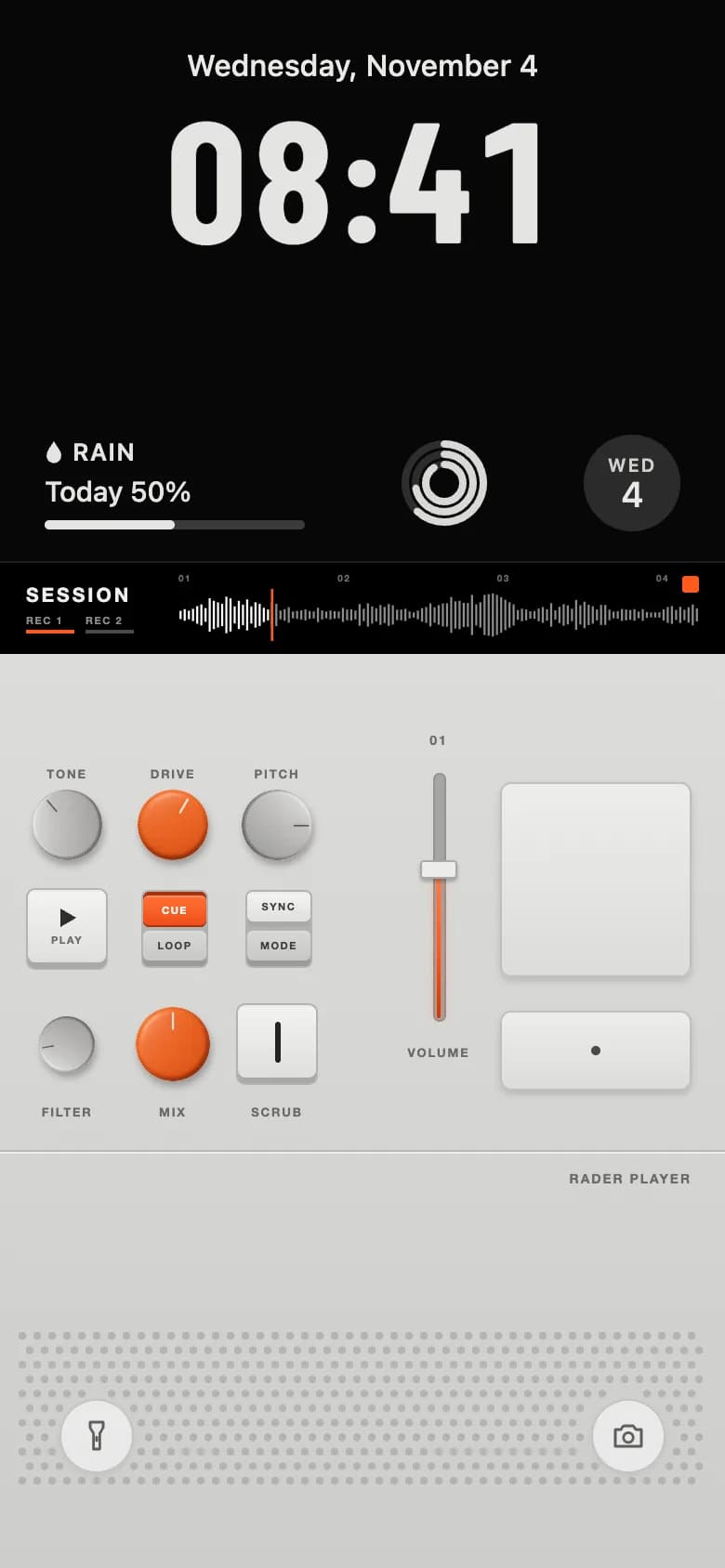
Player deck
A lock-screen clock with widgets and a session waveform above a pale deck of knobs, small keys, a volume fader and touch pads.
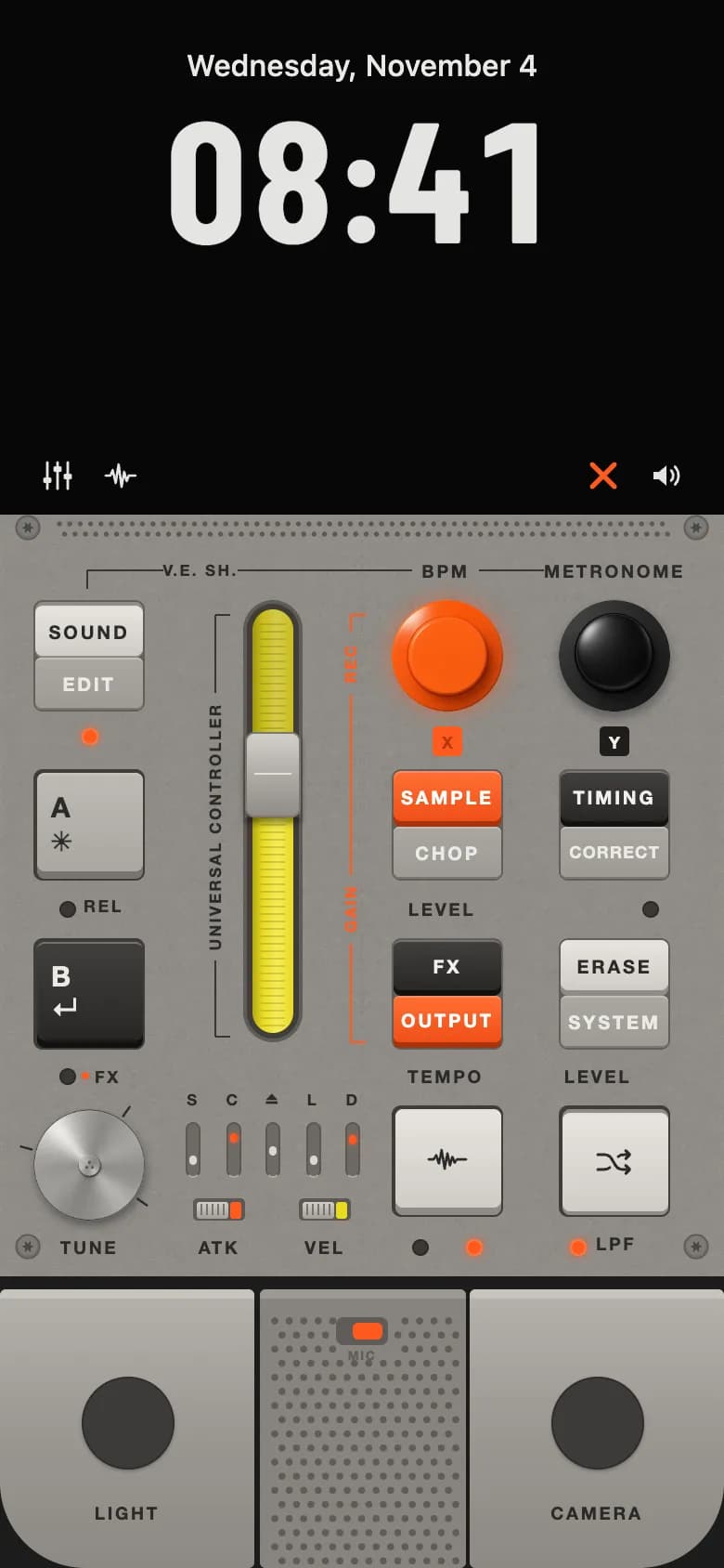
Universal controller
A textured metal panel with split keys, a ribbed yellow fader, large knobs, mini slots, a tune dial and foot pedals.
Copy the Industrial Sampler kit
Use the artifact as a design brief, the skill to generate the UI with an AI agent, or the code to run it right away.
Design artifact
The full design: tokens, screens and source
# Industrial Sampler: design artifact

Industrial Sampler is a skeuomorphic music app UI that looks like a piece of studio hardware, split across a player deck and a full controller.

- Type: Music mobile app UI
- Screens: 2
- Artboard: 390 × 844
- Target: Expo SDK 58, Expo Router, TypeScript, expo-haptics, expo-linear-gradient, react-native-svg
- Live page: https://developermill.com/app-designs/industrial-sampler-app-ui-design

## Design direction

Moulded grey hardware with engraved labels, machined knobs, latching key caps, LEDs and a tall yellow fader under a black lock screen.

- Draggable rotary knobs, faders and a tune dial
- Latching key caps with physical travel
- Animated LEDs and a live waveform
- Haptic feedback on every control

## Foundations

### Colour

| Token | Hex |
| --- | --- |
| Signal orange | `#FF5A1F` |
| Fader yellow | `#E9DA22` |
| Panel | `#8F8C87` |
| Deck | `#D5D5D3` |
| Engrave | `#2B2A28` |
| Lock black | `#070707` |

### Typography

- Typefaces: Barlow Condensed, Helvetica Neue
- Common sizes (px): 5.5, 6.5, 8.5, 9.5, 10, 15, 92

### Shape and depth

- Common corner radii (px): 3, 4, 5, 6, 20
- Shadows: `Native shadows for knobs, faders and LEDs`

## Screens

### 1. Player deck

A lock-screen clock with widgets and a session waveform above a pale deck of knobs, small keys, a volume fader and touch pads.

Preview: https://developermill.com/app-designs/industrial-sampler-app-ui-design/player.webp

### 2. Universal controller

A textured metal panel with split keys, a ribbed yellow fader, large knobs, mini slots, a tune dial and foot pedals.

Preview: https://developermill.com/app-designs/industrial-sampler-app-ui-design/controller.webp

## Design tokens in code

```ts
import { createContext, useContext } from 'react';
import { Platform, useWindowDimensions } from 'react-native';

// Demo textures are hosted by DeveloperMill. Point this at your own CDN, or swap to require().
const ASSET_BASE = 'https://developermill.com/app-designs/industrial-sampler-app-ui-design/assets';

export const asset = (name: string) => `${ASSET_BASE}/${name}`;

export const DESIGN_WIDTH = 390;

export const COLORS = {
  panel: '#8F8C87',
  well: '#615E5A',
  engrave: '#2B2A28',
  labelLight: '#ECEAE6',
  groove: '#1C1C1B',
  orange: '#FF5A1F',
  orangeHi: '#FF7A45',
  yellow: '#E9DA22',
  yellowHi: '#F6EC5A',
  yellowLo: '#B8A812',
  ledOff: '#3A3836',
  black: '#1E1D1C',
};

// Each key cap: gradient top, gradient bottom, side wall, legend colour.
export const CAPS = {
  light: ['#E6E3DE', '#CFCCC6', '#8E8B86', '#2B2A28'],
  grey: ['#BDBAB5', '#A9A6A1', '#77746F', '#2B2A28'],
  flat: ['#A9A6A1', '#9D9A95', '#7A7772', '#ECEAE6'],
  orange: ['#FF6E33', '#F04E17', '#A8330B', '#FFFFFF'],
  dark: ['#403F3D', '#282726', '#121212', '#F2F0EC'],
  paper: ['#F3F3F1', '#DFDFDD', '#A9A9A6', '#3C3C3A'],
  paperShade: ['#D6D6D3', '#C8C8C5', '#9B9B98', '#3C3C3A'],
} as const;

export type CapVariant = keyof typeof CAPS;

export const LABEL_FONT = Platform.select({
  ios: 'Helvetica Neue',
  android: 'sans-serif',
  default: "'Helvetica Neue', Helvetica, Arial, sans-serif",
});

export const ScaleContext = createContext<number | null>(null);

/** Converts artboard units to device pixels, capped so tablets keep phone proportions. */
export function useUnit() {
  const { width } = useWindowDimensions();
  const measured = useContext(ScaleContext);
  const scale = Math.min(measured ?? width, 430) / DESIGN_WIDTH;
  return (value: number) => value * scale;
}
```
SKILL.md
Save as .claude/skills/industrial-sampler-app-ui/SKILL.md
---
name: industrial-sampler-app-ui
description: Build the Industrial Sampler mobile app UI in Expo React Native. Use when asked to create a skeuomorphic app UI or a new screen in this visual style.
---

# Industrial Sampler app UI

Build this UI in an Expo SDK 58 app with Expo Router and strict TypeScript. Match the spec below rather than inventing a new look. The finished reference lives at https://developermill.com/app-designs/industrial-sampler-app-ui-design

## Visual direction

Moulded grey hardware with engraved labels, machined knobs, latching key caps, LEDs and a tall yellow fader under a black lock screen.

Keep these signature details:

- Draggable rotary knobs, faders and a tune dial
- Latching key caps with physical travel
- Animated LEDs and a live waveform
- Haptic feedback on every control

## Set up

```bash
npx expo install expo-haptics expo-linear-gradient react-native-svg @expo-google-fonts/barlow-condensed expo-font
```

## Tokens

| Token | Hex |
| --- | --- |
| Signal orange | `#FF5A1F` |
| Fader yellow | `#E9DA22` |
| Panel | `#8F8C87` |
| Deck | `#D5D5D3` |
| Engrave | `#2B2A28` |
| Lock black | `#070707` |

- Typefaces: Barlow Condensed, Helvetica Neue
- Common sizes (px): 5.5, 6.5, 8.5, 9.5, 10, 15, 92
- Common corner radii (px): 3, 4, 5, 6, 20

Define these once and reuse them. Do not add new colours.

## Screens

Build one Expo Router route per screen, in this order:

1. **Player deck**: A lock-screen clock with widgets and a session waveform above a pale deck of knobs, small keys, a volume fader and touch pads.
2. **Universal controller**: A textured metal panel with split keys, a ribbed yellow fader, large knobs, mini slots, a tune dial and foot pedals.

## Build rules

- Design on a 390 × 844 artboard, then scale to the device width so layouts match on every phone.
- Load each custom font weight by its own family name with expo-font. Do not rely on `fontWeight` with custom fonts.
- Draw icons, charts and illustrations with react-native-svg rather than image files or chart libraries.
- Use `Pressable` with an `accessibilityLabel` for every icon-only control, and keep touch targets at 44 px or larger.
- Wire navigation with `router.navigate`, and keep sample data in constants at the top of each file so it is easy to replace.
- Use expo-image for photos, with `contentFit` set explicitly.

## Done when

- Every screen above exists as a route and they link together.
- Colours, type and radii match the tokens exactly.
- `npx tsc --noEmit` and `npx expo lint` both pass.
- Layouts hold up on small and large phones.
Set up the project
npx create-expo-app@latest industrial-sampler-app --template default
cd industrial-sampler-app
rm -rf src
npx expo install expo-haptics expo-linear-gradient react-native-svg @expo-google-fonts/barlow-condensed expo-font
src/app/_layout.tsx
import { BarlowCondensed_700Bold } from '@expo-google-fonts/barlow-condensed';
import { useFonts } from 'expo-font';
import { Stack } from 'expo-router';
import { SafeAreaProvider } from 'react-native-safe-area-context';

export default function RootLayout() {
  const [fontsLoaded] = useFonts({ BarlowCondensed_700Bold });

  if (!fontsLoaded) return null;

  return (
    <SafeAreaProvider>
      <Stack screenOptions={{ headerShown: false }} />
    </SafeAreaProvider>
  );
}
src/app/index.tsx
import { useState } from 'react';
import { ScrollView, View } from 'react-native';

import ControllerScreen from '@/screens/controller';
import PlayerScreen from '@/screens/player';

const PAGES = [PlayerScreen, ControllerScreen];

export default function SamplerPager() {
  const [size, setSize] = useState({ width: 0, height: 0 });

  return (
    <View style={{ flex: 1 }} onLayout={(event) => setSize(event.nativeEvent.layout)}>
      <ScrollView
        horizontal
        pagingEnabled
        showsHorizontalScrollIndicator={false}
        style={{ flex: 1, backgroundColor: '#070707' }}>
        {PAGES.map((Page, index) => (
          <View key={index} style={size}>
            <Page />
          </View>
        ))}
      </ScrollView>
    </View>
  );
}
src/screens/controller.tsx
import { LinearGradient } from 'expo-linear-gradient';
import { StatusBar } from 'expo-status-bar';
import { Fragment, useCallback, useMemo, useState } from 'react';
import { ImageBackground, Pressable, StyleSheet, View } from 'react-native';
import { useSafeAreaInsets } from 'react-native-safe-area-context';
import Svg, { Circle, Line } from 'react-native-svg';

import {
  Badge,
  BigKey,
  CenteredLabel,
  Fader,
  Knob,
  Label,
  Led,
  MiniSlot,
  RibToggle,
  Screw,
  ShuffleIcon,
  SplitKey,
  tap,
  TuneDial,
  useAbsolute,
  VerticalLabel,
  WaveIcon,
} from '@/components/controls';
import { LockHeader, SamplerIconBar } from '@/components/lock-header';
import { ScaledScreen } from '@/components/scaled-screen';
import { asset, COLORS, DESIGN_WIDTH, useUnit } from '@/lib/tokens';

const DECK_HEIGHT = 410;
const FOOT_HEIGHT = 150;

const INITIAL_KEYS = {
  sound: true,
  edit: false,
  a: false,
  b: false,
  sample: false,
  chop: false,
  timing: false,
  correct: false,
  fx: false,
  output: false,
  erase: false,
  system: false,
  wave: false,
  shuffle: true,
  rec: true,
  metro: false,
  atk: true,
  vel: false,
  light: false,
  camera: false,
  mic: true,
};

// Engraved lines on the panel, in artboard units.
const ENGRAVED = [
  [47, 30, 47, 40],
  [47, 30, 88, 30],
  [128, 30, 222, 30],
  [258, 30, 293, 30],
  [124, 54, 116, 54],
  [116, 54, 116, 96],
  [116, 240, 116, 281],
  [116, 281, 124, 281],
];
const ORANGE_TRACES = [
  [197, 54, 189, 54],
  [189, 54, 189, 63],
  [189, 97, 189, 194],
  [189, 231, 189, 284],
  [189, 284, 197, 284],
];
const SLOTS = ['S', 'C', '⏏', 'L', 'D'];

export default function ControllerScreen() {
  return (
    <ScaledScreen>
      <Controller />
    </ScaledScreen>
  );
}

function Controller() {
  const u = useUnit();
  const abs = useAbsolute();
  const insets = useSafeAreaInsets();
  const [keys, setKeys] = useState(INITIAL_KEYS);
  const toggle = useCallback(
    (key: keyof typeof INITIAL_KEYS) => () => setKeys((all) => ({ ...all, [key]: !all[key] })),
    [],
  );
  const [fader, setFader] = useState(0.36);
  const [slots, setSlots] = useState([0.8, 0.15, 0.55, 0.8, 0.2]);
  const stepSlot = (index: number) => () =>
    setSlots((all) => all.map((level, i) => (i === index ? (level + 0.35) % 1 : level)));

  const ventHoles = useMemo(() => {
    const holes: { cx: number; cy: number }[] = [];
    for (let row = 0; row < 2; row++) {
      for (let x = 32; x <= 358; x += 5.6) holes.push({ cx: x + (row ? 2.8 : 0), cy: 5 + 5.5 * row });
    }
    return holes;
  }, []);

  return (
    <ImageBackground
      source={{ uri: asset('panel-texture.jpg') }}
      resizeMode="repeat"
      style={styles.root}>
      <StatusBar style="light" />
      <LockHeader>
        <SamplerIconBar rec={keys.rec} mute={!keys.mic} />
      </LockHeader>
      <View style={{ width: u(DESIGN_WIDTH), height: u(DECK_HEIGHT), alignSelf: 'center' }}>
        <Svg
          width={u(DESIGN_WIDTH)}
          height={u(DECK_HEIGHT)}
          viewBox={`0 0 ${DESIGN_WIDTH} ${DECK_HEIGHT}`}
          style={StyleSheet.absoluteFill}
          pointerEvents="none">
          {ventHoles.map((hole, index) => (
            <Circle key={index} cx={hole.cx} cy={hole.cy} r={1.35} fill="#5B5854" />
          ))}
          {ENGRAVED.map(([x1, y1, x2, y2], index) => (
            <Line key={index} x1={x1} y1={y1} x2={x2} y2={y2} stroke={COLORS.engrave} strokeWidth={0.9} />
          ))}
          {ORANGE_TRACES.map(([x1, y1, x2, y2], index) => (
            <Line key={index} x1={x1} y1={y1} x2={x2} y2={y2} stroke={COLORS.orange} strokeWidth={1.1} />
          ))}
        </Svg>
        <Screw x={15} y={7} />
        <Screw x={375} y={7} />
        <Screw x={15} y={394} />
        <Screw x={375} y={394} />
        <CenteredLabel cx={108} cy={30} size={8.5}>
          V.E. SH.
        </CenteredLabel>
        <CenteredLabel cx={240} cy={30}>
          BPM
        </CenteredLabel>
        <CenteredLabel cx={331} cy={30}>
          METRONOME
        </CenteredLabel>
        <SplitKey
          x={18}
          y={46}
          top="SOUND"
          bottom="EDIT"
          topVariant="light"
          topOn={keys.sound}
          bottomOn={keys.edit}
          onTop={toggle('sound')}
          onBottom={toggle('edit')}
        />
        <Led x={48} y={119} on={keys.sound} />
        <BigKey x={18} y={137} variant="grey" on={keys.a} onPress={toggle('a')}>
          <View style={[styles.keyGlyphs, { padding: u(8) }]}>
            <Label size={15} bold style={{ letterSpacing: 0 }}>
              A
            </Label>
            <Label size={15} style={{ letterSpacing: 0 }}>
              {'✳'}
            </Label>
          </View>
        </BigKey>
        <Led x={36} y={212} on={keys.a} />
        <View style={abs(45, 205, 30, 14)}>
          <Label size={9}>REL</Label>
        </View>
        <BigKey x={18} y={228} variant="dark" on={keys.b} onPress={toggle('b')}>
          <View style={[styles.keyGlyphs, { padding: u(8) }]}>
            <Label size={15} bold color={COLORS.labelLight} style={{ letterSpacing: 0 }}>
              B
            </Label>
            <Label size={15} bold color={COLORS.labelLight} style={{ letterSpacing: 0 }}>
              {'↵'}
            </Label>
          </View>
        </BigKey>
        <Led x={36} y={302} on={keys.b} />
        <View
          pointerEvents="none"
          style={[abs(44, 295, 34, 14), { flexDirection: 'row', alignItems: 'center' }]}>
          <View
            style={{
              width: u(4),
              height: u(4),
              borderRadius: u(2),
              backgroundColor: COLORS.orange,
              marginRight: u(3),
            }}
          />
          <Label size={9}>FX</Label>
        </View>
        <TuneDial cx={48} cy={350} r={30} source={{ uri: asset('tune-dial.png') }} />
        <CenteredLabel cx={48} cy={394}>
          TUNE
        </CenteredLabel>
        <VerticalLabel cx={116} cy={168} len={150} size={8.5}>
          UNIVERSAL CONTROLLER
        </VerticalLabel>
        <Fader x={131} y={46} w={32} h={238} value={fader} onChange={setFader} />
        {SLOTS.map((label, index) => (
          <Fragment key={label}>
            <CenteredLabel cx={104 + 21.5 * index} cy={315} w={18} size={8.5}>
              {label}
            </CenteredLabel>
            <MiniSlot cx={104 + 21.5 * index} y={327} level={slots[index]} onPress={stepSlot(index)} />
          </Fragment>
        ))}
        <RibToggle x={104} y={368} on={keys.atk} accent={COLORS.orange} onPress={toggle('atk')} />
        <RibToggle x={161} y={368} on={!keys.vel} accent={COLORS.yellow} onPress={toggle('vel')} />
        <CenteredLabel cx={118} cy={394}>
          ATK
        </CenteredLabel>
        <CenteredLabel cx={175} cy={394}>
          VEL
        </CenteredLabel>
        <VerticalLabel cx={189} cy={80} len={34} size={8.5} color={COLORS.orange}>
          REC
        </VerticalLabel>
        <VerticalLabel cx={189} cy={212} len={40} size={8.5} color={COLORS.orange}>
          GAIN
        </VerticalLabel>
        <Knob x={211} y={46} source={{ uri: asset('knob-orange.png') }} on={keys.rec} onPress={toggle('rec')} />
        <Badge cx={241} cy={122} letter="X" bg={COLORS.orange} fg="#B8380C" />
        <Knob x={301} y={46} source={{ uri: asset('knob-black.png') }} on={false} onPress={toggle('metro')} />
        <Badge cx={331} cy={122} letter="Y" bg={COLORS.black} fg="#F2F0EC" />
        <SplitKey
          x={211}
          y={137}
          top="SAMPLE"
          bottom="CHOP"
          topVariant="orange"
          topOn={keys.sample}
          bottomOn={keys.chop}
          onTop={toggle('sample')}
          onBottom={toggle('chop')}
        />
        <SplitKey
          x={301}
          y={137}
          top="TIMING"
          bottom="CORRECT"
          topVariant="dark"
          topOn={keys.timing}
          bottomOn={keys.correct}
          onTop={toggle('timing')}
          onBottom={toggle('correct')}
        />
        <CenteredLabel cx={238} cy={212}>
          LEVEL
        </CenteredLabel>
        <Led x={350} y={212} on={keys.timing} />
        <SplitKey
          x={211}
          y={228}
          top="FX"
          bottom="OUTPUT"
          topVariant="dark"
          bottomVariant="orange"
          topOn={keys.fx}
          bottomOn={keys.output}
          onTop={toggle('fx')}
          onBottom={toggle('output')}
        />
        <SplitKey
          x={301}
          y={228}
          top="ERASE"
          bottom="SYSTEM"
          topVariant="light"
          topOn={keys.erase}
          bottomOn={keys.system}
          onTop={toggle('erase')}
          onBottom={toggle('system')}
        />
        <CenteredLabel cx={240} cy={302}>
          TEMPO
        </CenteredLabel>
        <CenteredLabel cx={322} cy={302}>
          LEVEL
        </CenteredLabel>
        <BigKey x={211} y={318} variant="light" on={keys.wave} onPress={toggle('wave')}>
          <WaveIcon />
        </BigKey>
        <BigKey x={301} y={318} variant="light" on={keys.shuffle} onPress={toggle('shuffle')}>
          <ShuffleIcon />
        </BigKey>
        <Led x={226} y={394} on={keys.metro} />
        <Led x={255} y={394} on={keys.rec} blink />
        <Led x={311} y={394} on={keys.shuffle} />
        <View pointerEvents="none" style={abs(321, 387, 30, 14)}>
          <Label>LPF</Label>
        </View>
      </View>
      <View style={[styles.groove, { paddingTop: u(7), paddingBottom: insets.bottom }]}>
        <View
          style={{
            width: u(DESIGN_WIDTH),
            height: u(FOOT_HEIGHT) + insets.bottom,
            flexDirection: 'row',
            alignSelf: 'center',
            gap: u(2.5),
          }}>
          <FootPedal side="left" label="LIGHT" on={keys.light} onPress={toggle('light')} />
          <MicGrille on={keys.mic} onPress={toggle('mic')} />
          <FootPedal side="right" label="CAMERA" on={keys.camera} onPress={toggle('camera')} />
        </View>
      </View>
    </ImageBackground>
  );
}

type FootPedalProps = {
  side: 'left' | 'right';
  label: string;
  on: boolean;
  onPress: () => void;
};

function FootPedal({ side, label, on, onPress }: FootPedalProps) {
  const u = useUnit();
  const [held, setHeld] = useState(false);
  const corner = u(46);

  return (
    <Pressable
      accessibilityRole="button"
      accessibilityLabel={label}
      onPressIn={() => {
        setHeld(true);
        tap(true);
      }}
      onPressOut={() => setHeld(false)}
      onPress={onPress}
      style={{ width: u(137), flexGrow: 0 }}>
      <LinearGradient
        colors={held ? ['#9C9994', '#8A8782'] : ['#B3B0AB', '#9A9792', '#8C8984']}
        style={{
          flex: 1,
          borderTopLeftRadius: u(3),
          borderTopRightRadius: u(3),
          borderBottomLeftRadius: side === 'left' ? corner : u(3),
          borderBottomRightRadius: side === 'right' ? corner : u(3),
          borderTopWidth: u(5),
          borderTopColor: '#C6C3BE',
          alignItems: 'center',
          paddingTop: u(42),
        }}>
        <View
          style={{
            width: u(50),
            height: u(50),
            borderRadius: u(25),
            backgroundColor: on ? '#4A4846' : '#3C3B39',
            borderWidth: u(on ? 2 : 1),
            borderColor: on ? COLORS.orange : '#2E2D2B',
            shadowColor: on ? COLORS.orange : '#000',
            shadowOpacity: on ? 0.8 : 0.3,
            shadowRadius: u(on ? 10 : 2),
            shadowOffset: { width: 0, height: u(on ? 0 : 1) },
          }}
        />
        <Label style={{ marginTop: u(18) }}>{label}</Label>
      </LinearGradient>
    </Pressable>
  );
}

function MicGrille({ on, onPress }: { on: boolean; onPress: () => void }) {
  const u = useUnit();
  const holes = useMemo(() => {
    const dots: { cx: number; cy: number }[] = [];
    for (let row = 0; row < 18; row++) {
      for (let col = 0; col < 13; col++) {
        const cx = 8 + 7.8 * col + (row % 2 ? 3.9 : 0);
        const cy = 12 + 7.6 * row;
        if (cx < 106 && !(cy < 34 && cx > 40 && cx < 72)) dots.push({ cx, cy });
      }
    }
    return dots;
  }, []);

  return (
    <View
      style={{
        width: u(111),
        backgroundColor: '#86837E',
        borderTopWidth: u(5),
        borderTopColor: '#9C9994',
        borderRadius: u(3),
        overflow: 'hidden',
      }}>
      <Svg
        width={u(111)}
        height={u(FOOT_HEIGHT)}
        viewBox={`0 0 111 ${FOOT_HEIGHT}`}
        style={StyleSheet.absoluteFill}>
        {holes.map((hole, index) => (
          <Circle key={index} cx={hole.cx} cy={hole.cy} r={1.9} fill="#5E5B57" />
        ))}
      </Svg>
      <Pressable
        accessibilityRole="switch"
        accessibilityLabel="Microphone"
        accessibilityState={{ checked: on }}
        onPress={() => {
          tap();
          onPress();
        }}
        hitSlop={u(10)}
        style={{ alignSelf: 'center', marginTop: u(10), alignItems: 'center' }}>
        <View
          style={{
            width: u(28),
            height: u(15),
            borderRadius: u(4),
            backgroundColor: '#5E5B57',
            padding: u(3),
            alignItems: on ? 'flex-end' : 'flex-start',
          }}>
          <View
            style={{
              width: u(16),
              height: u(9),
              borderRadius: u(3),
              backgroundColor: on ? COLORS.orange : '#BDBAB5',
            }}
          />
        </View>
        <Label size={6.5} color="#5E5B57" style={{ marginTop: u(2) }}>
          MIC
        </Label>
      </Pressable>
    </View>
  );
}

const styles = StyleSheet.create({
  root: { flex: 1, backgroundColor: COLORS.panel },
  keyGlyphs: { flex: 1, alignSelf: 'stretch', justifyContent: 'space-between' },
  groove: { backgroundColor: COLORS.groove },
});
src/screens/player.tsx
import { LinearGradient } from 'expo-linear-gradient';
import { StatusBar } from 'expo-status-bar';
import { useCallback, useEffect, useMemo, useState, type ReactNode } from 'react';
import { Image, Pressable, StyleSheet, View, type ImageSourcePropType } from 'react-native';
import Svg, { Circle, Path, Rect } from 'react-native-svg';

import { Cap, CenteredLabel, Label, tap, useAbsolute, useDrag } from '@/components/controls';
import { LockHeader, PlayerWidgets, SessionStrip } from '@/components/lock-header';
import { ScaledScreen } from '@/components/scaled-screen';
import { asset, COLORS, DESIGN_WIDTH, useUnit, type CapVariant } from '@/lib/tokens';

const DECK_HEIGHT = 492;
const BODY = '#D5D5D3';
const KNOB_COLUMNS = [36, 93, 149];
const SILVER = { uri: asset('knob-silver.png') };
const COPPER = { uri: asset('knob-copper.png') };

export default function PlayerScreen() {
  return (
    <ScaledScreen>
      <Player />
    </ScaledScreen>
  );
}

function Player() {
  const u = useUnit();
  const abs = useAbsolute();
  const [playing, setPlaying] = useState(false);
  const [progress, setProgress] = useState(0.18);
  const [volume, setVolume] = useState(0.62);
  const [knobs, setKnobs] = useState([-40, 30, 90, -100, 0]);
  const [keys, setKeys] = useState({
    cue: true,
    loop: false,
    sync: false,
    mode: false,
    scrub: false,
    armed: false,
    torch: false,
    camera: false,
  });
  const toggle = useCallback(
    (key: keyof typeof keys) => () => setKeys((all) => ({ ...all, [key]: !all[key] })),
    [],
  );
  const setKnob = (index: number) => (degrees: number) =>
    setKnobs((all) => all.map((value, i) => (i === index ? degrees : value)));

  useEffect(() => {
    if (!playing) return;
    const timer = setInterval(() => setProgress((value) => (value + 0.0025) % 1), 50);
    return () => clearInterval(timer);
  }, [playing]);

  const speakerHoles = useMemo(() => {
    const holes: { cx: number; cy: number }[] = [];
    for (let row = 0; row < 11; row++) {
      for (let col = 0; col < 46; col++) {
        const cx = 12 + 8 * col + (row % 2 ? 4 : 0);
        const cy = 6 + 7.8 * row;
        const nearButton = Math.hypot(cx - 52, cy - 60) < 24 || Math.hypot(cx - 338, cy - 60) < 24;
        if (cx < 380 && !nearButton) holes.push({ cx, cy });
      }
    }
    return holes;
  }, []);

  return (
    <View style={{ flex: 1, backgroundColor: BODY }}>
      <StatusBar style="light" />
      <LockHeader>
        <PlayerWidgets ring={volume} />
        <SessionStrip progress={progress} playing={playing} />
      </LockHeader>
      <LinearGradient colors={['#DCDCDA', BODY, '#CDCDCB']} style={{ height: u(DECK_HEIGHT) }}>
        <View style={{ width: u(DESIGN_WIDTH), height: u(DECK_HEIGHT), alignSelf: 'center' }}>
          {['TONE', 'DRIVE', 'PITCH'].map((label, index) => (
            <CenteredLabel key={label} cx={KNOB_COLUMNS[index]} cy={64} size={6.5} color="#6A6A68">
              {label}
            </CenteredLabel>
          ))}
          <RotaryKnob cx={36} cy={92} d={38} source={SILVER} degrees={knobs[0]} onChange={setKnob(0)} />
          <RotaryKnob cx={93} cy={92} d={38} source={COPPER} degrees={knobs[1]} onChange={setKnob(1)} />
          <RotaryKnob cx={149} cy={92} d={38} source={SILVER} degrees={knobs[2]} onChange={setKnob(2)} />
          <View style={[abs(14, 126, 44, 44), styles.well, { borderRadius: u(5), padding: u(1) }]}>
            <Cap
              variant="paper"
              w={42}
              h={42}
              pressed={playing}
              onPress={() => setPlaying((value) => !value)}>
              <Svg width={u(11)} height={u(12)} viewBox="0 0 11 12">
                {playing ? (
                  <>
                    <Rect x={1} y={1} width={3.2} height={10} fill="#2E2E2D" />
                    <Rect x={6.8} y={1} width={3.2} height={10} fill="#2E2E2D" />
                  </>
                ) : (
                  <Path d="M1.5 1l8.5 5-8.5 5z" fill="#2E2E2D" />
                )}
              </Svg>
              <Label size={5.5} color="#6A6A68" style={{ marginTop: u(3) }}>
                {playing ? 'PAUSE' : 'PLAY'}
              </Label>
            </Cap>
          </View>
          <MiniSplitKey
            x={76}
            y={127}
            top="CUE"
            bottom="LOOP"
            topVariant="orange"
            topOn={keys.cue}
            bottomOn={keys.loop}
            onTop={toggle('cue')}
            onBottom={toggle('loop')}
          />
          <MiniSplitKey
            x={132}
            y={127}
            top="SYNC"
            bottom="MODE"
            topVariant="paper"
            topOn={keys.sync}
            bottomOn={keys.mode}
            onTop={toggle('sync')}
            onBottom={toggle('mode')}
          />
          <RotaryKnob cx={36} cy={210} d={30} source={SILVER} degrees={knobs[3]} onChange={setKnob(3)} />
          <RotaryKnob cx={93} cy={210} d={40} source={COPPER} degrees={knobs[4]} onChange={setKnob(4)} />
          <View style={[abs(127, 188, 44, 44), styles.well, { borderRadius: u(5), padding: u(1) }]}>
            <Cap variant="paper" w={42} h={42} pressed={keys.scrub} onPress={toggle('scrub')}>
              <View
                style={{
                  width: u(3),
                  height: u(22),
                  borderRadius: u(1.5),
                  backgroundColor: keys.scrub ? COLORS.orange : '#232322',
                }}
              />
            </Cap>
          </View>
          {['FILTER', 'MIX', 'SCRUB'].map((label, index) => (
            <CenteredLabel key={label} cx={KNOB_COLUMNS[index]} cy={246} size={6.5} color="#6A6A68">
              {label}
            </CenteredLabel>
          ))}
          <CenteredLabel cx={236} cy={46} size={7} color="#6A6A68">
            01
          </CenteredLabel>
          <VolumeFader cx={236} y={64} h={134} value={volume} onChange={setVolume} />
          <CenteredLabel cx={236} cy={214} size={6.5} color="#6A6A68">
            VOLUME
          </CenteredLabel>
          <TouchPad x={269} y={69} w={103} h={105} />
          <TouchPad x={269} y={192} w={103} h={43} onPress={toggle('armed')}>
            <View
              style={{
                width: u(5),
                height: u(5),
                borderRadius: u(2.5),
                backgroundColor: keys.armed ? COLORS.orange : '#4A4A48',
                shadowColor: COLORS.orange,
                shadowOpacity: keys.armed ? 0.9 : 0,
                shadowRadius: u(4),
                shadowOffset: { width: 0, height: 0 },
              }}
            />
          </TouchPad>
          <View style={[abs(0, 267, DESIGN_WIDTH, 1), { backgroundColor: '#B9B9B6' }]} />
          <View style={[abs(0, 268, DESIGN_WIDTH, 1), { backgroundColor: '#ECECEA' }]} />
          <View style={[abs(250, 278, 122, 14), { alignItems: 'flex-end' }]}>
            <Label size={7} color="#6A6A68">
              RADER PLAYER
            </Label>
          </View>
          <View style={abs(0, 361, DESIGN_WIDTH, 100)}>
            <Svg
              width={u(DESIGN_WIDTH)}
              height={u(100)}
              viewBox={`0 0 ${DESIGN_WIDTH} 100`}
              style={StyleSheet.absoluteFill}>
              {speakerHoles.map((hole, index) => (
                <Circle key={index} cx={hole.cx} cy={hole.cy} r={2.1} fill="#B3B3B0" />
              ))}
            </Svg>
            <RoundAction cx={52} cy={60} on={keys.torch} onPress={toggle('torch')} kind="torch" />
            <RoundAction cx={338} cy={60} on={keys.camera} onPress={toggle('camera')} kind="camera" />
          </View>
        </View>
      </LinearGradient>
    </View>
  );
}

type RotaryKnobProps = {
  cx: number;
  cy: number;
  d: number;
  source: ImageSourcePropType;
  degrees: number;
  onChange: (degrees: number) => void;
};

function RotaryKnob({ cx, cy, d, source, degrees, onChange }: RotaryKnobProps) {
  const abs = useAbsolute();
  const u = useUnit();
  const dragHandlers = useDrag(degrees, (origin, gesture) =>
    onChange(Math.max(-135, Math.min(135, origin + 1.4 * (gesture.dx - gesture.dy)))),
  );

  return (
    <View
      {...dragHandlers}
      style={[
        abs(cx - d / 2, cy - d / 2, d, d),
        {
          borderRadius: u(d / 2),
          shadowColor: '#000',
          shadowOpacity: 0.28,
          shadowRadius: u(4),
          shadowOffset: { width: u(1), height: u(3) },
          elevation: 4,
        },
      ]}>
      <Image
        source={source}
        style={{
          width: '100%',
          height: '100%',
          borderRadius: u(d / 2),
          transform: [{ rotate: `${degrees}deg` }],
        }}
      />
    </View>
  );
}

type MiniSplitKeyProps = {
  x: number;
  y: number;
  top: string;
  bottom: string;
  topVariant: CapVariant;
  topOn: boolean;
  bottomOn: boolean;
  onTop: () => void;
  onBottom: () => void;
};

function MiniSplitKey({ x, y, top, bottom, topVariant, topOn, bottomOn, onTop, onBottom }: MiniSplitKeyProps) {
  const abs = useAbsolute();
  const u = useUnit();

  return (
    <View style={[abs(x, y, 36, 42), styles.well, { borderRadius: u(4), padding: u(1), gap: u(2) }]}>
      <Cap variant={topVariant} w={34} h={19} radius={3} pressed={topOn} onPress={onTop}>
        <Label size={5.5} bold color={topVariant === 'orange' ? '#FFFFFF' : '#3C3C3A'}>
          {top}
        </Label>
      </Cap>
      <Cap variant="paperShade" w={34} h={19} radius={3} pressed={bottomOn} onPress={onBottom}>
        <Label size={5.5} color="#3C3C3A">
          {bottom}
        </Label>
      </Cap>
    </View>
  );
}

type VolumeFaderProps = {
  cx: number;
  y: number;
  h: number;
  value: number;
  onChange: (value: number) => void;
};

function VolumeFader({ cx, y, h, value, onChange }: VolumeFaderProps) {
  const abs = useAbsolute();
  const u = useUnit();
  const unit = u(1);
  const dragHandlers = useDrag(value, (origin, gesture) =>
    onChange(Math.max(0, Math.min(1, origin - gesture.dy / ((h - 10) * unit)))),
  );

  const fill = (h - 10) * value;

  return (
    <View {...dragHandlers} style={[abs(cx - 14, y, 28, h), { alignItems: 'center' }]}>
      <View
        style={{
          width: u(7),
          height: u(h),
          borderRadius: u(3.5),
          backgroundColor: '#A6A6A3',
          borderWidth: u(0.8),
          borderColor: '#939390',
          padding: u(1.5),
          justifyContent: 'flex-end',
        }}>
        <LinearGradient
          colors={[COLORS.orangeHi, COLORS.orange, '#C93A0C']}
          style={{
            height: u(fill),
            borderRadius: u(2),
            shadowColor: COLORS.orange,
            shadowOpacity: 0.8,
            shadowRadius: u(5),
            shadowOffset: { width: 0, height: 0 },
          }}
        />
      </View>
      <View
        style={{
          position: 'absolute',
          top: u(h - 10 - fill),
          width: u(20),
          height: u(10),
          borderRadius: u(2),
          backgroundColor: '#ECECEA',
          borderWidth: u(0.8),
          borderColor: '#A9A9A6',
          shadowColor: '#000',
          shadowOpacity: 0.25,
          shadowRadius: u(2),
          shadowOffset: { width: 0, height: u(1.5) },
          elevation: 3,
        }}
      />
    </View>
  );
}

type TouchPadProps = {
  x: number;
  y: number;
  w: number;
  h: number;
  onPress?: () => void;
  children?: ReactNode;
};

function TouchPad({ x, y, w, h, onPress, children }: TouchPadProps) {
  const abs = useAbsolute();
  const u = useUnit();
  const [held, setHeld] = useState(false);

  return (
    <Pressable
      accessibilityRole="button"
      onPressIn={() => {
        setHeld(true);
        tap(true);
      }}
      onPressOut={() => setHeld(false)}
      onPress={onPress}
      style={abs(x, y, w, h)}>
      <LinearGradient
        colors={held ? ['#D2D2CF', '#DCDCDA'] : ['#EDEDEB', '#DCDCDA']}
        style={{
          flex: 1,
          borderRadius: u(6),
          borderWidth: u(1),
          borderColor: held ? '#AFAFAC' : '#BFBFBC',
          alignItems: 'center',
          justifyContent: 'center',
          shadowColor: '#000',
          shadowOpacity: held ? 0.05 : 0.14,
          shadowRadius: u(held ? 1 : 4),
          shadowOffset: { width: 0, height: u(held ? 0 : 2) },
        }}>
        {children}
      </LinearGradient>
    </Pressable>
  );
}

type RoundActionProps = {
  cx: number;
  cy: number;
  on: boolean;
  onPress: () => void;
  kind: 'torch' | 'camera';
};

function RoundAction({ cx, cy, on, onPress, kind }: RoundActionProps) {
  const abs = useAbsolute();
  const u = useUnit();
  const stroke = on ? '#FFFFFF' : '#5E5E5C';

  return (
    <Pressable
      accessibilityRole="button"
      accessibilityLabel={kind === 'torch' ? 'Torch' : 'Camera'}
      onPress={() => {
        tap(true);
        onPress();
      }}
      style={[
        abs(cx - 20, cy - 20, 40, 40),
        {
          borderRadius: u(20),
          alignItems: 'center',
          justifyContent: 'center',
          backgroundColor: on ? COLORS.orange : 'rgba(255,255,255,0.55)',
          borderWidth: u(1),
          borderColor: on ? COLORS.orangeHi : '#C4C4C1',
          shadowColor: on ? COLORS.orange : '#000',
          shadowOpacity: on ? 0.6 : 0.08,
          shadowRadius: u(on ? 10 : 3),
          shadowOffset: { width: 0, height: u(on ? 0 : 1) },
        },
      ]}>
      <Svg width={u(18)} height={u(18)} viewBox="0 0 18 18">
        {kind === 'torch' ? (
          <Path
            d="M5.5 1.5h7v3l-1.8 3v8.5H7.3V7.5L5.5 4.5zM9 9.5v2"
            fill="none"
            stroke={stroke}
            strokeWidth={1.4}
            strokeLinejoin="round"
            strokeLinecap="round"
          />
        ) : (
          <>
            <Path
              d="M2 5.5h3l1.3-2h5.4l1.3 2h3v9H2z"
              fill="none"
              stroke={stroke}
              strokeWidth={1.4}
              strokeLinejoin="round"
            />
            <Circle cx={9} cy={9.8} r={2.6} fill="none" stroke={stroke} strokeWidth={1.4} />
          </>
        )}
      </Svg>
    </Pressable>
  );
}

const styles = StyleSheet.create({
  well: { backgroundColor: '#B4B4B1' },
});
src/components/controls.tsx
import * as Haptics from 'expo-haptics';
import { LinearGradient } from 'expo-linear-gradient';
import { useEffect, useMemo, useRef, useState, type ReactNode } from 'react';
import {
  Animated,
  Image,
  PanResponder,
  Platform,
  Pressable,
  Text,
  View,
  type ImageSourcePropType,
  type PanResponderGestureState,
  type StyleProp,
  type TextStyle,
  type ViewStyle,
} from 'react-native';
import Svg, { Circle, Line, Path } from 'react-native-svg';

import { CAPS, COLORS, LABEL_FONT, useUnit, type CapVariant } from '@/lib/tokens';

export const tap = (heavy = false) => {
  if (Platform.OS === 'web') return;
  Haptics.impactAsync(heavy ? Haptics.ImpactFeedbackStyle.Medium : Haptics.ImpactFeedbackStyle.Light);
};

/** Drag handlers for a control: `onMove` receives the value captured when the drag began. */
export function useDrag<T>(value: T, onMove: (origin: T, gesture: PanResponderGestureState) => void) {
  const drag = useRef({ value, onMove, origin: value });
  useEffect(() => {
    drag.current.value = value;
    drag.current.onMove = onMove;
  });

  /* eslint-disable react-hooks/refs -- PanResponder only reads the ref from gesture events. */
  return useMemo(
    () =>
      PanResponder.create({
        onStartShouldSetPanResponder: () => true,
        onMoveShouldSetPanResponder: () => true,
        onPanResponderGrant: () => {
          drag.current.origin = drag.current.value;
          tap();
        },
        onPanResponderMove: (_, gesture) => drag.current.onMove(drag.current.origin, gesture),
      }).panHandlers,
    [],
  );
  /* eslint-enable react-hooks/refs */
}

/** Absolute position in artboard units. */
export function useAbsolute() {
  const u = useUnit();
  return (x: number, y: number, width?: number, height?: number): ViewStyle => ({
    position: 'absolute',
    left: u(x),
    top: u(y),
    ...(width != null ? { width: u(width) } : null),
    ...(height != null ? { height: u(height) } : null),
  });
}

type LabelProps = {
  children: ReactNode;
  size?: number;
  color?: string;
  style?: StyleProp<TextStyle>;
  bold?: boolean;
};

export function Label({ children, size = 9.5, color = COLORS.engrave, style, bold }: LabelProps) {
  const u = useUnit();

  return (
    <Text
      allowFontScaling={false}
      style={[
        {
          fontFamily: LABEL_FONT,
          fontSize: u(size),
          letterSpacing: u(0.14 * size),
          fontWeight: bold ? '700' : '600',
          color,
          includeFontPadding: false,
        },
        style,
      ]}>
      {children}
    </Text>
  );
}

export function CenteredLabel({ cx, cy, w = 80, ...label }: LabelProps & { cx: number; cy: number; w?: number }) {
  const abs = useAbsolute();

  return (
    <View
      pointerEvents="none"
      style={[abs(cx - w / 2, cy - 7, w, 14), { alignItems: 'center', justifyContent: 'center' }]}>
      <Label {...label} />
    </View>
  );
}

export function VerticalLabel({ cx, cy, len, ...label }: LabelProps & { cx: number; cy: number; len: number }) {
  const abs = useAbsolute();

  return (
    <View
      pointerEvents="none"
      style={[
        abs(cx - len / 2, cy - 7, len, 14),
        { alignItems: 'center', justifyContent: 'center', transform: [{ rotate: '-90deg' }] },
      ]}>
      <Label {...label} />
    </View>
  );
}

export function Led({ x, y, on, blink }: { x: number; y: number; on: boolean; blink?: boolean }) {
  const abs = useAbsolute();
  const u = useUnit();
  const [opacity] = useState(() => new Animated.Value(1));

  useEffect(() => {
    if (!on || !blink) {
      opacity.setValue(1);
      return;
    }
    const pulse = Animated.loop(
      Animated.sequence([
        Animated.timing(opacity, { toValue: 0.25, duration: 450, useNativeDriver: true }),
        Animated.timing(opacity, { toValue: 1, duration: 450, useNativeDriver: true }),
      ]),
    );
    pulse.start();
    return () => pulse.stop();
  }, [on, blink, opacity]);

  return (
    <Animated.View
      pointerEvents="none"
      style={[
        abs(x - 4.5, y - 4.5, 9, 9),
        {
          borderRadius: u(4.5),
          backgroundColor: on ? COLORS.orange : COLORS.ledOff,
          borderWidth: u(1),
          borderColor: on ? COLORS.orangeHi : '#2A2927',
          opacity,
          shadowColor: COLORS.orange,
          shadowOpacity: on ? 0.9 : 0,
          shadowRadius: u(5),
          shadowOffset: { width: 0, height: 0 },
          elevation: on ? 4 : 0,
        },
      ]}
    />
  );
}

export function Screw({ x, y }: { x: number; y: number }) {
  const abs = useAbsolute();
  const u = useUnit();
  const star = useMemo(() => {
    const points = Array.from({ length: 12 }, (_, i) => {
      const radius = i % 2 ? 1.6 : 3.4;
      const angle = (Math.PI / 6) * i;
      return `${7 + radius * Math.cos(angle)},${7 + radius * Math.sin(angle)}`;
    });
    return `M${points.join('L')}Z`;
  }, []);

  return (
    <View pointerEvents="none" style={abs(x - 7, y - 7, 14, 14)}>
      <Svg width={u(14)} height={u(14)} viewBox="0 0 14 14">
        <Circle cx={7} cy={7} r={6.4} fill="#6F6C67" stroke="#5B5955" strokeWidth={0.8} />
        <Circle cx={7} cy={6.6} r={5.2} fill="#7E7B76" />
        <Path d={star} fill="#4A4845" />
      </Svg>
    </View>
  );
}

type CapProps = {
  variant: CapVariant;
  w: number;
  h: number;
  pressed?: boolean;
  onPress?: () => void;
  children: ReactNode;
  radius?: number;
  style?: StyleProp<ViewStyle>;
};

/** A physical key: the face slides down over its side wall when pressed or latched. */
export function Cap({ variant, w, h, pressed, onPress, children, radius = 4, style }: CapProps) {
  const u = useUnit();
  const [top, bottom, wall] = CAPS[variant];
  const [held, setHeld] = useState(false);
  const travel = variant === 'flat' ? 1.5 : 3.5;
  const offset = held || pressed ? 0.6 * travel : 0;

  return (
    <Pressable
      accessibilityRole="button"
      onPressIn={() => {
        setHeld(true);
        tap();
      }}
      onPressOut={() => setHeld(false)}
      onPress={onPress}
      style={[{ width: u(w), height: u(h) }, style]}>
      <View style={{ flex: 1, borderRadius: u(radius), backgroundColor: wall }}>
        <LinearGradient
          colors={[top, bottom]}
          start={{ x: 0, y: 0 }}
          end={{ x: 0, y: 1 }}
          style={{
            position: 'absolute',
            left: 0,
            right: 0,
            top: u(offset),
            height: u(h - travel),
            borderRadius: u(radius),
            borderTopWidth: u(0.8),
            borderTopColor: 'rgba(255,255,255,0.35)',
            alignItems: 'center',
            justifyContent: 'center',
          }}>
          {children}
        </LinearGradient>
      </View>
    </Pressable>
  );
}

type SplitKeyProps = {
  x: number;
  y: number;
  top: string;
  bottom: string;
  topVariant: CapVariant;
  bottomVariant?: CapVariant;
  topOn: boolean;
  bottomOn: boolean;
  onTop: () => void;
  onBottom: () => void;
};

export function SplitKey({
  x,
  y,
  top,
  bottom,
  topVariant,
  bottomVariant = 'flat',
  topOn,
  bottomOn,
  onTop,
  onBottom,
}: SplitKeyProps) {
  const abs = useAbsolute();
  const u = useUnit();
  const long = bottom.length > 6;

  return (
    <View style={[abs(x, y, 60, 60), { backgroundColor: COLORS.well, borderRadius: u(5), padding: u(1) }]}>
      <Cap variant={topVariant} w={58} h={30} pressed={topOn} onPress={onTop}>
        <Label size={10} bold color={CAPS[topVariant][3]}>
          {top}
        </Label>
      </Cap>
      <Cap variant={bottomVariant} w={58} h={28} pressed={bottomOn} onPress={onBottom} radius={3}>
        <Label
          size={long ? 9 : 10}
          color={CAPS[bottomVariant][3]}
          style={long ? { letterSpacing: 0.6 } : undefined}>
          {bottom}
        </Label>
      </Cap>
    </View>
  );
}

type BigKeyProps = {
  x: number;
  y: number;
  variant: CapVariant;
  on: boolean;
  onPress: () => void;
  children: ReactNode;
};

export function BigKey({ x, y, variant, on, onPress, children }: BigKeyProps) {
  const abs = useAbsolute();
  const u = useUnit();

  return (
    <View style={[abs(x, y, 60, 60), { backgroundColor: '#3E3C39', borderRadius: u(5), padding: u(1.5) }]}>
      <Cap variant={variant} w={57} h={57} pressed={on} onPress={onPress}>
        {children}
      </Cap>
    </View>
  );
}

type KnobProps = {
  x: number;
  y: number;
  size?: number;
  source: ImageSourcePropType;
  on: boolean;
  onPress: () => void;
};

export function Knob({ x, y, size = 60, source, on, onPress }: KnobProps) {
  const abs = useAbsolute();
  const u = useUnit();
  const [scale] = useState(() => new Animated.Value(1));
  const springTo = (toValue: number) =>
    Animated.spring(scale, { toValue, useNativeDriver: true, speed: 40, bounciness: 6 }).start();

  return (
    <Pressable
      accessibilityRole="button"
      onPressIn={() => {
        springTo(0.94);
        tap(true);
      }}
      onPressOut={() => springTo(1)}
      onPress={onPress}
      style={abs(x, y, size, size)}>
      <Animated.View
        style={{
          flex: 1,
          borderRadius: u(size / 2),
          transform: [{ scale }],
          shadowColor: on ? COLORS.orange : '#000',
          shadowOpacity: on ? 0.55 : 0.35,
          shadowRadius: u(on ? 12 : 6),
          shadowOffset: { width: 0, height: u(on ? 0 : 3) },
          elevation: 6,
        }}>
        <Image source={source} style={{ width: '100%', height: '100%', borderRadius: u(size / 2) }} />
      </Animated.View>
    </Pressable>
  );
}

type BadgeProps = { cx: number; cy: number; letter: string; bg: string; fg: string };

export function Badge({ cx, cy, letter, bg, fg }: BadgeProps) {
  const abs = useAbsolute();
  const u = useUnit();

  return (
    <View
      style={[
        abs(cx - 8, cy - 8, 16, 16),
        { backgroundColor: bg, borderRadius: u(2.5), alignItems: 'center', justifyContent: 'center' },
      ]}>
      <Label size={9} bold color={fg} style={{ letterSpacing: 0 }}>
        {letter}
      </Label>
    </View>
  );
}

type TuneDialProps = { cx: number; cy: number; r: number; source: ImageSourcePropType };

export function TuneDial({ cx, cy, r, source }: TuneDialProps) {
  const abs = useAbsolute();
  const u = useUnit();
  const [rotation, setRotation] = useState(0);
  const dragHandlers = useDrag(rotation, (origin, gesture) =>
    setRotation(origin + 1.6 * (gesture.dx - gesture.dy)),
  );

  const box = 2 * (r + 9);
  const ticks = [-55, 35, 195].map((degrees) => {
    const angle = (degrees * Math.PI) / 180;
    const mid = box / 2;
    return {
      x1: mid + (r + 2) * Math.cos(angle),
      y1: mid + (r + 2) * Math.sin(angle),
      x2: mid + (r + 8) * Math.cos(angle),
      y2: mid + (r + 8) * Math.sin(angle),
    };
  });

  return (
    <View style={abs(cx - box / 2, cy - box / 2, box, box)} {...dragHandlers}>
      <Svg width={u(box)} height={u(box)} viewBox={`0 0 ${box} ${box}`} style={{ position: 'absolute' }}>
        {ticks.map((tick, index) => (
          <Line key={index} {...tick} stroke={COLORS.engrave} strokeWidth={1.2} strokeLinecap="round" />
        ))}
      </Svg>
      <View
        style={{
          position: 'absolute',
          left: u(9),
          top: u(9),
          width: u(2 * r),
          height: u(2 * r),
          borderRadius: u(r),
          shadowColor: '#000',
          shadowOpacity: 0.35,
          shadowRadius: u(5),
          shadowOffset: { width: u(1), height: u(3) },
          elevation: 5,
        }}>
        <Image
          source={source}
          style={{
            width: '100%',
            height: '100%',
            borderRadius: u(r),
            transform: [{ rotate: `${rotation}deg` }],
          }}
        />
      </View>
    </View>
  );
}

type FaderProps = {
  x: number;
  y: number;
  w: number;
  h: number;
  value: number;
  onChange: (value: number) => void;
};

export function Fader({ x, y, w, h, value, onChange }: FaderProps) {
  const abs = useAbsolute();
  const u = useUnit();
  const travel = h - 10 - 46;
  const unit = u(1);
  const dragHandlers = useDrag(value, (origin, gesture) => {
    const next = Math.max(0, Math.min(1, origin + gesture.dy / (travel * unit)));
    if (Math.round(20 * next) !== Math.round(20 * value)) tap();
    onChange(next);
  });

  const handleTop = 5 + value * travel;
  const ribs = Array.from({ length: Math.floor((h - 16) / 4) }, (_, i) => 8 + 4 * i);

  return (
    <View
      style={[abs(x, y, w, h), { borderRadius: u(w / 2), backgroundColor: '#5E5B57', padding: u(2) }]}
      {...dragHandlers}>
      <View
        style={{
          flex: 1,
          borderRadius: u(w / 2 - 2),
          backgroundColor: '#3F3D3A',
          padding: u(3),
          overflow: 'hidden',
        }}>
        <LinearGradient
          colors={[COLORS.yellowLo, COLORS.yellow, COLORS.yellowHi, COLORS.yellow]}
          locations={[0, 0.25, 0.6, 1]}
          start={{ x: 0, y: 0 }}
          end={{ x: 1, y: 0 }}
          style={{ flex: 1, borderRadius: u(w / 2 - 5) }}>
          <Svg width="100%" height="100%" style={{ position: 'absolute' }}>
            {ribs.map((rib) => (
              <Line
                key={rib}
                x1="20%"
                x2="80%"
                y1={u(rib)}
                y2={u(rib)}
                stroke="rgba(90,80,0,0.28)"
                strokeWidth={u(0.8)}
              />
            ))}
          </Svg>
          <View
            style={{
              position: 'absolute',
              left: 0,
              right: 0,
              top: 0,
              height: u(Math.max(0, handleTop - 5)),
              backgroundColor: 'rgba(60,55,0,0.18)',
            }}
          />
        </LinearGradient>
      </View>
      <View
        style={{
          position: 'absolute',
          left: u(1),
          right: u(1),
          top: u(handleTop),
          height: u(46),
          shadowColor: '#000',
          shadowOpacity: 0.45,
          shadowRadius: u(4),
          shadowOffset: { width: 0, height: u(3) },
          elevation: 6,
        }}>
        <LinearGradient
          colors={['#D3D0CA', '#AFACA6', '#8F8C87']}
          locations={[0, 0.48, 1]}
          style={{
            flex: 1,
            borderRadius: u(5),
            borderWidth: u(0.8),
            borderColor: '#7A7772',
            justifyContent: 'center',
          }}>
          <View
            style={{
              height: u(1.5),
              marginHorizontal: u(4),
              backgroundColor: '#6D6A65',
              borderBottomWidth: u(0.6),
              borderBottomColor: '#E2DFDA',
            }}
          />
        </LinearGradient>
      </View>
    </View>
  );
}

type MiniSlotProps = { cx: number; y: number; level: number; onPress: () => void };

export function MiniSlot({ cx, y, level, onPress }: MiniSlotProps) {
  const abs = useAbsolute();
  const u = useUnit();
  const low = level < 0.5;

  return (
    <Pressable
      accessibilityRole="button"
      onPress={() => {
        tap();
        onPress();
      }}
      style={abs(cx - 9, y - 4, 18, 38)}
      hitSlop={u(4)}>
      <View
        style={{
          position: 'absolute',
          left: u(5),
          top: u(4),
          width: u(8),
          height: u(30),
          borderRadius: u(4),
          backgroundColor: '#6C6964',
          borderWidth: u(0.8),
          borderColor: '#5A5753',
          borderBottomColor: '#A8A5A0',
        }}>
        <View
          style={{
            position: 'absolute',
            left: u(1.2),
            top: u(2 + 19 * level),
            width: u(4),
            height: u(5),
            borderRadius: u(2),
            backgroundColor: low ? COLORS.orange : '#D9D6D0',
            shadowColor: COLORS.orange,
            shadowOpacity: low ? 0.9 : 0,
            shadowRadius: u(3),
            shadowOffset: { width: 0, height: 0 },
          }}
        />
      </View>
    </Pressable>
  );
}

type RibToggleProps = { x: number; y: number; on: boolean; accent: string; onPress: () => void };

export function RibToggle({ x, y, on, accent, onPress }: RibToggleProps) {
  const abs = useAbsolute();
  const u = useUnit();

  return (
    <Pressable
      accessibilityRole="switch"
      accessibilityState={{ checked: on }}
      onPress={() => {
        tap();
        onPress();
      }}
      style={abs(x, y, 28, 12)}
      hitSlop={u(8)}>
      <View
        style={{
          flex: 1,
          borderRadius: u(2.5),
          backgroundColor: '#5B5854',
          padding: u(1.5),
          flexDirection: on ? 'row-reverse' : 'row',
        }}>
        <View
          style={{
            width: u(6),
            borderRadius: u(1.5),
            backgroundColor: accent,
            marginHorizontal: u(1),
          }}
        />
        <LinearGradient
          colors={['#D2CFC9', '#A19E99']}
          style={{
            flex: 1,
            borderRadius: u(1.5),
            flexDirection: 'row',
            justifyContent: 'space-evenly',
            alignItems: 'center',
          }}>
          {[0, 1, 2, 3, 4].map((rib) => (
            <View key={rib} style={{ width: u(0.8), height: u(6), backgroundColor: '#77746F' }} />
          ))}
        </LinearGradient>
      </View>
    </Pressable>
  );
}

type IconProps = { size?: number; color?: string };

export function WaveIcon({ size = 22, color = COLORS.engrave }: IconProps) {
  const u = useUnit();

  return (
    <Svg width={u(size)} height={u(0.55 * size)} viewBox="0 0 24 13">
      <Path
        d="M1 6.5h3l1.4-2.5 1.6 5 1.6-8 1.8 11 1.6-9 1.5 7 1.4-5 1.4 3.5 1.2-2h5.5"
        fill="none"
        stroke={color}
        strokeWidth={1.4}
        strokeLinecap="round"
        strokeLinejoin="round"
      />
    </Svg>
  );
}

export function ShuffleIcon({ size = 20, color = COLORS.engrave }: IconProps) {
  const u = useUnit();

  return (
    <Svg width={u(size)} height={u(0.75 * size)} viewBox="0 0 20 15">
      <Path
        d="M1 3.5h3.5c2.5 0 3.5 1.2 5 4s2.5 4 5 4H18M1 11.5h3.5c1.3 0 2.2-.4 3-1.1M12 4.6c.8-.8 1.7-1.1 3-1.1H18M16 1.3l2.2 2.2L16 5.7M16 9.3l2.2 2.2L16 13.7"
        fill="none"
        stroke={color}
        strokeWidth={1.5}
        strokeLinecap="round"
        strokeLinejoin="round"
      />
    </Svg>
  );
}
src/components/lock-header.tsx
import { Fragment, useEffect, useState, type ReactNode } from 'react';
import { Text, View } from 'react-native';
import { useSafeAreaInsets } from 'react-native-safe-area-context';
import Svg, { Circle, Line, Path, Rect } from 'react-native-svg';

import { Label } from '@/components/controls';
import { COLORS, useUnit } from '@/lib/tokens';

const pad = (value: number) => String(value).padStart(2, '0');

function buildPeaks() {
  const peaks: number[] = [];
  let seed = 7;
  for (let i = 0; i < 125; i++) {
    const envelope = 0.25 + 0.75 * Math.abs(Math.sin(i / 9) * Math.cos(i / 23));
    seed = (9301 * seed + 49297) % 233280;
    peaks.push(Math.max(0.06, envelope * (0.35 + (seed / 233280) * 0.65)));
  }
  return peaks;
}

const WAVE_PEAKS = buildPeaks();

function useClock() {
  const [now, setNow] = useState(() => new Date());

  useEffect(() => {
    const timer = setInterval(() => setNow(new Date()), 10000);
    return () => clearInterval(timer);
  }, []);

  return now;
}

export function LockHeader({ children }: { children: ReactNode }) {
  const u = useUnit();
  const insets = useSafeAreaInsets();
  const now = useClock();
  const date = now.toLocaleDateString('en-US', { weekday: 'long', month: 'long', day: 'numeric' });

  return (
    <View
      style={{
        flex: 1,
        backgroundColor: '#070707',
        paddingTop: insets.top + u(26),
        alignItems: 'center',
        minHeight: u(230),
      }}>
      <Text
        allowFontScaling={false}
        style={{ color: '#E9E9E7', fontSize: u(16), fontWeight: '500', letterSpacing: u(0.2) }}>
        {date}
      </Text>
      <Text
        allowFontScaling={false}
        style={{
          color: '#E4E4E2',
          fontFamily: 'BarlowCondensed_700Bold',
          fontSize: u(92),
          lineHeight: u(96),
          letterSpacing: u(1),
          marginTop: u(2),
          fontVariant: ['tabular-nums'],
        }}>
        {pad(now.getHours())}:{pad(now.getMinutes())}
      </Text>
      <View style={{ flex: 1 }} />
      <View style={{ alignSelf: 'stretch' }}>{children}</View>
    </View>
  );
}

export function SamplerIconBar({ rec, mute }: { rec: boolean; mute: boolean }) {
  const u = useUnit();
  const size = u(18);

  return (
    <View
      style={{
        flexDirection: 'row',
        alignItems: 'center',
        paddingHorizontal: u(22),
        paddingBottom: u(12),
        gap: u(16),
      }}>
      <Svg width={size} height={size} viewBox="0 0 18 18">
        {[3.5, 9, 14.5].map((x, index) => (
          <Fragment key={x}>
            <Line x1={x} y1={2} x2={x} y2={16} stroke="#E4E4E2" strokeWidth={1.4} strokeLinecap="round" />
            <Rect x={x - 2.2} y={[10, 4, 8][index]} width={4.4} height={3} rx={0.8} fill="#E4E4E2" />
          </Fragment>
        ))}
      </Svg>
      <Svg width={size} height={size} viewBox="0 0 18 18">
        <Path
          d="M1 9h2.5l1.2-3 1.6 7 1.6-10 1.6 12 1.4-8 1.3 5 1.2-3H17"
          fill="none"
          stroke="#E4E4E2"
          strokeWidth={1.3}
          strokeLinecap="round"
          strokeLinejoin="round"
        />
      </Svg>
      <View style={{ flex: 1 }} />
      <Svg width={size} height={size} viewBox="0 0 18 18">
        <Path
          d="M3 3l12 12M15 3L3 15"
          stroke={rec ? COLORS.orange : '#5A5A58'}
          strokeWidth={2.6}
          strokeLinecap="round"
        />
      </Svg>
      <Svg width={size} height={size} viewBox="0 0 18 18">
        <Path d="M2 7h3l4-3.5v11L5 11H2z" fill="#E4E4E2" />
        {mute ? (
          <Path d="M12 6.5l4 5M16 6.5l-4 5" stroke="#E4E4E2" strokeWidth={1.4} strokeLinecap="round" />
        ) : (
          <Path
            d="M11.5 6.2a4 4 0 010 5.6M13.6 4.2a7 7 0 010 9.6"
            fill="none"
            stroke="#E4E4E2"
            strokeWidth={1.4}
            strokeLinecap="round"
          />
        )}
      </Svg>
    </View>
  );
}

export function PlayerWidgets({ ring }: { ring: number }) {
  const u = useUnit();
  const now = useClock();
  const weekday = now.toLocaleDateString('en-US', { weekday: 'short' }).toUpperCase();

  return (
    <View
      style={{
        flexDirection: 'row',
        alignItems: 'center',
        justifyContent: 'space-between',
        paddingHorizontal: u(24),
        paddingBottom: u(16),
      }}>
      <View style={{ gap: u(4), width: u(140) }}>
        <View style={{ flexDirection: 'row', alignItems: 'center', gap: u(5) }}>
          <Svg width={u(10)} height={u(13)} viewBox="0 0 10 13">
            <Path d="M5 0.5C3.6 3 1 5.6 1 8.3a4 4 0 008 0C9 5.6 6.4 3 5 0.5z" fill="#E4E4E2" />
          </Svg>
          <Text
            allowFontScaling={false}
            style={{ color: '#E4E4E2', fontSize: u(13), fontWeight: '600', letterSpacing: u(0.6) }}>
            RAIN
          </Text>
        </View>
        <Text allowFontScaling={false} style={{ color: '#E4E4E2', fontSize: u(15), fontWeight: '500' }}>
          Today 50%
        </Text>
        <View
          style={{ height: u(5), borderRadius: u(3), backgroundColor: '#3A3A39', marginTop: u(3) }}>
          <View
            style={{ width: '50%', height: '100%', borderRadius: u(3), backgroundColor: '#E4E4E2' }}
          />
        </View>
      </View>
      <Svg width={u(48)} height={u(48)} viewBox="0 0 48 48">
        {[21, 15.5, 10].map((radius, index) => {
          const fill = [ring, 0.72, 0.9][index];
          const length = 2 * Math.PI * radius;
          return (
            <Fragment key={radius}>
              <Circle cx={24} cy={24} r={radius} stroke="#2E2E2D" strokeWidth={4} fill="none" />
              <Circle
                cx={24}
                cy={24}
                r={radius}
                stroke="#D9D9D7"
                strokeWidth={4}
                fill="none"
                strokeDasharray={`${length * fill} ${length}`}
                strokeLinecap="round"
                transform="rotate(-90 24 24)"
              />
            </Fragment>
          );
        })}
      </Svg>
      <View
        style={{
          width: u(52),
          height: u(52),
          borderRadius: u(26),
          backgroundColor: '#2B2B2A',
          alignItems: 'center',
          justifyContent: 'center',
        }}>
        <Text
          allowFontScaling={false}
          style={{ color: '#CFCFCD', fontSize: u(10), fontWeight: '600', letterSpacing: u(0.8) }}>
          {weekday}
        </Text>
        <Text
          allowFontScaling={false}
          style={{ color: '#E9E9E7', fontSize: u(19), fontWeight: '500', lineHeight: u(21) }}>
          {now.getDate()}
        </Text>
      </View>
    </View>
  );
}

export function SessionStrip({ progress, playing }: { progress: number; playing: boolean }) {
  const u = useUnit();
  const playhead = 250 * progress;

  return (
    <View
      style={{
        height: u(50),
        backgroundColor: '#000',
        borderTopWidth: u(1),
        borderTopColor: '#1E1E1D',
        flexDirection: 'row',
        alignItems: 'center',
        paddingHorizontal: u(14),
      }}>
      <View style={{ width: u(82), gap: u(5) }}>
        <Label size={10.5} bold color="#F0F0EE">
          SESSION
        </Label>
        <View style={{ flexDirection: 'row', gap: u(6) }}>
          {['REC 1', 'REC 2'].map((track, index) => (
            <View key={track} style={{ gap: u(2) }}>
              <Label size={5.5} color="#8A8A88">
                {track}
              </Label>
              <View
                style={{
                  width: u(26),
                  height: u(2.5),
                  backgroundColor: index === 0 || playing ? COLORS.orange : '#4A4A48',
                }}
              />
            </View>
          ))}
        </View>
      </View>
      <View style={{ flex: 1, height: u(40), justifyContent: 'center' }}>
        <View
          style={{
            position: 'absolute',
            top: 0,
            left: 0,
            right: 0,
            flexDirection: 'row',
            justifyContent: 'space-between',
            paddingRight: u(16),
          }}>
          {['01', '02', '03', '04'].map((bar) => (
            <Label key={bar} size={5} color="#6E6E6C">
              {bar}
            </Label>
          ))}
        </View>
        <Svg
          width="100%"
          height={u(28)}
          viewBox="0 0 250 28"
          preserveAspectRatio="none"
          style={{ marginTop: u(6) }}>
          {WAVE_PEAKS.map((peak, index) => {
            const x = 2 * index + 1;
            return (
              <Line
                key={index}
                x1={x}
                x2={x}
                y1={14 - 13 * peak}
                y2={14 + 13 * peak}
                stroke={x <= playhead ? '#FFFFFF' : '#8E8E8C'}
                strokeWidth={1}
              />
            );
          })}
          <Rect x={playhead - 0.6} y={0} width={1.2} height={28} fill={COLORS.orange} />
        </Svg>
        <View
          style={{
            position: 'absolute',
            right: 0,
            top: u(2),
            width: u(9),
            height: u(9),
            backgroundColor: COLORS.orange,
            borderRadius: u(1.5),
          }}
        />
      </View>
    </View>
  );
}
src/components/scaled-screen.tsx
import { useState, type ReactNode } from 'react';
import { View } from 'react-native';

import { ScaleContext } from '@/lib/tokens';

export function ScaledScreen({ children }: { children: ReactNode }) {
  const [width, setWidth] = useState<number | null>(null);

  return (
    <View style={{ flex: 1 }} onLayout={(event) => setWidth(event.nativeEvent.layout.width)}>
      <ScaleContext.Provider value={width}>{width != null ? children : null}</ScaleContext.Provider>
    </View>
  );
}
src/lib/tokens.ts
import { createContext, useContext } from 'react';
import { Platform, useWindowDimensions } from 'react-native';

// Demo textures are hosted by DeveloperMill. Point this at your own CDN, or swap to require().
const ASSET_BASE = 'https://developermill.com/app-designs/industrial-sampler-app-ui-design/assets';

export const asset = (name: string) => `${ASSET_BASE}/${name}`;

export const DESIGN_WIDTH = 390;

export const COLORS = {
  panel: '#8F8C87',
  well: '#615E5A',
  engrave: '#2B2A28',
  labelLight: '#ECEAE6',
  groove: '#1C1C1B',
  orange: '#FF5A1F',
  orangeHi: '#FF7A45',
  yellow: '#E9DA22',
  yellowHi: '#F6EC5A',
  yellowLo: '#B8A812',
  ledOff: '#3A3836',
  black: '#1E1D1C',
};

// Each key cap: gradient top, gradient bottom, side wall, legend colour.
export const CAPS = {
  light: ['#E6E3DE', '#CFCCC6', '#8E8B86', '#2B2A28'],
  grey: ['#BDBAB5', '#A9A6A1', '#77746F', '#2B2A28'],
  flat: ['#A9A6A1', '#9D9A95', '#7A7772', '#ECEAE6'],
  orange: ['#FF6E33', '#F04E17', '#A8330B', '#FFFFFF'],
  dark: ['#403F3D', '#282726', '#121212', '#F2F0EC'],
  paper: ['#F3F3F1', '#DFDFDD', '#A9A9A6', '#3C3C3A'],
  paperShade: ['#D6D6D3', '#C8C8C5', '#9B9B98', '#3C3C3A'],
} as const;

export type CapVariant = keyof typeof CAPS;

export const LABEL_FONT = Platform.select({
  ios: 'Helvetica Neue',
  android: 'sans-serif',
  default: "'Helvetica Neue', Helvetica, Arial, sans-serif",
});

export const ScaleContext = createContext<number | null>(null);

/** Converts artboard units to device pixels, capped so tablets keep phone proportions. */
export function useUnit() {
  const { width } = useWindowDimensions();
  const measured = useContext(ScaleContext);
  const scale = Math.min(measured ?? width, 430) / DESIGN_WIDTH;
  return (value: number) => value * scale;
}
About this design
It is one of the most interactive designs here: knobs and faders respond to drag, key caps latch with real travel, LEDs blink, and the waveform moves while playing. Native haptics fire on every control.
Moulded grey hardware with engraved labels, machined knobs, latching key caps, LEDs and a tall yellow fader under a black lock screen.
- Draggable rotary knobs, faders and a tune dial
- Latching key caps with physical travel
- Animated LEDs and a live waveform
- Haptic feedback on every control
Colour palette
Signal orange
#FF5A1F
Fader yellow
#E9DA22
Panel
#8F8C87
Deck
#D5D5D3
Engrave
#2B2A28
Lock black
#070707
How to use this design
- 01
Pick what to copy
Copy the Industrial Sampler artifact, skill or code from this page.
- 02
Run it or generate it
Paste the code into a new Expo app and start it, or give the skill to your AI coding agent.
- 03
Make it yours
Replace the demo images and sample content, then connect your own data.
Frequently asked questions
Do the knobs and faders really move?
Yes. Drag gestures use React Native PanResponder, so knobs rotate, faders slide and the volume fader also updates the on-screen ring widget.
Is the Industrial Sampler design free to use?
Yes. The design, skill and Expo code are free and MIT licensed, including for commercial apps. Replace the demo images and sample content with your own before you ship.
What is the difference between the artifact, skill and code?
The artifact is the full design: tokens, screens and source. The skill is a SKILL.md that teaches an AI coding agent to build the UI. The code is the finished Expo app you can paste in and run.
Which Expo version does the code use?
It targets Expo SDK 58 with Expo Router and TypeScript. It uses packages installed through npx expo install, with no custom native code.