// Entertainment app UI
Live Casino Community App UI Design in Expo
This live casino community app UI leads with presenters instead of game tables. Host stories sit at the top, live rooms appear as poster cards, and popular sessions scroll underneath.
- Screens
- 2
- Built with
- Expo SDK 58
- Fonts
- Inter, Instrument Serif
- License
- Free (MIT)
Adverse Live Casino app screens
Live feed
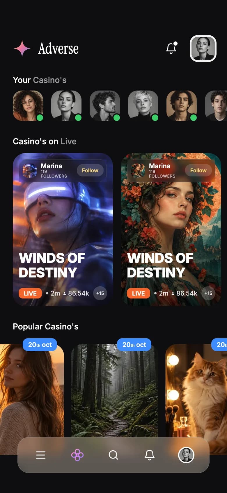
Host stories, two live poster cards with viewer counts, a popular row with date tags and a frosted glass tab bar.
Host profile
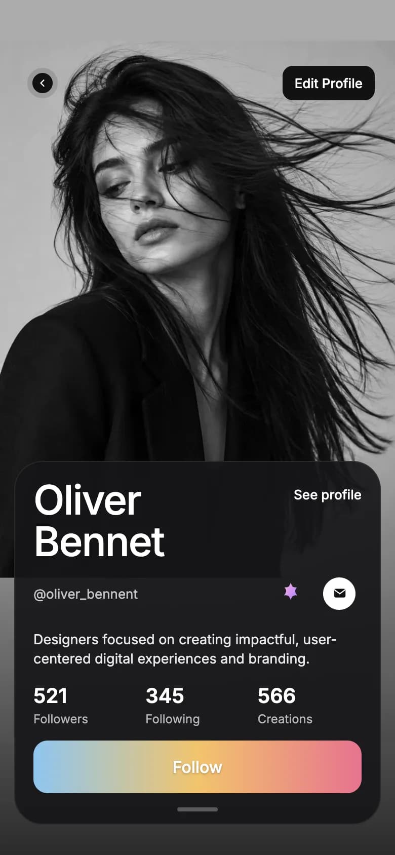
A full-height black and white portrait, a large name, bio, follower stats and a gradient follow button.
Copy the Adverse Live Casino kit
Use the artifact as a design brief, the skill to generate the UI with an AI agent, or the code to run it right away.
Design artifact
The full design: tokens, screens and source
# Adverse Live Casino: design artifact
This live casino community app UI leads with presenters instead of game tables. Host stories sit at the top, live rooms appear as poster cards, and popular sessions scroll underneath.
- Type: Entertainment mobile app UI
- Screens: 2
- Artboard: 390 × 844
- Target: Expo SDK 58, Expo Router, TypeScript, expo-blur, expo-image, expo-linear-gradient, react-native-svg
- Live page: https://developermill.com/app-designs/casino-game-app-ui-design
## Design direction
Near-black pages with art-poster cards, serif display type, glass navigation and a single orange live signal.
- Host stories with online indicators
- Live poster cards with follow actions
- Frosted glass bottom navigation
- Full-bleed monochrome profile with a gradient follow button
## Foundations
### Colour
| Token | Hex |
| --- | --- |
| Onyx | `#0E0E0F` |
| Graphite | `#222226` |
| Live orange | `#F2652B` |
| Silver | `#D9D9D9` |
| Ash | `#9B9B9F` |
| White | `#FFFFFF` |
### Typography
- Typefaces: Inter, Instrument Serif
- Common sizes (px): 7, 8, 11, 12, 13, 14, 15, 20
### Shape and depth
- Common corner radii (px): 2, 3, 4, 10, 14, 20
## Screens
### 1. Live feed
Host stories, two live poster cards with viewer counts, a popular row with date tags and a frosted glass tab bar.
Preview: https://developermill.com/app-designs/casino-game-app-ui-design/live.webp
Copy on this screen:
- 95
- Adverse
- Your
- Casino's
- Casino's on
- Live
- Marina
- 119 FOLLOWERS
- Follow
- WINDS OF
- DESTINY
- LIVE
- 2m
- 86.54k
- +15
- Popular Casino's
- 20
- th
- oct
### 2. Host profile
A full-height black and white portrait, a large name, bio, follower stats and a gradient follow button.
Preview: https://developermill.com/app-designs/casino-game-app-ui-design/profile.webp
Copy on this screen:
- 95
- Edit Profile
- Oliver
- Bennet
- See profile
- @oliver_bennent
- Designers focused on creating impactful, user-centered digital experiences and branding.
- 521
- Followers
- 345
- Following
- 566
- Creations
- Follow
## Full source
The original artboards as HTML. Image URLs point at the hosted demo assets.
### Live feed (Main)
```html
<!doctype html>
<html lang="en">
<head>
<meta charset="utf-8">
<title>Adverse home</title>
<script src="./support.js"></script>
</head>
<body>
<x-dc>
<helmet>
<link rel="preconnect" href="https://fonts.googleapis.com">
<link href="https://fonts.googleapis.com/css2?family=Inter:wght@400;500;600;700;800&family=Instrument+Serif&display=swap" rel="stylesheet">
<style>
body{margin:0}
a{color:#ffffff}a:hover{color:#d9d9d9}
.hs::-webkit-scrollbar{display:none}
</style>
</helmet>
<div style="width: 390px; height: 844px; position: relative; overflow: hidden; background: #0e0e0f; color: #ffffff; font-family: Inter, system-ui, sans-serif; box-sizing: border-box">
<div style="height: 50px; padding: 0 30px 0 34px; display: flex; align-items: center; justify-content: space-between; font-size: 15px; font-weight: 600">
<span>9:41</span>
<div style="display: flex; align-items: center; gap: 6px">
<svg aria-hidden="true" width="18" height="12" viewBox="0 0 18 12"><rect x="0" y="8" width="3" height="4" rx="1" fill="#fff"/><rect x="5" y="5.5" width="3" height="6.5" rx="1" fill="#fff"/><rect x="10" y="3" width="3" height="9" rx="1" fill="#fff"/><rect x="15" y="0" width="3" height="12" rx="1" fill="#fff"/></svg>
<svg aria-hidden="true" width="16" height="12" viewBox="0 0 16 12" fill="none" stroke="#fff" stroke-width="1.8" stroke-linecap="round"><path d="M1 4.2a10 10 0 0 1 14 0"/><path d="M3.6 7a6.2 6.2 0 0 1 8.8 0"/><circle cx="8" cy="10" r="1" fill="#fff"/></svg>
<span style="background: #ffffff; color: #0e0e0f; font-size: 11px; font-weight: 700; padding: 1px 5px; border-radius: 4px">95</span>
</div>
</div>
<div style="padding: 10px 18px 0 22px; display: flex; align-items: center; justify-content: space-between">
<div style="display: flex; align-items: center; gap: 12px">
<svg aria-hidden="true" width="32" height="32" viewBox="0 0 32 32"><defs><linearGradient id="lg" x1="0" y1="0" x2="1" y2="1"><stop offset="0" stop-color="#f6c66b"/><stop offset=".5" stop-color="#e46fa1"/><stop offset="1" stop-color="#5aa7ff"/></linearGradient></defs><path d="M16 1 C17.5 11 21 14.5 31 16 C21 17.5 17.5 21 16 31 C14.5 21 11 17.5 1 16 C11 14.5 14.5 11 16 1Z" fill="url(#lg)"/></svg>
<span style="font-family: 'Instrument Serif', Georgia, serif; font-size: 26px; letter-spacing: 0.2px">Adverse</span>
</div>
<div style="display: flex; align-items: center; gap: 10px">
<button aria-label="Notifications" style="width: 44px; height: 44px; border: 0; background: transparent; color: #ffffff; position: relative; display: flex; align-items: center; justify-content: center; padding: 0">
<svg aria-hidden="true" width="22" height="22" viewBox="0 0 24 24" fill="none" stroke="currentColor" stroke-width="1.7" stroke-linecap="round" stroke-linejoin="round"><path d="M6 9a6 6 0 0 1 12 0c0 6 2.5 7.5 2.5 7.5h-17S6 15 6 9"/><path d="M10 20a2.2 2.2 0 0 0 4 0"/></svg>
<span style="position: absolute; top: 8px; right: 9px; width: 7px; height: 7px; border-radius: 50%; background: #ffffff; border: 2px solid #0e0e0f"></span>
</button>
<button aria-label="Your profile" style="width: 46px; height: 46px; border: 0; border-radius: 14px; background: #f2f2f2; padding: 3px; display: flex">
<img src="https://developermill.com/app-designs/casino-game-app-ui-design/assets/0a6c0ed151.jpg" alt="" style="width: 40px; height: 40px; border-radius: 11px; object-fit: cover; display: block">
</button>
</div>
</div>
<div style="padding: 22px 22px 10px; font-size: 14px; font-weight: 500">Your <span style="color: #9b9b9f">Casino's</span></div>
<div class="hs" style="display: flex; gap: 14px; padding: 0 22px; overflow-x: auto">
<sc-for list="{{stories}}" as="s" hint-placeholder-count="6">
<div style="position: relative; flex: 0 0 52px">
<img src="{{s.src}}" alt="{{s.name}}" style="width: 52px; height: 52px; border-radius: 16px; object-fit: cover; display: block">
<span style="position: absolute; right: -2px; bottom: -2px; width: 11px; height: 11px; border-radius: 50%; background: #3ccf6a; border: 2px solid #0e0e0f"></span>
</div>
</sc-for>
</div>
<div style="padding: 26px 22px 12px; font-size: 14px; font-weight: 500">Casino's on <span style="color: #9b9b9f">Live</span></div>
<div class="hs" style="display: flex; gap: 14px; padding: 0 22px; overflow-x: auto">
<sc-for list="{{lives}}" as="c" hint-placeholder-count="2">
<div style="flex: 0 0 172px; height: 262px; border-radius: 22px; background: #222226; position: relative; overflow: hidden; box-sizing: border-box; padding: 10px; display: flex; flex-direction: column; justify-content: space-between">
<img src="{{c.src}}" alt="{{c.alt}}" style="position: absolute; inset: 0; width: 100%; height: 100%; object-fit: cover">
<div style="position: absolute; left: 0; right: 0; bottom: 0; height: 60%; background: linear-gradient(180deg, rgba(0,0,0,0) 0%, rgba(0,0,0,0.65) 100%)"></div>
<div style="position: relative; display: flex; align-items: center; gap: 7px; background: rgba(40,40,44,0.55); border: 1px solid rgba(255,255,255,0.14); border-radius: 14px; padding: 5px 5px 5px 6px; backdrop-filter: blur(10px)">
<img src="{{c.src}}" alt="" style="width: 24px; height: 24px; border-radius: 8px; object-fit: cover; flex: 0 0 24px">
<div style="flex: 1; min-width: 0; display: flex; flex-direction: column; line-height: 1.1">
<span style="font-size: 11px; font-weight: 600">Marina</span>
<span style="font-size: 7px; color: #c9c9cc; letter-spacing: 0.3px">119 FOLLOWERS</span>
</div>
<button style="border: 0; border-radius: 10px; background: rgba(255,255,255,0.16); color: #f2d27a; font-size: 9px; font-weight: 600; padding: 5px 9px; font-family: inherit">Follow</button>
</div>
<div style="position: relative; display: flex; flex-direction: column; gap: 10px">
<div style="font-size: 23px; font-weight: 800; line-height: 1.08; letter-spacing: -0.3px">WINDS OF<br>DESTINY</div>
<div style="display: flex; align-items: center; gap: 7px; font-size: 11px; color: #e6e6e8">
<span style="background: {{live}}; color: #ffffff; font-weight: 700; font-size: 10px; padding: 3px 9px; border-radius: 7px">LIVE</span>
<span style="display: flex; align-items: center; gap: 4px"><span style="width: 4px; height: 4px; border-radius: 50%; background: #c9c9cc"></span>2m</span>
<span style="display: flex; align-items: center; gap: 3px">
<svg aria-hidden="true" width="11" height="11" viewBox="0 0 24 24" fill="#fff"><circle cx="12" cy="8" r="4.5"/><path d="M3 21c1.5-5 5-7 9-7s7.5 2 9 7z"/></svg>86.54k
</span>
<span style="margin-left: auto; width: 24px; height: 24px; border-radius: 50%; background: rgba(255,255,255,0.18); font-size: 8px; display: flex; align-items: center; justify-content: center; font-weight: 600">+15</span>
</div>
</div>
</div>
</sc-for>
</div>
<div style="padding: 26px 22px 12px; font-size: 14px; font-weight: 500">Popular Casino's</div>
<div class="hs" style="display: flex; gap: 12px; padding: 0 0 0 0; margin-left: -40px; overflow-x: auto">
<sc-for list="{{popular}}" as="p" hint-placeholder-count="3">
<div style="flex: 0 0 150px; height: 190px; border-radius: 20px; background: #222226; position: relative; margin-top: 10px">
<img src="{{p.src}}" alt="{{p.alt}}" style="width: 150px; height: 190px; border-radius: 20px; object-fit: cover; display: block">
<span style="position: absolute; top: -10px; right: 12px; background: #3d8bff; color: #ffffff; font-size: 11px; font-weight: 600; padding: 4px 9px; border-radius: 9px">20<sup style="font-size: 7px">th</sup> oct</span>
</div>
</sc-for>
</div>
<nav aria-label="Main" style="position: absolute; left: 30px; right: 30px; bottom: 34px; height: 60px; border-radius: 20px; background: rgba(150,140,130,0.42); border: 1px solid rgba(255,255,255,0.18); backdrop-filter: blur(18px); display: flex; align-items: center; justify-content: space-around; padding: 0 8px">
<button aria-label="Menu" style="width: 44px; height: 44px; border: 0; background: transparent; color: #ffffff; display: flex; align-items: center; justify-content: center">
<svg aria-hidden="true" width="22" height="22" viewBox="0 0 24 24" fill="none" stroke="currentColor" stroke-width="1.6" stroke-linecap="round"><path d="M4 6h16M4 12h16M4 18h16"/></svg>
</button>
<button aria-label="Discover" style="width: 44px; height: 44px; border: 0; background: transparent; display: flex; align-items: center; justify-content: center">
<svg aria-hidden="true" width="26" height="26" viewBox="0 0 24 24" fill="none" stroke="url(#ng)" stroke-width="1.6"><defs><linearGradient id="ng" x1="0" y1="0" x2="1" y2="1"><stop offset="0" stop-color="#ff8fd0"/><stop offset="1" stop-color="#9b7bff"/></linearGradient></defs><circle cx="12" cy="6.5" r="3.5"/><circle cx="12" cy="17.5" r="3.5"/><circle cx="6.5" cy="12" r="3.5"/><circle cx="17.5" cy="12" r="3.5"/><circle cx="12" cy="12" r="1.6"/></svg>
</button>
<button aria-label="Search" style="width: 44px; height: 44px; border: 0; background: transparent; color: #ffffff; display: flex; align-items: center; justify-content: center">
<svg aria-hidden="true" width="22" height="22" viewBox="0 0 24 24" fill="none" stroke="currentColor" stroke-width="1.7" stroke-linecap="round"><circle cx="11" cy="11" r="7"/><path d="m20 20-3.6-3.6"/></svg>
</button>
<button aria-label="Notifications" style="width: 44px; height: 44px; border: 0; background: transparent; color: #ffffff; display: flex; align-items: center; justify-content: center">
<svg aria-hidden="true" width="22" height="22" viewBox="0 0 24 24" fill="none" stroke="currentColor" stroke-width="1.7" stroke-linecap="round" stroke-linejoin="round"><path d="M6 9a6 6 0 0 1 12 0c0 6 2.5 7.5 2.5 7.5h-17S6 15 6 9"/><path d="M10 20a2.2 2.2 0 0 0 4 0"/></svg>
</button>
<button aria-label="Profile" style="width: 44px; height: 44px; border: 0; background: transparent; display: flex; align-items: center; justify-content: center">
<img src="https://developermill.com/app-designs/casino-game-app-ui-design/assets/0a6c0ed151.jpg" alt="" style="width: 28px; height: 28px; border-radius: 50%; object-fit: cover; border: 2px solid #ffffff; box-sizing: border-box">
</button>
</nav>
<div style="position: absolute; bottom: 9px; left: 50%; transform: translateX(-50%); width: 134px; height: 5px; border-radius: 3px; background: #ffffff"></div>
</div>
</x-dc>
<script type="text/x-dc" data-dc-script data-props='{"liveColor":{"editor":"color","default":"#f2652b","options":["#f2652b","#ff3b5c","#3d8bff"]},"$preview":{"width":390,"height":844}}'>
class Component extends DCLogic {
renderVals() {
return {
live: this.props.liveColor ?? '#f2652b',
stories: [
{ name: 'Casino 1', src: 'https://developermill.com/app-designs/casino-game-app-ui-design/assets/0b0d613b8d.jpg' },
{ name: 'Casino 2', src: 'https://developermill.com/app-designs/casino-game-app-ui-design/assets/0a6c0ed151.jpg' },
{ name: 'Casino 3', src: 'https://developermill.com/app-designs/casino-game-app-ui-design/assets/3476cb7292.jpg' },
{ name: 'Casino 4', src: 'https://developermill.com/app-designs/casino-game-app-ui-design/assets/1015031b43.jpg' },
{ name: 'Casino 5', src: 'https://developermill.com/app-designs/casino-game-app-ui-design/assets/f1b646620e.jpg' },
{ name: 'Casino 6', src: 'https://developermill.com/app-designs/casino-game-app-ui-design/assets/f02f6c64c2.jpg' }
],
lives: [
{ alt: 'Woman wearing a glowing visor', src: 'https://developermill.com/app-designs/casino-game-app-ui-design/assets/150f5b81bc.jpg' },
{ alt: 'Woman with a crown of flowers', src: 'https://developermill.com/app-designs/casino-game-app-ui-design/assets/2860851ec3.jpg' }
],
popular: [
{ alt: 'Woman at sunset', src: 'https://developermill.com/app-designs/casino-game-app-ui-design/assets/e7e1bf54d6.jpg' },
{ alt: 'Misty forest path', src: 'https://developermill.com/app-designs/casino-game-app-ui-design/assets/13399e711e.jpg' },
{ alt: 'Cat by a vanity mirror', src: 'https://developermill.com/app-designs/casino-game-app-ui-design/assets/b918818670.jpg' }
]
};
}
}
</script>
</body>
</html>
```
### Host profile (Profile)
```html
<!doctype html>
<html lang="en">
<head>
<meta charset="utf-8">
<title>Oliver Bennet profile</title>
<script src="./support.js"></script>
</head>
<body>
<x-dc>
<helmet>
<link rel="preconnect" href="https://fonts.googleapis.com">
<link href="https://fonts.googleapis.com/css2?family=Inter:wght@400;500;600;700&display=swap" rel="stylesheet">
<style>
body{margin:0}
a{color:#ffffff}a:hover{color:#d9d9d9}
</style>
</helmet>
<div style="width: 390px; height: 844px; position: relative; overflow: hidden; background: #acacac; color: #ffffff; font-family: Inter, system-ui, sans-serif; box-sizing: border-box">
<img src="https://developermill.com/app-designs/casino-game-app-ui-design/assets/eb68535af1.jpg" alt="Black and white portrait of a woman with windswept hair" style="position: absolute; top: 40px; left: 0; width: 390px; height: 693px; object-fit: cover; object-position: top">
<div style="position: absolute; left: 0; right: 0; bottom: 0; height: 420px; background: linear-gradient(180deg, rgba(20,20,20,0) 0%, rgba(20,20,20,0.85) 100%)"></div>
<div style="position: relative; height: 50px; padding: 0 30px 0 34px; display: flex; align-items: center; justify-content: space-between; font-size: 15px; font-weight: 600; color: #111111">
<span>9:41</span>
<div style="display: flex; align-items: center; gap: 6px">
<svg aria-hidden="true" width="18" height="12" viewBox="0 0 18 12"><rect x="0" y="8" width="3" height="4" rx="1" fill="#111"/><rect x="5" y="5.5" width="3" height="6.5" rx="1" fill="#111"/><rect x="10" y="3" width="3" height="9" rx="1" fill="#111"/><rect x="15" y="0" width="3" height="12" rx="1" fill="#111"/></svg>
<svg aria-hidden="true" width="16" height="12" viewBox="0 0 16 12" fill="none" stroke="#111" stroke-width="1.8" stroke-linecap="round"><path d="M1 4.2a10 10 0 0 1 14 0"/><path d="M3.6 7a6.2 6.2 0 0 1 8.8 0"/><circle cx="8" cy="10" r="1" fill="#111"/></svg>
<span style="background: #111111; color: #ffffff; font-size: 11px; font-weight: 700; padding: 1px 5px; border-radius: 4px">95</span>
</div>
</div>
<div style="position: relative; padding: 10px 20px 0; display: flex; align-items: center; justify-content: space-between">
<button aria-label="Back" style="width: 44px; height: 44px; border: 0; background: transparent; padding: 0; display: flex; align-items: center; justify-content: center">
<span style="width: 30px; height: 30px; border-radius: 50%; background: rgba(0,0,0,0.12); display: flex; align-items: center; justify-content: center">
<span style="width: 20px; height: 20px; border-radius: 50%; background: #111111; display: flex; align-items: center; justify-content: center">
<svg aria-hidden="true" width="10" height="10" viewBox="0 0 24 24" fill="none" stroke="#fff" stroke-width="3" stroke-linecap="round" stroke-linejoin="round"><path d="m15 5-7 7 7 7"/></svg>
</span>
</span>
</button>
<button style="height: 34px; border: 0; border-radius: 10px; background: #111111; color: #ffffff; font-family: inherit; font-size: 13px; font-weight: 500; padding: 0 12px">Edit Profile</button>
</div>
<section style="position: absolute; left: 14px; right: 14px; bottom: 30px; border-radius: 28px; background: rgba(22,22,24,0.92); border: 1px solid rgba(255,255,255,0.08); padding: 18px 18px 12px; box-sizing: border-box; display: flex; flex-direction: column; gap: 14px">
<div style="display: flex; align-items: flex-start; justify-content: space-between">
<h1 style="margin: 0; font-size: 40px; font-weight: 500; line-height: 1.02; letter-spacing: -1px">Oliver<br>Bennet</h1>
<a href="#" style="font-size: 13px; font-weight: 500; text-decoration: none; padding-top: 6px">See profile</a>
</div>
<div style="display: flex; align-items: center; justify-content: space-between; margin-top: -6px">
<span style="font-size: 13px; color: #c4c4c8">@oliver_bennent</span>
<div style="display: flex; align-items: center; gap: 4px">
<button aria-label="Highlights" style="width: 44px; height: 44px; border: 0; background: transparent; display: flex; align-items: center; justify-content: center; padding: 0">
<svg aria-hidden="true" width="26" height="26" viewBox="0 0 24 24"><defs><linearGradient id="pg" x1="0" y1="0" x2="1" y2="1"><stop offset="0" stop-color="#ffb3e0"/><stop offset="1" stop-color="#a77bff"/></linearGradient></defs><path d="M12 2c1.2 3.6 2.2 4.6 5.6 4.2-2 2.9-2 4.3.4 7.4-3.7-.4-4.8.6-6 4.2-1.2-3.6-2.3-4.6-6-4.2 2.4-3.1 2.4-4.5.4-7.4 3.4.4 4.4-.6 5.6-4.2z" fill="url(#pg)"/></svg>
</button>
<button aria-label="Message" style="width: 44px; height: 44px; border: 0; background: transparent; display: flex; align-items: center; justify-content: center; padding: 0">
<span style="width: 32px; height: 32px; border-radius: 50%; background: #ffffff; display: flex; align-items: center; justify-content: center">
<svg aria-hidden="true" width="15" height="15" viewBox="0 0 24 24" fill="#111"><rect x="3" y="5" width="18" height="14" rx="3"/><path d="m4 7 8 6 8-6" fill="none" stroke="#fff" stroke-width="1.8" stroke-linecap="round"/></svg>
</span>
</button>
</div>
</div>
<p style="margin: 0; font-size: 13.5px; line-height: 1.45; color: #e8e8ea">Designers focused on creating impactful, user-centered digital experiences and branding.</p>
<div style="display: grid; grid-template-columns: repeat(3, minmax(0, 1fr)); gap: 8px">
<div style="display: flex; flex-direction: column; gap: 3px"><span style="font-size: 20px; font-weight: 600">521</span><span style="font-size: 12px; color: #b4b4b9">Followers</span></div>
<div style="display: flex; flex-direction: column; gap: 3px"><span style="font-size: 20px; font-weight: 600">345</span><span style="font-size: 12px; color: #b4b4b9">Following</span></div>
<div style="display: flex; flex-direction: column; gap: 3px"><span style="font-size: 20px; font-weight: 600">566</span><span style="font-size: 12px; color: #b4b4b9">Creations</span></div>
</div>
<button style="height: 52px; border: 0; border-radius: 14px; background: linear-gradient(90deg, {{c1}} 0%, {{c2}} 50%, {{c3}} 100%); color: #ffffff; font-family: inherit; font-size: 16px; font-weight: 500; text-shadow: 0 1px 2px rgba(0,0,0,0.25)">Follow</button>
<span style="align-self: center; width: 40px; height: 4px; border-radius: 2px; background: #5a5a5e"></span>
</section>
<div style="position: absolute; bottom: 9px; left: 50%; transform: translateX(-50%); width: 134px; height: 5px; border-radius: 3px; background: #ffffff"></div>
</div>
</x-dc>
<script type="text/x-dc" data-dc-script data-props='{"followStart":{"editor":"color","default":"#8ec5f0","section":"Follow button"},"followMid":{"editor":"color","default":"#f2c46d","section":"Follow button"},"followEnd":{"editor":"color","default":"#e7738f","section":"Follow button"},"$preview":{"width":390,"height":844}}'>
class Component extends DCLogic {
renderVals() {
return {
c1: this.props.followStart ?? '#8ec5f0',
c2: this.props.followMid ?? '#f2c46d',
c3: this.props.followEnd ?? '#e7738f'
};
}
}
</script>
</body>
</html>
```SKILL.md
Save as .claude/skills/casino-game-app-ui/SKILL.md
---
name: casino-game-app-ui
description: Build the Adverse Live Casino mobile app UI in Expo React Native. Use when asked to create a casino app UI or a new screen in this visual style.
---

# Adverse Live Casino app UI

Build this entertainment app UI in an Expo Router project with TypeScript.

Reference: https://developermill.com/app-designs/casino-game-app-ui-design

## Visual direction

Near-black pages with art-poster cards, serif display type, glass navigation and a single orange live signal.

Keep these signature details:

- Host stories with online indicators
- Live poster cards with follow actions
- Frosted glass bottom navigation
- Full-bleed monochrome profile with a gradient follow button

## Set up

```bash
npx expo install expo-blur expo-image expo-linear-gradient react-native-svg @expo-google-fonts/instrument-serif @expo-google-fonts/inter expo-font
```

## Tokens

| Name | Hex |
| --- | --- |
| Onyx | `#0E0E0F` |
| Graphite | `#222226` |
| Live orange | `#F2652B` |
| Silver | `#D9D9D9` |
| Ash | `#9B9B9F` |
| White | `#FFFFFF` |

- Typefaces: Inter, Instrument Serif
- Text sizes (px): 7, 8, 11, 12, 13, 14, 15, 20
- Corner radii (px): 2, 3, 4, 10, 14, 20

Define these once and reuse them. Do not add new colours.

## Screens

1. **Live feed.** Host stories, two live poster cards with viewer counts, a popular row with date tags and a frosted glass tab bar.
2. **Host profile.** A full-height black and white portrait, a large name, bio, follower stats and a gradient follow button.

## Build rules

- Draw each screen on a 390 × 844 artboard and scale it to the device width.
- Load each custom font weight by family name with expo-font. Do not set fontWeight with custom fonts.
- Draw icons, charts and illustrations with react-native-svg.
- Use Pressable with an accessibilityLabel for controls, with at least a 44px target.
- Navigate with router.navigate and keep sample data as constants at the top of the file.
- Use expo-image with contentFit for photos.

## Done when

- All routes are linked and reachable.
- Colours, type and radii match the tokens above.
- `npx tsc --noEmit` and `npx expo lint` pass.
- The layout holds up on small and large phones.
Set up the project
npx create-expo-app@latest casino-game-app --template default
cd casino-game-app
rm -rf src
npx expo install expo-blur expo-image expo-linear-gradient react-native-svg @expo-google-fonts/instrument-serif @expo-google-fonts/inter expo-font
src/app/_layout.tsx
import { InstrumentSerif_400Regular } from '@expo-google-fonts/instrument-serif';
import {
  Inter_400Regular,
  Inter_500Medium,
  Inter_600SemiBold,
  Inter_700Bold,
  Inter_800ExtraBold,
} from '@expo-google-fonts/inter';
import { useFonts } from 'expo-font';
import { Stack } from 'expo-router';

export default function RootLayout() {
  const [fontsLoaded] = useFonts({
    InstrumentSerif_400Regular,
    Inter_400Regular,
    Inter_500Medium,
    Inter_600SemiBold,
    Inter_700Bold,
    Inter_800ExtraBold,
  });

  if (!fontsLoaded) return null;

  return <Stack screenOptions={{ headerShown: false }} />;
}
src/app/index.tsx
import { BlurView } from 'expo-blur';
import { Image } from 'expo-image';
import { LinearGradient } from 'expo-linear-gradient';
import { Pressable, ScrollView, StyleSheet, Text, View } from 'react-native';
import Svg, {
Circle,
Defs,
Path,
Stop,
LinearGradient as SvgLinearGradient,
} from 'react-native-svg';
import { Screen } from '@/components/screen';
import { asset } from '@/lib/assets';
const live = '#f2652b';
const stories = [
{ name: 'Casino 1', src: '0b0d613b8d.jpg' },
{ name: 'Casino 2', src: '0a6c0ed151.jpg' },
{ name: 'Casino 3', src: '3476cb7292.jpg' },
{ name: 'Casino 4', src: '1015031b43.jpg' },
{ name: 'Casino 5', src: 'f1b646620e.jpg' },
{ name: 'Casino 6', src: 'f02f6c64c2.jpg' },
];
const lives = [
{ alt: 'Woman wearing a glowing visor', src: '150f5b81bc.jpg' },
{ alt: 'Woman with a crown of flowers', src: '2860851ec3.jpg' },
];
const popular = [
{ alt: 'Woman at sunset', src: 'e7e1bf54d6.jpg' },
{ alt: 'Misty forest path', src: '13399e711e.jpg' },
{ alt: 'Cat by a vanity mirror', src: 'b918818670.jpg' },
];
export default function MainScreen() {
return (
<Screen background="#0e0e0f" statusBar="light">
<View style={{ flex: 1 }}>
<View
style={{
height: 50,
paddingVertical: 0,
paddingLeft: 34,
paddingRight: 30,
alignItems: 'center',
justifyContent: 'space-between',
flexDirection: 'row',
}}
/>
<View
style={{
paddingTop: 10,
paddingBottom: 0,
paddingLeft: 22,
paddingRight: 18,
alignItems: 'center',
justifyContent: 'space-between',
flexDirection: 'row',
}}>
<View style={{ alignItems: 'center', gap: 12, flexShrink: 1, flexDirection: 'row' }}>
<Svg width="32" height="32" viewBox="0 0 32 32">
<Defs>
<SvgLinearGradient id="lg" x1="0" y1="0" x2="1" y2="1">
<Stop offset="0" stopColor="#f6c66b" />
<Stop offset=".5" stopColor="#e46fa1" />
<Stop offset="1" stopColor="#5aa7ff" />
</SvgLinearGradient>
</Defs>
<Path
d="M16 1 C17.5 11 21 14.5 31 16 C21 17.5 17.5 21 16 31 C14.5 21 11 17.5 1 16 C11 14.5 14.5 11 16 1Z"
fill="url(#lg)"
/>
</Svg>
<Text
style={{
flexShrink: 1,
fontFamily: 'InstrumentSerif_400Regular',
fontSize: 26,
color: '#ffffff',
letterSpacing: 0.2,
}}>
Adverse
</Text>
</View>
<View style={{ alignItems: 'center', gap: 10, flexShrink: 1, flexDirection: 'row' }}>
<Pressable
accessibilityRole="button"
accessibilityLabel="Notifications"
style={{
width: 44,
height: 44,
borderWidth: 0,
alignItems: 'center',
justifyContent: 'center',
padding: 0,
flexDirection: 'row',
}}>
<Svg
width="22"
height="22"
viewBox="0 0 24 24"
fill="none"
stroke="#ffffff"
strokeWidth="1.7"
strokeLinecap="round"
strokeLinejoin="round">
<Path d="M6 9a6 6 0 0 1 12 0c0 6 2.5 7.5 2.5 7.5h-17S6 15 6 9" />
<Path d="M10 20a2.2 2.2 0 0 0 4 0" />
</Svg>
<View
style={{
position: 'absolute',
top: 8,
right: 9,
width: 11,
height: 11,
borderRadius: '50%',
backgroundColor: '#ffffff',
borderWidth: 2,
borderColor: '#0e0e0f',
}}
/>
</Pressable>
<Pressable
accessibilityRole="button"
accessibilityLabel="Your profile"
style={{
width: 46,
height: 46,
borderWidth: 0,
borderRadius: 14,
backgroundColor: '#f2f2f2',
padding: 3,
flexDirection: 'row',
}}>
<Image
source={{ uri: asset('0a6c0ed151.jpg') }}
contentFit="cover"
style={{ width: 40, height: 40, borderRadius: 11 }}
/>
</Pressable>
</View>
</View>
<Text
style={{
paddingTop: 22,
paddingBottom: 10,
paddingHorizontal: 22,
fontFamily: 'Inter_500Medium',
fontSize: 14,
color: '#ffffff',
}}>
{'Your '}
<Text style={{ color: '#9b9b9f' }}>{"Casino's"}</Text>
</Text>
<ScrollView
horizontal
showsHorizontalScrollIndicator={false}
contentContainerStyle={{ gap: 14, paddingHorizontal: 22 }}
style={{ paddingVertical: 0, flexGrow: 0 }}>
{stories.map((s, index) => (
<View key={index} style={{ flexGrow: 0, flexShrink: 0, flexBasis: 52 }}>
<Image
source={{ uri: asset(s.src) }}
contentFit="cover"
style={{ width: 52, height: 52, borderRadius: 16 }}
/>
<View
style={{
position: 'absolute',
right: -2,
bottom: -2,
width: 15,
height: 15,
borderRadius: '50%',
backgroundColor: '#3ccf6a',
borderWidth: 2,
borderColor: '#0e0e0f',
}}
/>
</View>
))}
</ScrollView>
<Text
style={{
paddingTop: 26,
paddingBottom: 12,
paddingHorizontal: 22,
fontFamily: 'Inter_500Medium',
fontSize: 14,
color: '#ffffff',
}}>
{"Casino's on "}
<Text style={{ color: '#9b9b9f' }}>Live</Text>
</Text>
<ScrollView
horizontal
showsHorizontalScrollIndicator={false}
contentContainerStyle={{ gap: 14, paddingHorizontal: 22 }}
style={{ paddingVertical: 0, flexGrow: 0 }}>
{lives.map((c, index) => (
<View
key={index}
style={{
flexGrow: 0,
flexShrink: 0,
flexBasis: 172,
height: 262,
borderRadius: 22,
backgroundColor: '#222226',
overflow: 'hidden',
padding: 10,
justifyContent: 'space-between',
}}>
<Image
source={{ uri: asset(c.src) }}
contentFit="cover"
style={{
position: 'absolute',
top: 0,
right: 0,
bottom: 0,
left: 0,
width: '100%',
height: '100%',
}}
/>
<View style={{ position: 'absolute', left: 0, right: 0, bottom: 0, height: '60%' }}>
<LinearGradient
colors={['rgba(0,0,0,0)', 'rgba(0,0,0,0.65)']}
locations={[0, 1]}
start={{ x: 0.5, y: 0 }}
end={{ x: 0.5, y: 1 }}
style={StyleSheet.absoluteFill}
/>
</View>
<View
style={{
alignItems: 'center',
gap: 7,
backgroundColor: 'rgba(40,40,44,0.55)',
borderWidth: 1,
borderColor: 'rgba(255,255,255,0.14)',
borderRadius: 14,
paddingVertical: 5,
paddingLeft: 6,
paddingRight: 5,
overflow: 'hidden',
flexDirection: 'row',
}}>
<BlurView intensity={20} tint="dark" style={StyleSheet.absoluteFill} />
<Image
source={{ uri: asset(c.src) }}
contentFit="cover"
style={{
width: 24,
height: 24,
borderRadius: 8,
flexGrow: 0,
flexShrink: 0,
flexBasis: 24,
}}
/>
<View style={{ flex: 1, minWidth: 0 }}>
<Text
style={{
fontFamily: 'Inter_600SemiBold',
fontSize: 11,
color: '#ffffff',
lineHeight: 12.1,
}}>
Marina
</Text>
<Text
style={{
fontFamily: 'Inter_400Regular',
fontSize: 7,
color: '#c9c9cc',
letterSpacing: 0.3,
lineHeight: 7.7,
}}>
119 FOLLOWERS
</Text>
</View>
<Pressable
accessibilityRole="button"
style={{
borderWidth: 0,
borderRadius: 10,
backgroundColor: 'rgba(255,255,255,0.16)',
paddingVertical: 5,
paddingHorizontal: 9,
flexShrink: 1,
alignItems: 'center',
justifyContent: 'center',
}}>
<Text
style={{
fontFamily: 'Inter_600SemiBold',
fontSize: 9,
color: '#f2d27a',
textAlign: 'center',
}}>
Follow
</Text>
</Pressable>
</View>
<View style={{ gap: 10 }}>
<Text
style={{
fontFamily: 'Inter_800ExtraBold',
fontSize: 23,
color: '#ffffff',
letterSpacing: -0.3,
lineHeight: 24.84,
}}>
WINDS OF{'\n'}DESTINY
</Text>
<View style={{ alignItems: 'center', gap: 7, flexDirection: 'row' }}>
<Text
style={{
backgroundColor: live,
paddingVertical: 3,
paddingHorizontal: 9,
borderRadius: 7,
flexShrink: 1,
fontFamily: 'Inter_700Bold',
fontSize: 10,
color: '#ffffff',
}}>
LIVE
</Text>
<View
style={{ alignItems: 'center', gap: 4, flexShrink: 1, flexDirection: 'row' }}>
<View
style={{
width: 4,
height: 4,
borderRadius: '50%',
backgroundColor: '#c9c9cc',
}}
/>
<Text
style={{
fontFamily: 'Inter_400Regular',
fontSize: 11,
color: '#e6e6e8',
flexShrink: 1,
}}>
2m
</Text>
</View>
<View
style={{ alignItems: 'center', gap: 3, flexShrink: 1, flexDirection: 'row' }}>
<Svg width="11" height="11" viewBox="0 0 24 24" fill="#fff">
<Circle cx="12" cy="8" r="4.5" />
<Path d="M3 21c1.5-5 5-7 9-7s7.5 2 9 7z" />
</Svg>
<Text
style={{
fontFamily: 'Inter_400Regular',
fontSize: 11,
color: '#e6e6e8',
flexShrink: 1,
}}>
86.54k
</Text>
</View>
<View
style={{
marginLeft: 'auto',
width: 24,
height: 24,
borderRadius: '50%',
backgroundColor: 'rgba(255,255,255,0.18)',
alignItems: 'center',
justifyContent: 'center',
flexDirection: 'row',
}}>
<Text
style={{
fontFamily: 'Inter_600SemiBold',
fontSize: 8,
color: '#e6e6e8',
flexShrink: 1,
}}>
+15
</Text>
</View>
</View>
</View>
</View>
))}
</ScrollView>
<Text
style={{
paddingTop: 26,
paddingBottom: 12,
paddingHorizontal: 22,
fontFamily: 'Inter_500Medium',
fontSize: 14,
color: '#ffffff',
}}>
{"Popular Casino's"}
</Text>
<ScrollView
horizontal
showsHorizontalScrollIndicator={false}
contentContainerStyle={{ gap: 12, padding: 0 }}
style={{ marginLeft: -40, flexGrow: 0 }}>
{popular.map((p, index) => (
<View
key={index}
style={{
flexGrow: 0,
flexShrink: 0,
flexBasis: 150,
height: 190,
borderRadius: 20,
backgroundColor: '#222226',
marginTop: 10,
}}>
<Image
source={{ uri: asset(p.src) }}
contentFit="cover"
style={{ width: 150, height: 190, borderRadius: 20 }}
/>
<Text
style={{
position: 'absolute',
top: -10,
right: 12,
backgroundColor: '#3d8bff',
paddingVertical: 4,
paddingHorizontal: 9,
borderRadius: 9,
fontFamily: 'Inter_600SemiBold',
fontSize: 11,
color: '#ffffff',
}}>
20<Text style={{ fontSize: 7 }}>th</Text>
{' oct'}
</Text>
</View>
))}
</ScrollView>
<View
style={{
position: 'absolute',
left: 30,
right: 30,
bottom: 34,
height: 62,
borderRadius: 20,
backgroundColor: 'rgba(150,140,130,0.42)',
borderWidth: 1,
borderColor: 'rgba(255,255,255,0.18)',
alignItems: 'center',
justifyContent: 'space-around',
paddingVertical: 0,
paddingHorizontal: 8,
overflow: 'hidden',
flexDirection: 'row',
}}>
<BlurView intensity={36} tint="default" style={StyleSheet.absoluteFill} />
<Pressable
accessibilityRole="button"
accessibilityLabel="Menu"
style={{
width: 44,
height: 44,
borderWidth: 0,
alignItems: 'center',
justifyContent: 'center',
flexDirection: 'row',
}}>
<Svg
width="22"
height="22"
viewBox="0 0 24 24"
fill="none"
stroke="#ffffff"
strokeWidth="1.6"
strokeLinecap="round">
<Path d="M4 6h16M4 12h16M4 18h16" />
</Svg>
</Pressable>
<Pressable
accessibilityRole="button"
accessibilityLabel="Discover"
style={{
width: 44,
height: 44,
borderWidth: 0,
alignItems: 'center',
justifyContent: 'center',
flexDirection: 'row',
}}>
<Svg
width="26"
height="26"
viewBox="0 0 24 24"
fill="none"
stroke="url(#ng)"
strokeWidth="1.6">
<Defs>
<SvgLinearGradient id="ng" x1="0" y1="0" x2="1" y2="1">
<Stop offset="0" stopColor="#ff8fd0" />
<Stop offset="1" stopColor="#9b7bff" />
</SvgLinearGradient>
</Defs>
<Circle cx="12" cy="6.5" r="3.5" />
<Circle cx="12" cy="17.5" r="3.5" />
<Circle cx="6.5" cy="12" r="3.5" />
<Circle cx="17.5" cy="12" r="3.5" />
<Circle cx="12" cy="12" r="1.6" />
</Svg>
</Pressable>
<Pressable
accessibilityRole="button"
accessibilityLabel="Search"
style={{
width: 44,
height: 44,
borderWidth: 0,
alignItems: 'center',
justifyContent: 'center',
flexDirection: 'row',
}}>
<Svg
width="22"
height="22"
viewBox="0 0 24 24"
fill="none"
stroke="#ffffff"
strokeWidth="1.7"
strokeLinecap="round">
<Circle cx="11" cy="11" r="7" />
<Path d="m20 20-3.6-3.6" />
</Svg>
</Pressable>
<Pressable
accessibilityRole="button"
accessibilityLabel="Notifications"
style={{
width: 44,
height: 44,
borderWidth: 0,
alignItems: 'center',
justifyContent: 'center',
flexDirection: 'row',
}}>
<Svg
width="22"
height="22"
viewBox="0 0 24 24"
fill="none"
stroke="#ffffff"
strokeWidth="1.7"
strokeLinecap="round"
strokeLinejoin="round">
<Path d="M6 9a6 6 0 0 1 12 0c0 6 2.5 7.5 2.5 7.5h-17S6 15 6 9" />
<Path d="M10 20a2.2 2.2 0 0 0 4 0" />
</Svg>
</Pressable>
<Pressable
accessibilityRole="button"
accessibilityLabel="Profile"
style={{
width: 44,
height: 44,
borderWidth: 0,
alignItems: 'center',
justifyContent: 'center',
flexDirection: 'row',
}}>
<Image
source={{ uri: asset('0a6c0ed151.jpg') }}
contentFit="cover"
style={{
width: 28,
height: 28,
borderRadius: '50%',
borderWidth: 2,
borderColor: '#ffffff',
}}
/>
</Pressable>
</View>
</View>
</Screen>
);
}src/app/profile.tsx
import { Image } from 'expo-image';
import { LinearGradient } from 'expo-linear-gradient';
import { Pressable, StyleSheet, Text, View } from 'react-native';
import Svg, { Defs, Path, Rect, Stop, LinearGradient as SvgLinearGradient } from 'react-native-svg';

import { Screen } from '@/components/screen';
import { asset } from '@/lib/assets';

const c1 = '#8ec5f0';
const c2 = '#f2c46d';
const c3 = '#e7738f';

export default function ProfileScreen() {
  return (
    <Screen background="#acacac" statusBar="dark">
      <View style={{ flex: 1 }}>
        <Image
          source={{ uri: asset('eb68535af1.jpg') }}
          contentFit="cover"
          contentPosition="top center"
          accessibilityLabel="Black and white portrait of a woman with windswept hair"
          style={{ position: 'absolute', top: 40, left: 0, width: 390, height: 693 }}
        />
        <View style={{ position: 'absolute', left: 0, right: 0, bottom: 0, height: 420 }}>
          <LinearGradient
            colors={['rgba(20,20,20,0)', 'rgba(20,20,20,0.85)']}
            locations={[0, 1]}
            start={{ x: 0.5, y: 0 }}
            end={{ x: 0.5, y: 1 }}
            style={StyleSheet.absoluteFill}
          />
        </View>
        <View
          style={{
            height: 50,
            paddingVertical: 0,
            paddingLeft: 34,
            paddingRight: 30,
            alignItems: 'center',
            justifyContent: 'space-between',
            flexDirection: 'row',
          }}
        />
        <View
          style={{
            paddingTop: 10,
            paddingBottom: 0,
            paddingHorizontal: 20,
            alignItems: 'center',
            justifyContent: 'space-between',
            flexDirection: 'row',
          }}>
          <Pressable
            accessibilityRole="button"
            accessibilityLabel="Back"
            style={{
              width: 44,
              height: 44,
              borderWidth: 0,
              padding: 0,
              alignItems: 'center',
              justifyContent: 'center',
              flexDirection: 'row',
            }}>
            <View
              style={{
                width: 30,
                height: 30,
                borderRadius: '50%',
                backgroundColor: 'rgba(0,0,0,0.12)',
                alignItems: 'center',
                justifyContent: 'center',
                flexDirection: 'row',
              }}>
              <View
                style={{
                  width: 20,
                  height: 20,
                  borderRadius: '50%',
                  backgroundColor: '#111111',
                  alignItems: 'center',
                  justifyContent: 'center',
                  flexDirection: 'row',
                }}>
                <Svg
                  width="10"
                  height="10"
                  viewBox="0 0 24 24"
                  fill="none"
                  stroke="#fff"
                  strokeWidth="3"
                  strokeLinecap="round"
                  strokeLinejoin="round">
                  <Path d="m15 5-7 7 7 7" />
                </Svg>
              </View>
            </View>
          </Pressable>
          <Pressable
            accessibilityRole="button"
            style={{
              height: 34,
              borderWidth: 0,
              borderRadius: 10,
              backgroundColor: '#111111',
              paddingVertical: 0,
              paddingHorizontal: 12,
              flexShrink: 1,
              alignItems: 'center',
              justifyContent: 'center',
            }}>
            <Text
              style={{
                fontFamily: 'Inter_500Medium',
                fontSize: 13,
                color: '#ffffff',
                textAlign: 'center',
              }}>
              Edit Profile
            </Text>
          </Pressable>
        </View>
        <View
          style={{
            position: 'absolute',
            left: 14,
            right: 14,
            bottom: 30,
            borderRadius: 28,
            backgroundColor: 'rgba(22,22,24,0.92)',
            borderWidth: 1,
            borderColor: 'rgba(255,255,255,0.08)',
            paddingTop: 18,
            paddingBottom: 12,
            paddingHorizontal: 18,
            gap: 14,
          }}>
          <View
            style={{
              alignItems: 'flex-start',
              justifyContent: 'space-between',
              flexDirection: 'row',
            }}>
            <Text
              style={{
                margin: 0,
                flexShrink: 1,
                fontFamily: 'Inter_500Medium',
                fontSize: 40,
                color: '#ffffff',
                letterSpacing: -1,
                lineHeight: 40.8,
              }}>
              Oliver{'\n'}Bennet
            </Text>
            <Pressable accessibilityRole="link" style={{ paddingTop: 6, flexShrink: 1 }}>
              <Text style={{ fontFamily: 'Inter_500Medium', fontSize: 13, color: '#ffffff' }}>
                See profile
              </Text>
            </Pressable>
          </View>
          <View
            style={{
              alignItems: 'center',
              justifyContent: 'space-between',
              marginTop: -6,
              flexDirection: 'row',
            }}>
            <Text
              style={{
                flexShrink: 1,
                fontFamily: 'Inter_400Regular',
                fontSize: 13,
                color: '#c4c4c8',
              }}>
              @oliver_bennent
            </Text>
            <View style={{ alignItems: 'center', gap: 4, flexShrink: 1, flexDirection: 'row' }}>
              <Pressable
                accessibilityRole="button"
                accessibilityLabel="Highlights"
                style={{
                  width: 44,
                  height: 44,
                  borderWidth: 0,
                  alignItems: 'center',
                  justifyContent: 'center',
                  padding: 0,
                  flexDirection: 'row',
                }}>
                <Svg width="26" height="26" viewBox="0 0 24 24">
                  <Defs>
                    <SvgLinearGradient id="pg" x1="0" y1="0" x2="1" y2="1">
                      <Stop offset="0" stopColor="#ffb3e0" />
                      <Stop offset="1" stopColor="#a77bff" />
                    </SvgLinearGradient>
                  </Defs>
                  <Path
                    d="M12 2c1.2 3.6 2.2 4.6 5.6 4.2-2 2.9-2 4.3.4 7.4-3.7-.4-4.8.6-6 4.2-1.2-3.6-2.3-4.6-6-4.2 2.4-3.1 2.4-4.5.4-7.4 3.4.4 4.4-.6 5.6-4.2z"
                    fill="url(#pg)"
                  />
                </Svg>
              </Pressable>
              <Pressable
                accessibilityRole="button"
                accessibilityLabel="Message"
                style={{
                  width: 44,
                  height: 44,
                  borderWidth: 0,
                  alignItems: 'center',
                  justifyContent: 'center',
                  padding: 0,
                  flexDirection: 'row',
                }}>
                <View
                  style={{
                    width: 32,
                    height: 32,
                    borderRadius: '50%',
                    backgroundColor: '#ffffff',
                    alignItems: 'center',
                    justifyContent: 'center',
                    flexDirection: 'row',
                  }}>
                  <Svg width="15" height="15" viewBox="0 0 24 24" fill="#111">
                    <Rect x="3" y="5" width="18" height="14" rx="3" />
                    <Path
                      d="m4 7 8 6 8-6"
                      fill="none"
                      stroke="#fff"
                      strokeWidth="1.8"
                      strokeLinecap="round"
                    />
                  </Svg>
                </View>
              </Pressable>
            </View>
          </View>
          <Text
            style={{
              margin: 0,
              fontFamily: 'Inter_400Regular',
              fontSize: 13.5,
              color: '#e8e8ea',
              lineHeight: 19.58,
            }}>
            Designers focused on creating impactful, user-centered digital experiences and branding.
          </Text>
          <View style={{ flexDirection: 'row', gap: 8 }}>
            <View style={{ gap: 3, flex: 1 }}>
              <Text style={{ fontFamily: 'Inter_600SemiBold', fontSize: 20, color: '#ffffff' }}>
                521
              </Text>
              <Text style={{ fontFamily: 'Inter_400Regular', fontSize: 12, color: '#b4b4b9' }}>
                Followers
              </Text>
            </View>
            <View style={{ gap: 3, flex: 1 }}>
              <Text style={{ fontFamily: 'Inter_600SemiBold', fontSize: 20, color: '#ffffff' }}>
                345
              </Text>
              <Text style={{ fontFamily: 'Inter_400Regular', fontSize: 12, color: '#b4b4b9' }}>
                Following
              </Text>
            </View>
            <View style={{ gap: 3, flex: 1 }}>
              <Text style={{ fontFamily: 'Inter_600SemiBold', fontSize: 20, color: '#ffffff' }}>
                566
              </Text>
              <Text style={{ fontFamily: 'Inter_400Regular', fontSize: 12, color: '#b4b4b9' }}>
                Creations
              </Text>
            </View>
          </View>
          <Pressable
            accessibilityRole="button"
            style={{
              height: 52,
              borderWidth: 0,
              borderRadius: 14,
              overflow: 'hidden',
              alignItems: 'center',
              justifyContent: 'center',
            }}>
            <LinearGradient
              colors={[c1, c2, c3]}
              locations={[0, 0.5, 1]}
              start={{ x: 0, y: 0.5 }}
              end={{ x: 1, y: 0.5 }}
              style={StyleSheet.absoluteFill}
            />
            <Text
              style={{
                fontFamily: 'Inter_500Medium',
                fontSize: 16,
                color: '#ffffff',
                textAlign: 'center',
                textShadowOffset: { width: 0, height: 1 },
                textShadowRadius: 2,
                textShadowColor: 'rgba(0,0,0,0.25)',
              }}>
              Follow
            </Text>
          </Pressable>
          <View
            style={{
              alignSelf: 'center',
              width: 40,
              height: 4,
              borderRadius: 2,
              backgroundColor: '#5a5a5e',
            }}
          />
        </View>
      </View>
    </Screen>
  );
}
src/components/screen.tsx
import { StatusBar } from 'expo-status-bar';
import type { ReactNode } from 'react';
import { ScrollView, useWindowDimensions, View } from 'react-native';

// Every screen is drawn on a 390 wide artboard, then scaled to the device width.
const ARTBOARD_WIDTH = 390;

type Props = {
  background: string;
  statusBar: 'light' | 'dark';
  height?: number;
  children: ReactNode;
};

export function Screen({ background, statusBar, height: artboardHeight = 844, children }: Props) {
  const { width, height } = useWindowDimensions();
  const scale = width / ARTBOARD_WIDTH;

  return (
    <ScrollView
      bounces={false}
      showsVerticalScrollIndicator={false}
      style={{ flex: 1, backgroundColor: background }}
      contentContainerStyle={{ height: Math.max(artboardHeight * scale, height) }}>
      <StatusBar style={statusBar} />
      <View
        style={{
          width: ARTBOARD_WIDTH,
          height: artboardHeight,
          overflow: 'hidden',
          transformOrigin: 'left top',
          transform: [{ scale }],
        }}>
        {children}
      </View>
    </ScrollView>
  );
}
src/lib/assets.ts
// Demo images are hosted by DeveloperMill. Point this at your own CDN, or swap to require().
const ASSET_BASE = 'https://developermill.com/app-designs/casino-game-app-ui-design/assets';

export const asset = (name: string) => `${ASSET_BASE}/${name}`;
About this design
A monochrome profile screen gives the design a magazine feel. The layout suits any live streaming, creator or community app, because every card simply takes a cover image, a title and a few counts.
Near-black pages with art-poster cards, serif display type, glass navigation and a single orange live signal.
- Host stories with online indicators
- Live poster cards with follow actions
- Frosted glass bottom navigation
- Full-bleed monochrome profile with a gradient follow button
Colour palette
Onyx
#0E0E0F
Graphite
#222226
Live orange
#F2652B
Silver
#D9D9D9
Ash
#9B9B9F
White
#FFFFFF
How to use this design
- 01
Pick what to copy
Copy the Adverse Live Casino artifact, skill or code from this page.
- 02
Run it or generate it
Paste the code into a new Expo app and start it, or give the skill to your AI coding agent.
- 03
Make it yours
Replace the demo images and sample content, then connect your own data.
Frequently asked questions
Is this a working casino game?
No. It is a front-end UI for a live community or streaming app. It has no games, payments or wagering logic, and any real-money product needs the licences your region requires.
Can I use the design for a streaming app instead?
Yes. The screens are general: stories, live cards and a profile. Change the copy and cover images and it works for music, gaming or creator streams.
How is the glass tab bar built?
It uses a BlurView from expo-blur inside a rounded view, with the design colour on top, so the feed shows softly through it.
Is the Adverse Live Casino design free to use?
Yes. The design, skill and Expo code are free and MIT licensed, including for commercial apps. Replace the demo images and sample content with your own before you ship.
What is the difference between the artifact, skill and code?
The artifact is the full design: tokens, screens and source. The skill is a SKILL.md that teaches an AI coding agent to build the UI. The code is the finished Expo app you can paste in and run.
Which Expo version does the code use?
It targets Expo SDK 58 with Expo Router and TypeScript. It uses packages installed through npx expo install, with no custom native code.